
Data with a readable hierarchy
Dashboard UI components
A dashboard should help people notice change and decide what to do next. This collection pairs compact visual summaries with explicit labels, sensible reading order, and layouts that remain meaningful when the viewport or dataset changes.
Why this set works
A stronger implementation baseline.
Clear text labels alongside visual encodings
Responsive summaries that preserve data meaning on smaller screens
Focused components that can be composed into different dashboard systems
Working source
Preview, customize, and download.
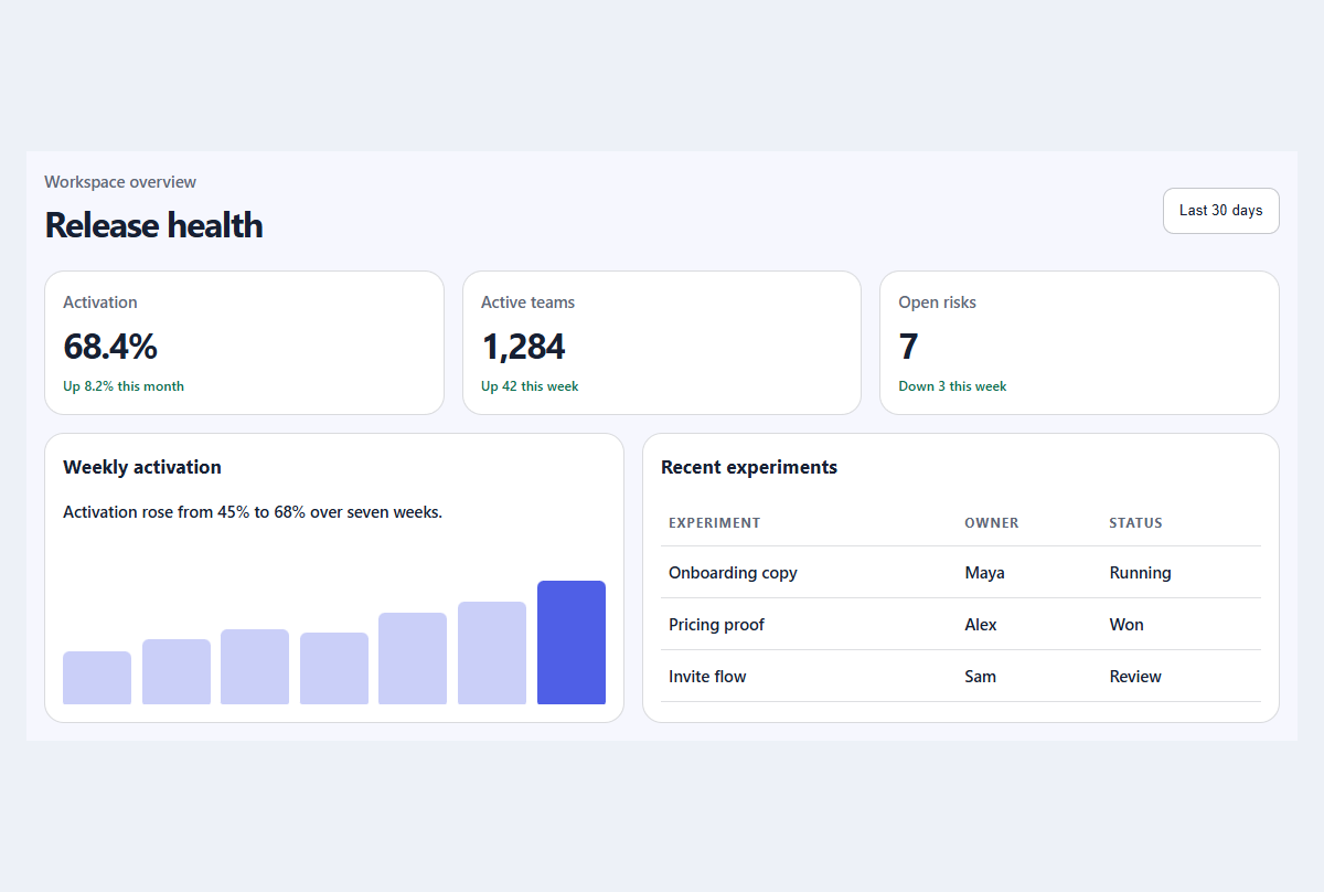
Compact metric dashboard
A responsive dashboard summary with meaningful trends, progress, and a readable activity table.
Open component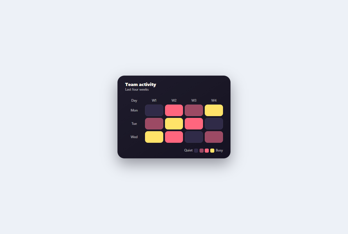
Accessible heatmap grid
A semantic weekly activity heatmap whose focusable cells provide exact text labels alongside thermal color levels.
Open component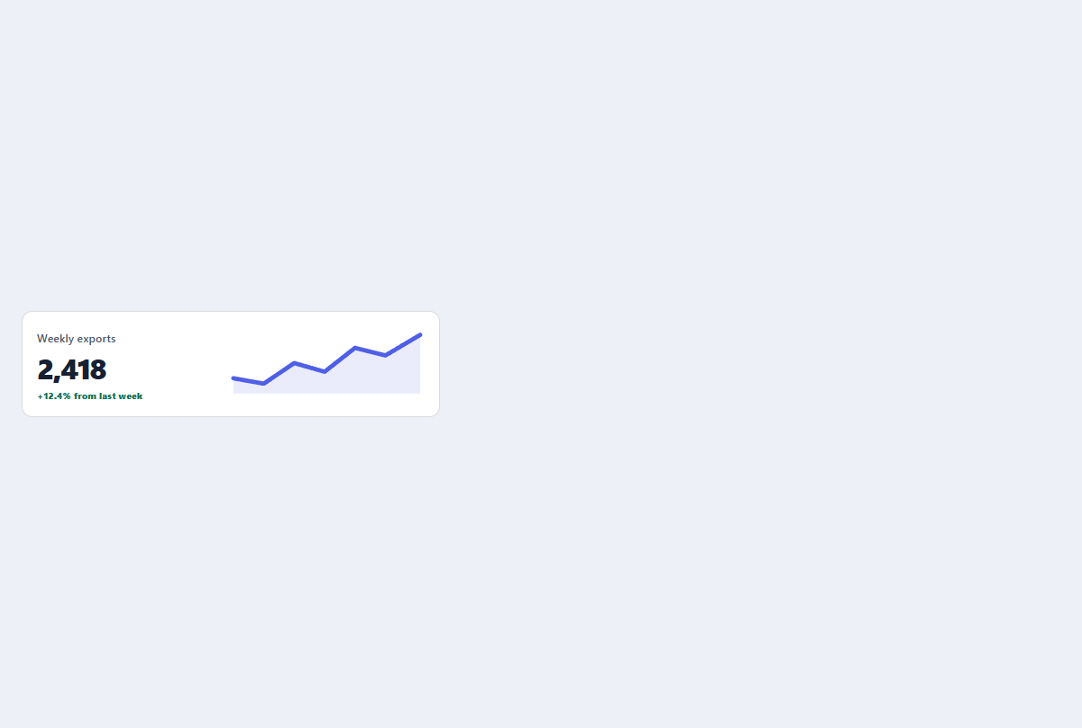
Sparkline stat card
A small metric card with a labeled trend and an accessible inline sparkline.
Open component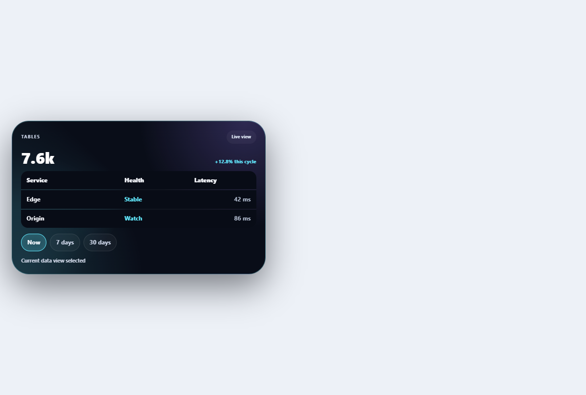
Morphing data table
Adapts a compact table between density modes and mobile card rows without losing headers.
Open component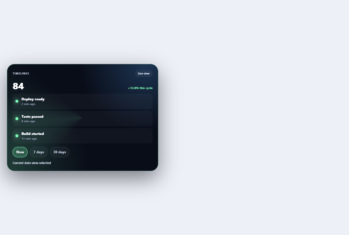
Live activity timeline
Streams a bounded sequence of operational events with source filters and a pauseable live edge.
Open component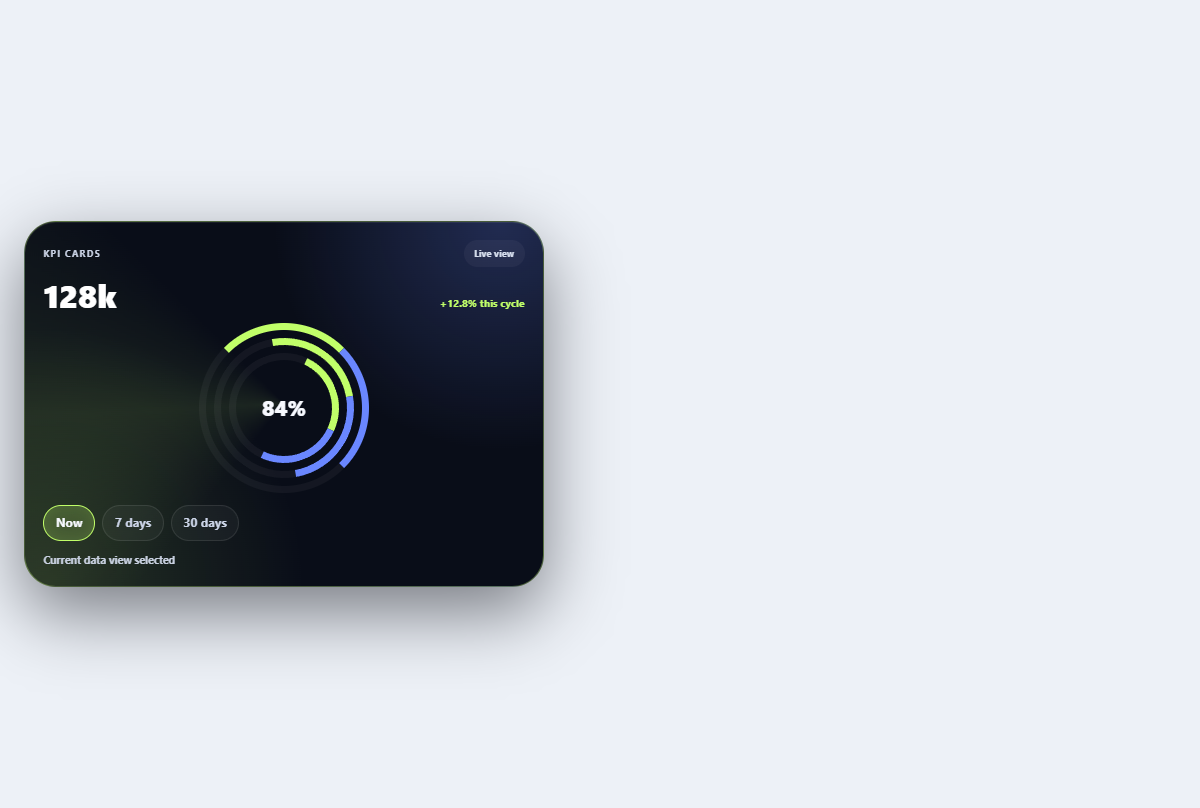
Orbital KPI ring
Pairs a central KPI with target orbit, forecast marker, and remaining-gap annotation.
Open componentBefore shipping
Implementation checklist.
Use these checks after adapting the components to your content and application state.
- 01
State the metric, unit, comparison period, and direction in text.
- 02
Provide a table, summary, or accessible name for information encoded in a chart.
- 03
Reserve space for asynchronously loaded values to prevent layout movement.
- 04
Use color as reinforcement rather than the only indicator of status.
Implementation guidance