
Accessible data visualization for frontend dashboards
Make charts understandable with semantic summaries, keyboard access, redundant encoding, readable labels, and responsive fallbacks.
What you will build correctly
- Lead with the conclusion and provide the underlying values in an accessible form.
- Never depend on color alone to distinguish a series or state.
- Design keyboard exploration and small-screen reading as first-class chart modes.
State the insight before presenting the graphic
A chart should answer a question, not merely occupy a dashboard card. Place a concise title and summary near the visualization: “Signups rose 18% after the release, led by mobile traffic” gives every reader context before they inspect individual points.
Expose the underlying data in a table, list, or downloadable format when precision matters. A screen-reader label that says only “bar chart” does not communicate the values, relationships, or conclusion that sighted users can inspect.
Use redundant visual encoding
Combine color with labels, patterns, line styles, shapes, or direct annotations. Legends should use the same marks as the chart and maintain sufficient contrast against their surfaces. Avoid rainbow scales for ordered values because hue does not communicate a reliable sequence.
For heatmaps, show a textual value in each cell when space allows and offer focus details otherwise. Choose a sequential lightness scale with readable foreground pairs, then test common color-vision simulations without assuming simulation replaces user testing.
- Label important peaks and thresholds directly.
- Pair status colors with icons or text.
- Keep grid lines quieter than the data marks.
Define keyboard exploration deliberately
A dense SVG with every mark in the Tab order can create hundreds of stops. Use one entry point for the chart, arrow keys to move through related values, and a visible focus indicator on the active mark. Announce the series, category, value, and change in a consistent order.
Provide a clear way to leave the visualization and avoid trapping arrow keys when the page needs them for scrolling. For simpler charts, a semantic summary plus an adjacent table may be more usable than a custom interactive exploration model.
                      <figure>
  <figcaption>Weekly signups increased 18%.</figcaption>
  <svg role="img" aria-labelledby="chart-title chart-desc">…</svg>
</figure>
Recompose rather than shrink on mobile
Small screens rarely benefit from a desktop chart squeezed to half its intended width. Reduce the number of labels, move the legend, emphasize the latest value, or switch to a ranked list while preserving access to the complete data.
Test zoom, long translations, large text, and touch exploration. Tooltips must remain available through focus and should not cover the point that triggered them. When hover is the only path to a value, the chart is incomplete.
Use the pattern
Study it in working components.
These internal examples connect the guide to standalone HTML, CSS, and JavaScript you can preview, customize, and download.
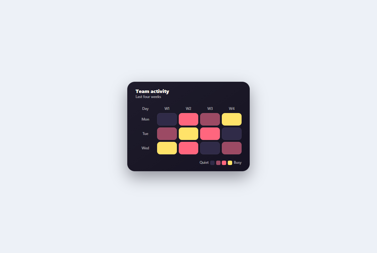
Accessible heatmap grid
A semantic weekly activity heatmap whose focusable cells provide exact text labels alongside thermal color levels.
Open component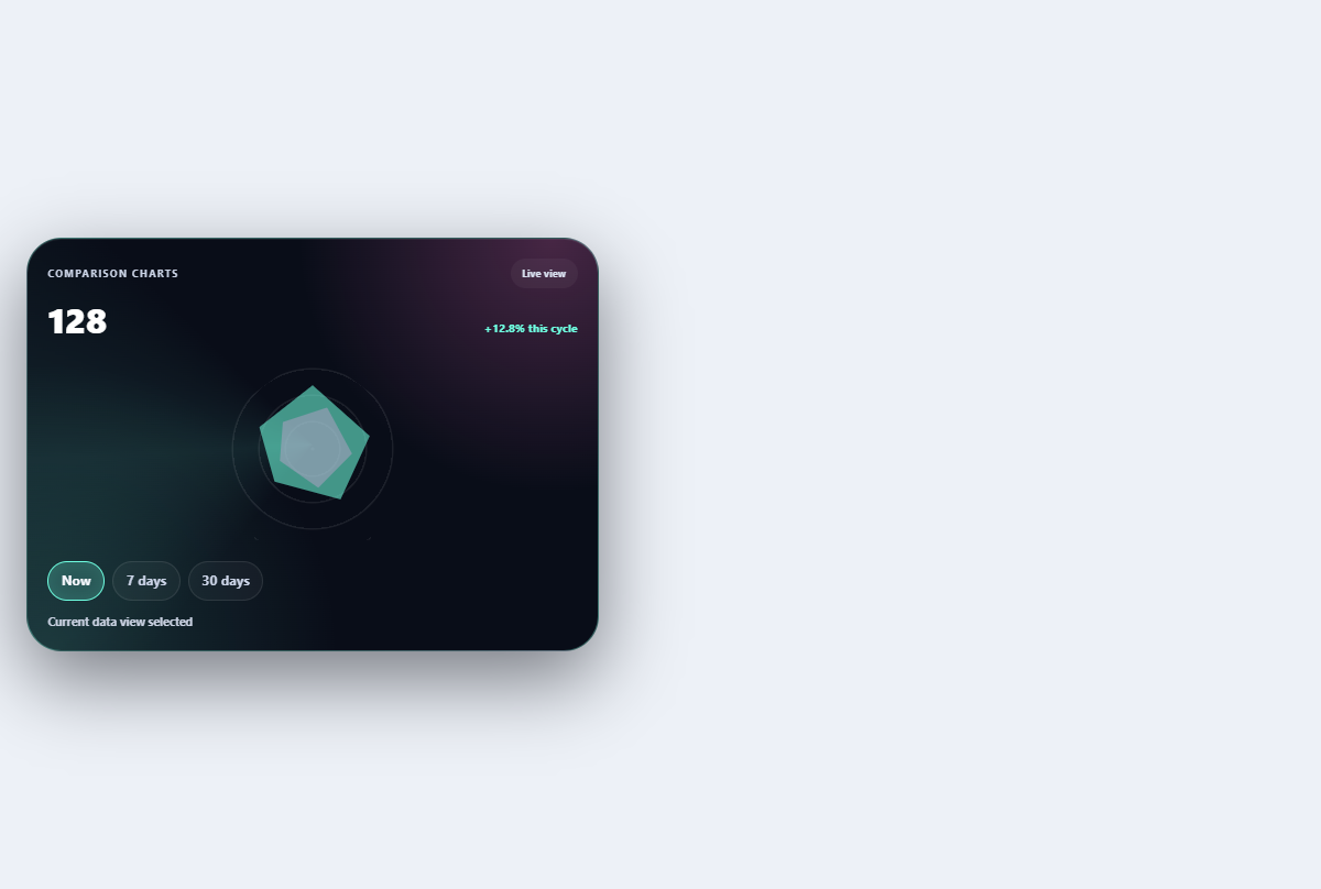
Comparison radar panel
Compares two profiles across five dimensions with readable values and selectable emphasis.
Open component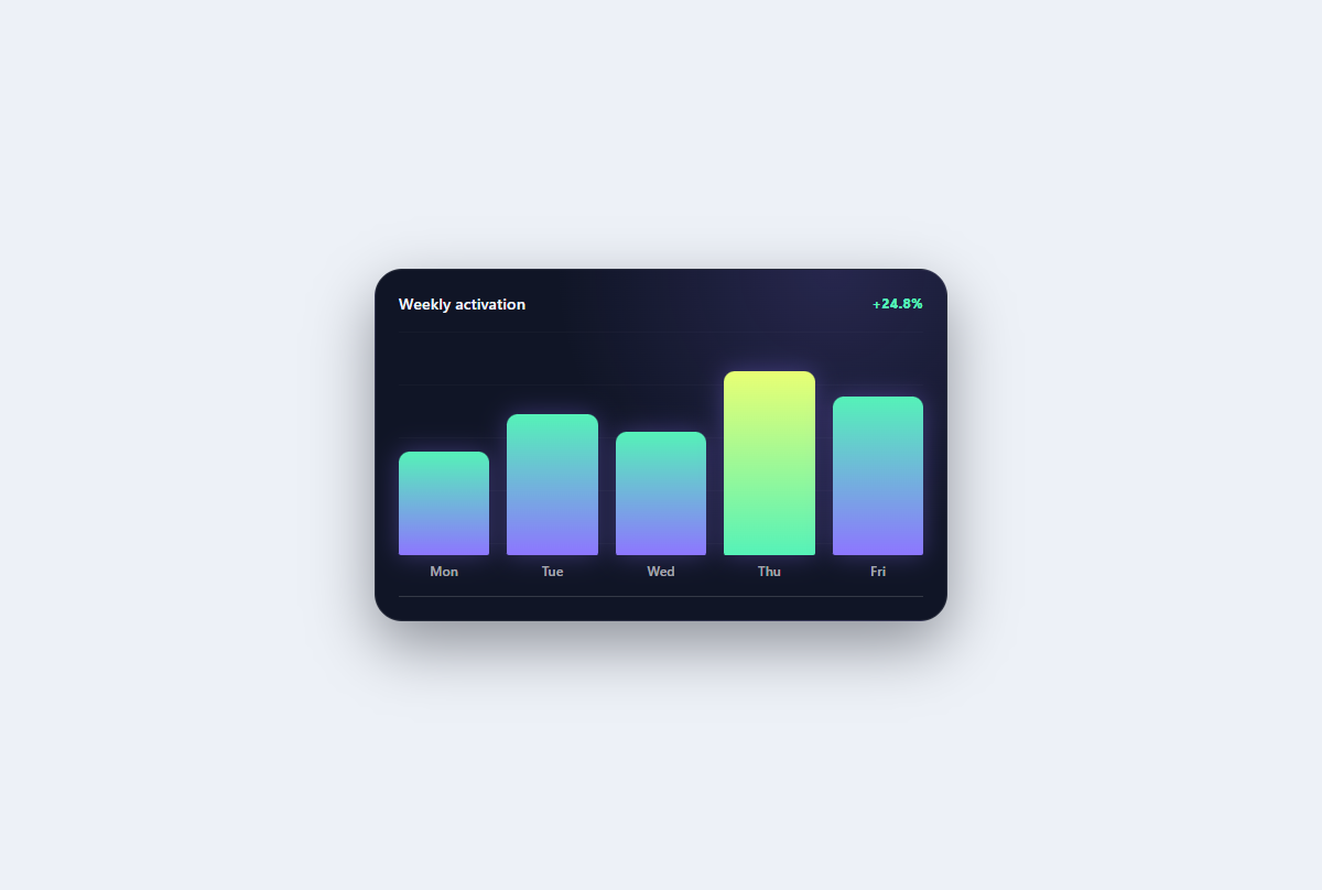
Aurora bar chart
A compact categorical chart with aurora columns, permanently visible values, and a clearly labelled best performer.
Open component