
Button or link? Choose the correct HTML control
Learn when an interface action needs a button, when navigation needs a link, and how the choice affects keyboards, semantics, and UX.
What you will build correctly
- Use links for navigation and buttons for actions that change the current interface.
- Do not recreate native keyboard behavior with a clickable div.
- Keep loading, disabled, and pressed states visible and programmatically exposed.
Decide from the result, not the visual style
A control that opens another URL is a link, even when the design makes it look like a large primary button. A control that submits a form, opens a dialog, changes a tab, copies text, or reveals local content is a button. The element communicates the expected behavior before your JavaScript runs.
This distinction improves keyboard support and browser features automatically. Links can be opened in a new tab, copied, or announced with their destination. Buttons respond to Space and Enter and participate in forms. Styling either element is easier than rebuilding those contracts on a generic container.
                      <a class="button" href="/components">Browse components</a>
<button type="button" aria-pressed="false">Save favorite</button>
Give controls a specific accessible name
Visible labels such as “Download CSS” or “Open filter menu” reduce uncertainty. Icon-only actions need a reliable accessible name, usually through aria-label or visually hidden text. The name should describe the action rather than the icon: “Delete project” is clearer than “Trash.”
When a button controls another region, connect the relationship with aria-controls and expose state with aria-expanded or aria-pressed. Keep the visible label stable unless the changed label communicates a meaningful new action, such as switching from “Mute” to “Unmute.”
Handle disabled and pending states honestly
A native disabled button is removed from the tab order and cannot be submitted, which is appropriate when the action is impossible. If users need to discover why an action is unavailable, keep the control focusable with aria-disabled and block activation in the event handler, then provide nearby explanatory text.
For asynchronous work, retain the button width, show a concise pending label, set aria-busy on the affected region, and prevent duplicate activation. Do not replace the button with a spinner that loses its name and focus position.
- Preserve the control position while work is pending.
- Announce the resulting success or error near the action.
- Restore an actionable label after completion.
Test native behavior before adding effects
Fire, liquid, magnetic, and ripple effects can make a call to action memorable, but decoration must remain behind a crisp label and visible focus indicator. Verify the native control first, then layer pointer effects, transforms, particles, and sound-independent feedback around it.
Test Enter, Space, touch, high contrast, and reduced motion. A visually exciting control should still make sense when animation is disabled and should not move far enough on hover that a user loses the target they intended to press.
Use the pattern
Study it in working components.
These internal examples connect the guide to standalone HTML, CSS, and JavaScript you can preview, customize, and download.
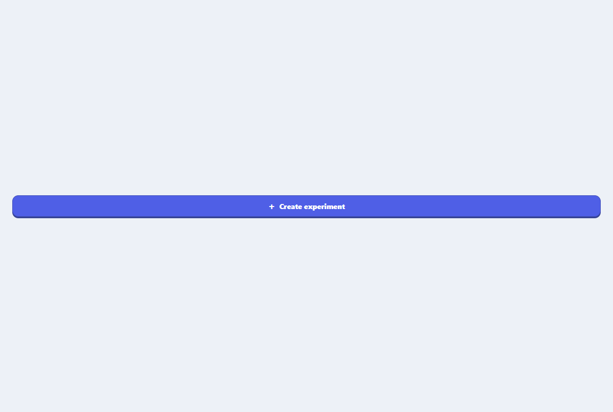
Primary action button
A focused primary button with an icon slot, compact sizing, and clear interaction states.
Open component
Icon action button
A square toolbar button with an accessible name and a lightweight hover tooltip.
Open component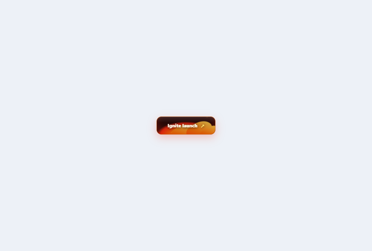
Fire forged button
A cinematic action button with a layered ember bed, licking flames, sparks, and heat-reactive states.
Open component