
How to build an accessible modal dialog
Implement modal semantics, focus movement, Escape handling, background isolation, responsive layout, and reliable focus restoration.
What you will build correctly
- Open a modal only for a focused task that truly interrupts the page flow.
- Move focus into the dialog, contain it while open, and restore it on close.
- Label the dialog and keep every closing path predictable.
Choose dialog only when interruption is justified
A modal blocks the surrounding page, so it should support a short decision or task: confirming a destructive action, editing a compact record, or reviewing critical details. Long reading, multi-step setup, and content users may want to bookmark usually deserve a normal page instead.
The native dialog element provides a strong starting point with showModal, a top-layer backdrop, and browser-managed modal behavior. It does not remove the need for a clear label, sensible initial focus, close controls, or testing across the browsers you support.
                      <dialog aria-labelledby="dialog-title">
  <h2 id="dialog-title">Delete collection?</h2>
  <button value="cancel">Cancel</button>
  <button value="confirm">Delete</button>
</dialog>
Move focus based on the task
When the dialog opens, focus the least destructive useful control or a static heading with tabindex="-1" when users should read context first. Avoid automatically focusing a destructive confirmation button because an accidental Enter press could complete the action.
Store the opener before showing the dialog. On close, return focus to that element if it still exists; otherwise choose a logical nearby destination. The restored location matters as much as the opening movement for keyboard and screen-reader continuity.
Support every expected closing path
Provide a visible close or cancel button and support Escape. Decide deliberately whether clicking the backdrop should close the dialog; accidental dismissal is harmful when the modal contains unsaved work. If dismissal is blocked, explain the required action rather than silently ignoring users.
After confirmation, announce success in the underlying page when the result is not already obvious. If the trigger disappears because its record was deleted, place focus on the updated list heading or another stable region instead of the removed button.
- Visible cancel or close control
- Escape behavior that matches the task
- Focus restoration after every exit path
Make the dialog fit small and large screens
Constrain width on large displays, but allow the panel to use the available mobile viewport with comfortable edge spacing. Long content should scroll inside a clearly bounded region while the title and essential actions remain discoverable. Avoid fixed heights that clip translated or zoomed text.
Test the dialog at 320 pixels, at 200% zoom, with a keyboard, and with reduced motion. Opening animation should reinforce the layer change without delaying interaction, and closing animation must not remove focus before the UI is actually finished.
Use the pattern
Study it in working components.
These internal examples connect the guide to standalone HTML, CSS, and JavaScript you can preview, customize, and download.

Accessible confirmation modal
A compact destructive-action dialog with focus trapping, restoration, and clear consequences.
Open component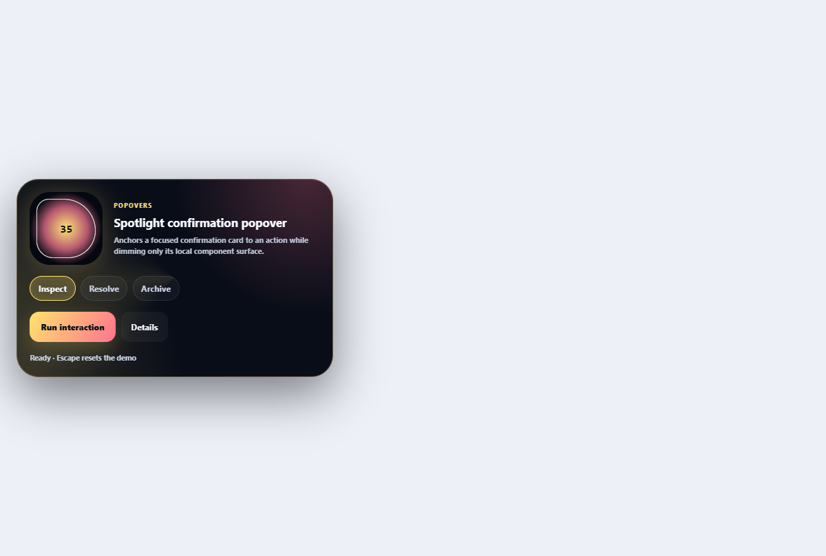
Spotlight confirmation popover
Anchors a focused confirmation card to an action while dimming only its local component surface.
Open component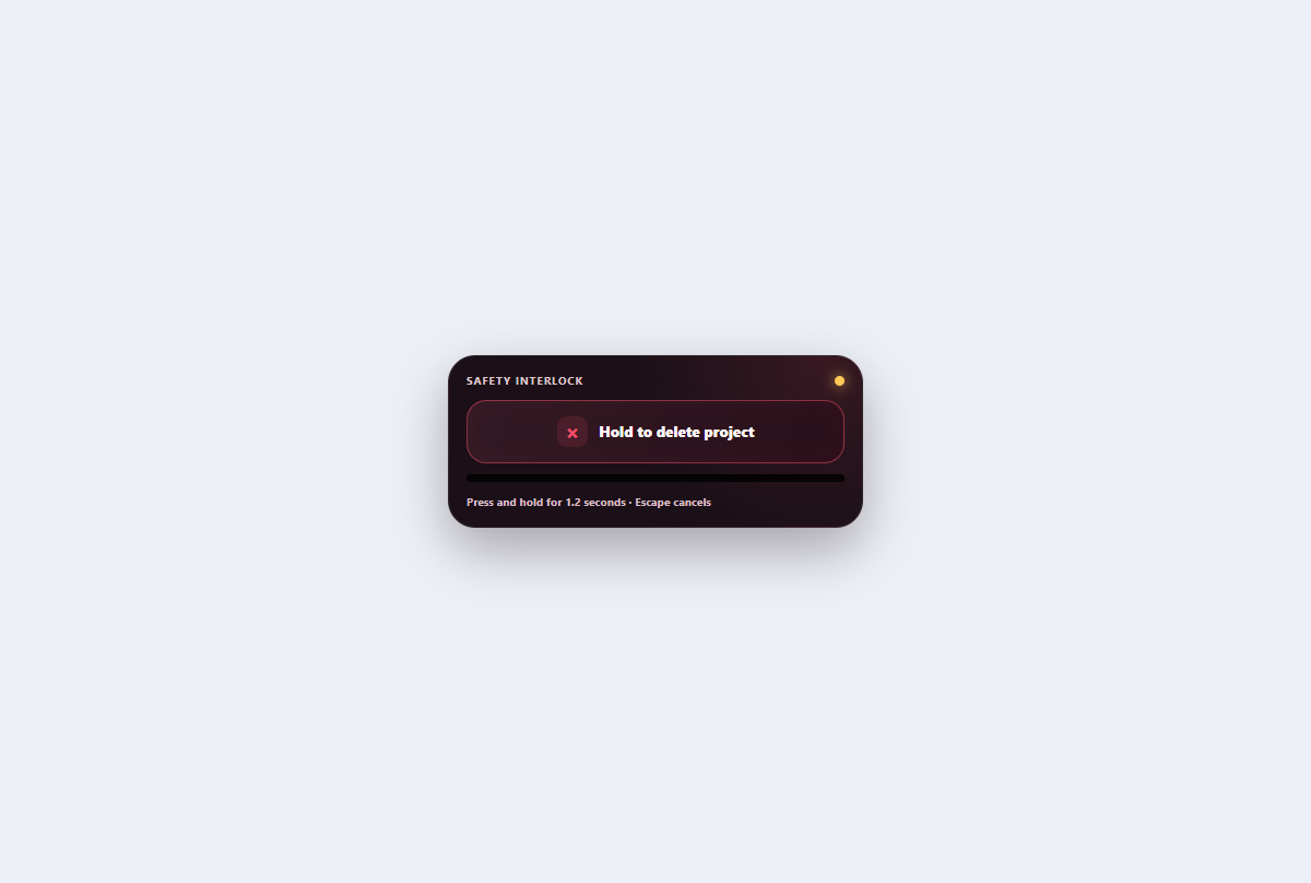
Hold-to-confirm button
A deliberate destructive control with pointer and keyboard holding, visible progress, cancellation, and confirmation.
Open component