
What makes an accessible component library trustworthy
Evaluate semantics, keyboard paths, focus behavior, reduced motion, documentation, downloads, and testing evidence before adopting a UI component.
An accessibility badge is a claim. A trustworthy component library makes the underlying contract inspectable and gives developers enough evidence to repeat the checks after customization.
Inspect semantics before the visual treatment
Open the source and identify the elements that create meaning. Actions should use buttons, navigation should use links, fields should have labels, and page patterns should preserve headings and landmarks. ARIA can communicate state and relationships, but it should not replace native behavior without a documented reason.
Sample copy matters because heading order, error language, and accessible names are part of the component. A library should explain which text developers may replace freely and which relationships must remain. The preview should also expose the standalone source rather than hiding structure behind an opaque runtime.
Follow every keyboard and focus transition
Tab through the component, activate it with expected keys, and inspect where focus moves when content opens or closes. Dialogs, menus, comboboxes, and carousels each have interaction expectations beyond being technically focusable. A trustworthy example documents those expectations and avoids trapping users outside intentional modal experiences.
Repeat the test at mobile zoom and with sticky page chrome because a valid focus target can still be covered. Visible focus must remain distinguishable across themes. Reduced-motion preferences should remove nonessential movement while preserving immediate state feedback and the same usable controls.
- Semantic elements and relationships are visible in the source.
- Every interaction has a documented keyboard path.
- Focus remains visible and returns predictably after overlays close.
- State is not communicated by color, position, or motion alone.
- The exported files preserve the same accessibility behavior as the preview.
Treat automated results as evidence, not a guarantee
Automated accessibility scans are valuable release gates for names, roles, contrast, relationships, and invalid attributes. They cannot decide whether a workflow is understandable or focus returns to the useful place. Libraries should combine automated checks with explicit keyboard scenarios and document the limits of both.
Responsive screenshots and console monitoring add another layer of evidence. Testing at representative widths catches clipped content and overlapping controls, while console checks reveal script failures that can remove accessible state. The important signal is a repeatable process tied to the downloadable source, not a permanent score attached to one preview.
Revalidate after integration and customization
A component can begin with a strong contract and become inaccessible when a team changes labels, colors, focus order, content length, or application state. Adoption guidance should identify public design tokens and behavioral assumptions so developers can customize without reaching into fragile internal selectors.
Run the original interaction checks inside the real application and include surrounding navigation, dialogs, and error handling. The linked components provide different accessibility challenges, including modal focus, combobox state, and mobile navigation, that make useful evaluation fixtures before a library enters production.
Implementation guides
Turn the strategy into reliable frontend code.
These field guides cover the concrete HTML, CSS, JavaScript, accessibility, and integration work behind the decisions in this article.
Working component examples
Inspect the pattern in standalone source.
Open each component to preview its states, customize documented tokens, and download the portable HTML, CSS, and JavaScript package.
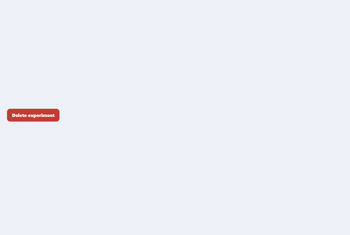
Accessible confirmation modal
A compact destructive-action dialog with focus trapping, restoration, and clear consequences.
Open component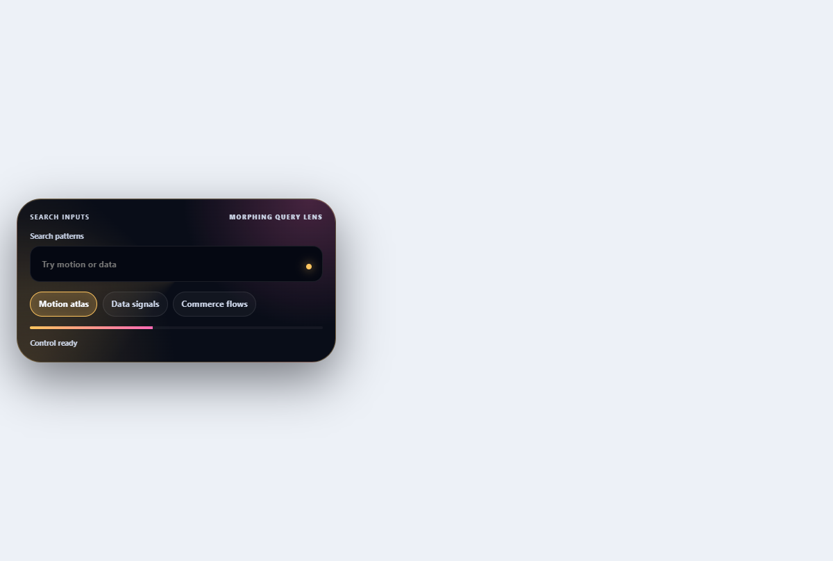
Morphing search combobox
Turns a compact search field into a filtered, keyboard-navigable suggestion lens.
Open component
Mobile navigation drawer
A full-height mobile menu with a dimmed backdrop, focus management, and grouped links.
Open component