
Design accessible focus states that look intentional
Create visible, attractive keyboard focus styles with focus-visible, reliable contrast, offset rings, and component-level testing.
What you will build correctly
- A focused control must remain obvious against every nearby surface.
- Use focus-visible to preserve keyboard cues without forcing pointer-only decoration.
- Test focus order and focus appearance as separate requirements.
Treat focus as a designed interaction state
Focus is the keyboard equivalent of a pointer location, but it also persists while users read labels and decide what to do next. A thin browser outline can disappear against branded surfaces, while removing it entirely makes the interface unusable. Define a shared ring token and make it part of the component system.
A two-layer ring works across mixed backgrounds: a narrow surface-colored gap separates the control from a stronger outer color. Use outline and box-shadow carefully so the indicator is not clipped by overflow-hidden ancestors.
                      .control:focus-visible {
  outline: 3px solid var(--focus-ring);
  outline-offset: 3px;
}
Use focus-visible without hiding essential cues
The focus-visible pseudo-class lets browsers decide when a strong indicator is necessary, typically for keyboard navigation. It is a good default for buttons and links, but text fields normally continue to match because focus context is important while typing.
Do not pair :focus { outline: none } with a selector that fails in older or unusual environments. Define the visible :focus style first and refine it with :focus:not(:focus-visible) only when pointer focus decoration truly interferes with the design.
Keep focus order aligned with the interface
A beautiful ring cannot repair a confusing sequence. Source order should follow the visual reading order, and positive tabindex values should not be used to force a custom sequence. When a dialog or menu closes, return focus to the trigger so users do not restart at the top of the page.
Composite widgets such as tabs and menus may use roving tabindex, where only one child is in the page Tab sequence and arrow keys move within the widget. Implement that pattern only when the widget semantics call for it; a simple group of links should remain a simple group of links.
Test the ring on every state and theme
Inspect default, hover, active, selected, disabled, light-theme, and dark-theme surfaces. Focus must not be communicated only through a subtle color change, and an animated halo must stop or simplify when reduced motion is requested.
Start at the address bar, press Tab through the whole experience, and watch for missing, clipped, duplicated, or off-screen indicators. Repeat at 200% zoom and in forced-colors mode because those environments expose assumptions that a normal desktop screenshot will not.
- The current target is always visible.
- The ring is not clipped by rounded containers.
- Focus returns after temporary UI closes.
Use the pattern
Study it in working components.
These internal examples connect the guide to standalone HTML, CSS, and JavaScript you can preview, customize, and download.
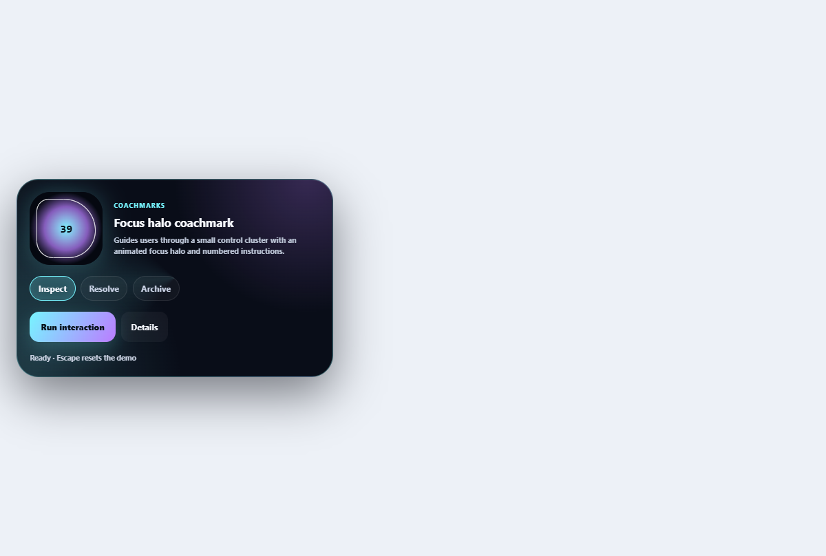
Focus halo coachmark
Guides users through a small control cluster with an animated focus halo and numbered instructions.
Open component
Accessible confirmation modal
A compact destructive-action dialog with focus trapping, restoration, and clear consequences.
Open component
Primary action button
A focused primary button with an icon slot, compact sizing, and clear interaction states.
Open component