
Semantic HTML page structure: a practical frontend blueprint
Build a clear HTML document outline with landmarks, headings, navigation, and content regions that work for people and search engines.
What you will build correctly
- Give every page one clear main region and one descriptive primary heading.
- Choose elements for meaning before adding classes for appearance.
- Use landmarks and headings together so navigation remains useful at every zoom level.
Start with the document landmarks
A dependable page begins with a small set of recognizable regions: a header for site identity, navigation for major destinations, main for the page-specific content, and a footer for supporting information. These landmarks create shortcuts for assistive technology and make the source easier for every developer to audit.
Do not add a landmark for every visual box. A card grid belongs inside main; it does not need five nested regions. Add an accessible label when a page contains multiple navigation or complementary regions so users can distinguish primary navigation from breadcrumbs, filters, or related material.
                      <header>…</header>
<nav aria-label="Primary">…</nav>
<main id="main-content">…</main>
<footer>…</footer>
Build a heading outline around user questions
The first heading should name the page, not the website. Subsequent headings should divide the answer into sections a reader could understand in a table of contents. A useful test is to hide every paragraph and read only the headings: the remaining outline should still explain what the page covers.
Heading levels communicate nesting, not typography. Style a second-level heading to look compact when the design needs it, but do not jump to an h4 simply because its browser default is smaller. Repeated card titles can use h3 elements when the card group is introduced by an h2.
- Use one prominent h1 for the page topic.
- Introduce every major section with an h2.
- Use h3 only for subsections that belong to the preceding h2.
Validate the rendered reading order
CSS grid can place a sidebar visually before the article even when it appears later in the DOM. That may look polished while producing a confusing keyboard and screen-reader sequence. Keep source order aligned with the reading order, then use layout styles that preserve that relationship across breakpoints.
Test the page without styles, navigate landmarks with a screen reader, and press Tab from the browser chrome into the document. Those checks reveal missing skip links, duplicated navigation, and visually reordered controls faster than inspecting the DOM in isolation.
Use the pattern
Study it in working components.
These internal examples connect the guide to standalone HTML, CSS, and JavaScript you can preview, customize, and download.
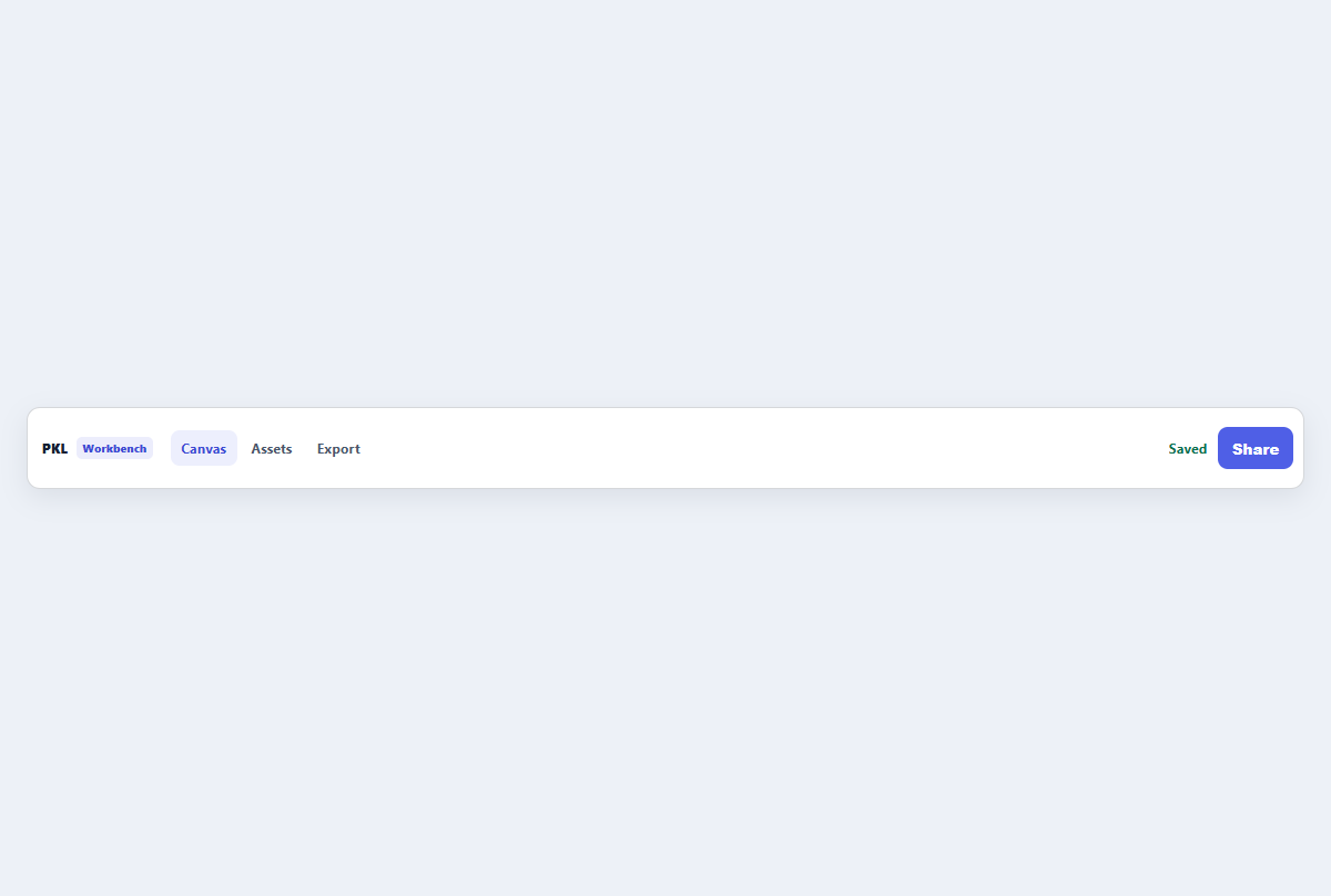
Compact top app bar
A narrow application header with brand, navigation links, status, and one action.
Open component
Breadcrumb trail
A small responsive breadcrumb that clarifies hierarchy without dominating the page.
Open component
Compact sidebar menu
A slim dashboard navigation rail with section labels, active state, and item counts.
Open component