
Accessible form errors: validation messages that help users recover
Connect errors to fields, write actionable messages, manage focus after submission, and preserve user input through correction.
What you will build correctly
- Explain what went wrong and how to correct it beside the affected field.
- Use an error summary for failed submissions without duplicating every announcement.
- Never erase valid user input when validation fails.
Validate at a moment users can understand
Immediate validation can interrupt users before they finish typing. Validate required and format rules on blur when the field contains a meaningful attempt, then validate the full form on submission. Clear an error as soon as the corrected value satisfies the rule so stale feedback does not remain.
Native constraints such as required, type="email", minlength, and autocomplete provide useful semantics and mobile keyboard hints. Custom messages can improve clarity, but they should build on those foundations instead of replacing the form with a collection of generic text boxes.
Connect each message to its field
Set aria-invalid="true" only while the value is invalid and reference persistent help plus the current error through aria-describedby. Keep the message close to the field visually. Color can reinforce the state, but an icon, border treatment, and explicit text should carry the meaning together.
Write “Enter an email address in the format name@example.com” instead of “Invalid input.” The message should name the expected correction without blaming the user or exposing an internal validation rule they cannot act on.
                      <input id="email" type="email" aria-invalid="true" aria-describedby="email-help email-error">
<p id="email-error">Enter an email address in the format name@example.com.</p>
Use a submission summary for complex forms
When submission fails, place a concise summary before the form, focus its heading, and include links that move focus to each invalid field. This gives users a quick map without forcing them to hunt through a long checkout or account form.
Do not fire an assertive live-region announcement for every invalid field at once. A focused summary plus programmatically connected inline errors is usually calmer and more understandable. Reserve assertive announcements for urgent failures that would otherwise be missed.
- State the number of problems.
- Link each summary item to its field.
- Keep the original values and scroll position stable.
Test correction, not only rejection
A validation test is incomplete if it stops after confirming an error appears. Correct the value, verify aria-invalid is removed, ensure the message disappears, and submit again. Repeat with keyboard navigation, browser autofill, pasted text, and server-returned errors.
Server validation remains authoritative even when client feedback is excellent. Return errors in the same field-level structure, avoid revealing whether sensitive accounts exist, and restore the user to the form with their non-sensitive entries intact.
Use the pattern
Study it in working components.
These internal examples connect the guide to standalone HTML, CSS, and JavaScript you can preview, customize, and download.
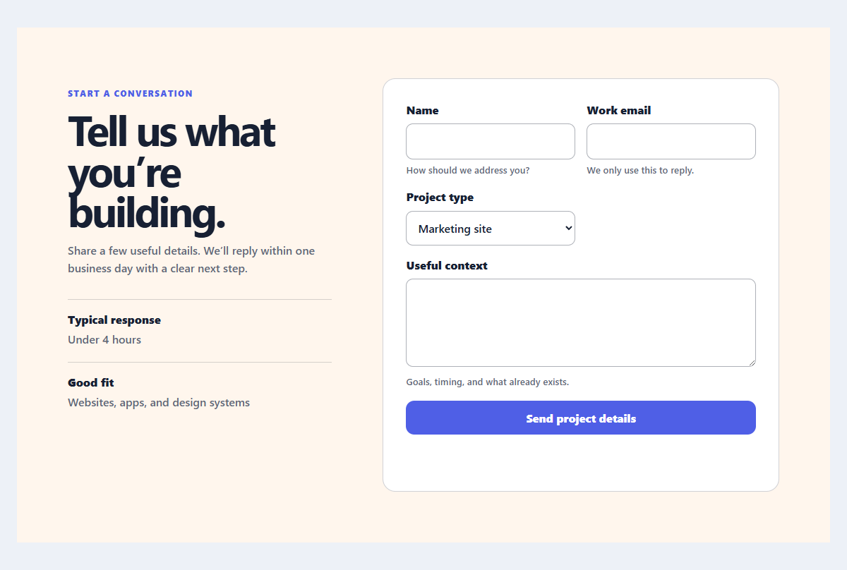
Accessible contact form
A practical contact form with explicit labels, helpful hints, and client-side validation feedback.
Open component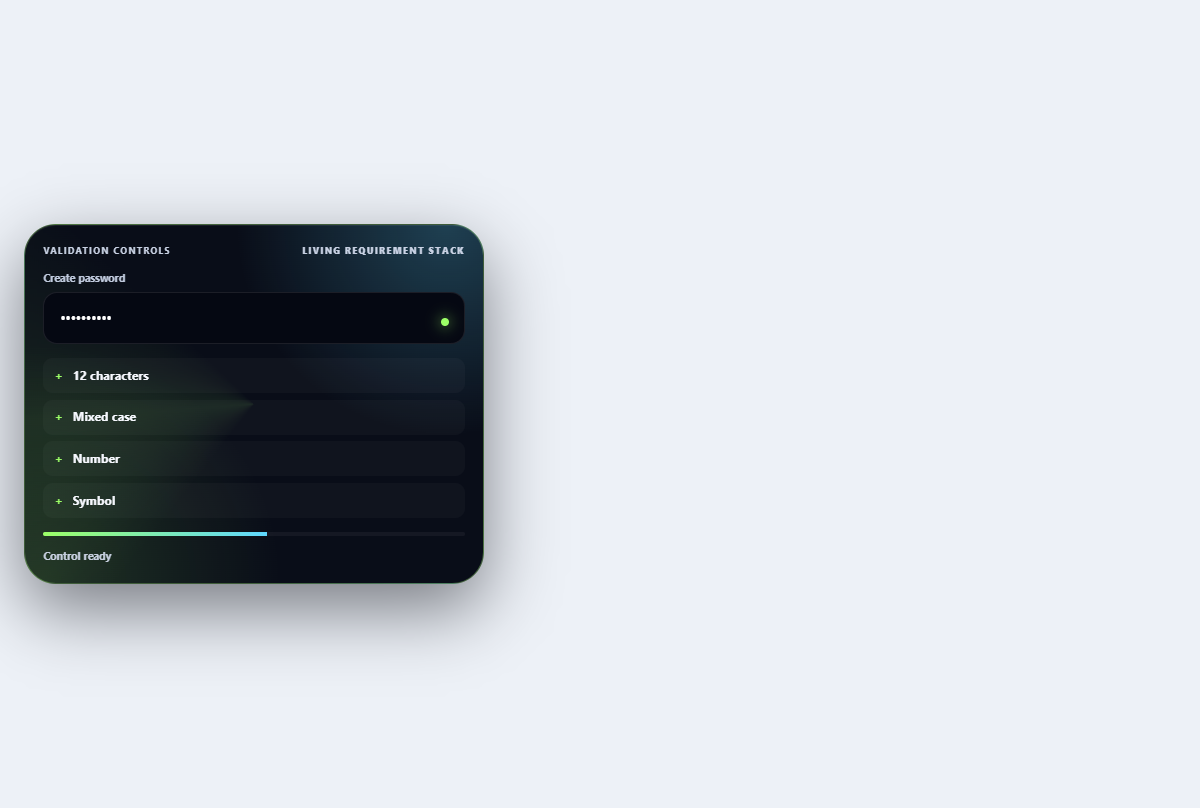
Inline validation stack
Turns password requirements into an ordered live checklist with strength and reveal controls.
Open component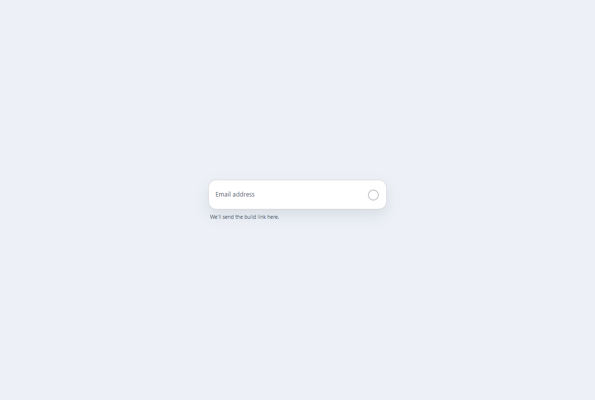
Floating label email field
A CSS-first email field with a persistent floating label, native validation, and visible status icon.
Open component