
Build an accessible mobile navigation menu
Create a responsive mobile menu with native controls, meaningful labels, Escape support, focus management, and stable page layout.
What you will build correctly
- Use a real button connected to a labelled navigation region.
- Keep disclosure menus simple; add modal behavior only for a truly modal drawer.
- Close predictably on Escape and route changes while restoring focus when needed.
Choose disclosure or modal drawer behavior
A compact panel that expands below the header can remain a normal disclosure: focus stays on the trigger and users Tab into the links. A full-screen drawer that visually blocks the page acts more like a modal and needs background isolation, contained focus, and deliberate restoration.
Do not mix the two models. A panel that looks modal but lets keyboard focus disappear behind it is confusing, while a small dropdown with an aggressive focus trap becomes cumbersome. Let the visual level of interruption determine the interaction contract.
Close without surprising the user
Support Escape and a visible close button. Close after a navigation link is activated, and close when a breakpoint change restores the desktop navigation so hidden state cannot linger. If users dismiss the drawer, return focus to its trigger; a completed navigation will naturally move focus with the new page.
Lock page scrolling only for a modal drawer, and preserve the current scroll position. Avoid translating the entire document off canvas because hidden transformed content can create horizontal overflow and unexpected touch behavior.
- Escape closes the open panel.
- Breakpoint changes reset stale mobile state.
- The page never gains horizontal overflow.
Respect touch size, zoom, and motion preferences
Give the trigger and every navigation link a comfortable touch target, allow labels to wrap, and test at 200% zoom. A drawer should remain operable in landscape orientation and when browser chrome reduces the available viewport height.
Use a short transform or opacity transition only when it clarifies where the panel came from. Under reduced motion, remove the traveling animation and reveal the panel immediately. The navigation hierarchy and focus indicator must remain equally clear without movement.
Use the pattern
Study it in working components.
These internal examples connect the guide to standalone HTML, CSS, and JavaScript you can preview, customize, and download.

Mobile navigation drawer
A full-height mobile menu with a dimmed backdrop, focus management, and grouped links.
Open component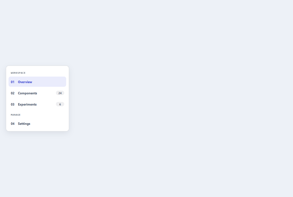
Compact sidebar menu
A slim dashboard navigation rail with section labels, active state, and item counts.
Open component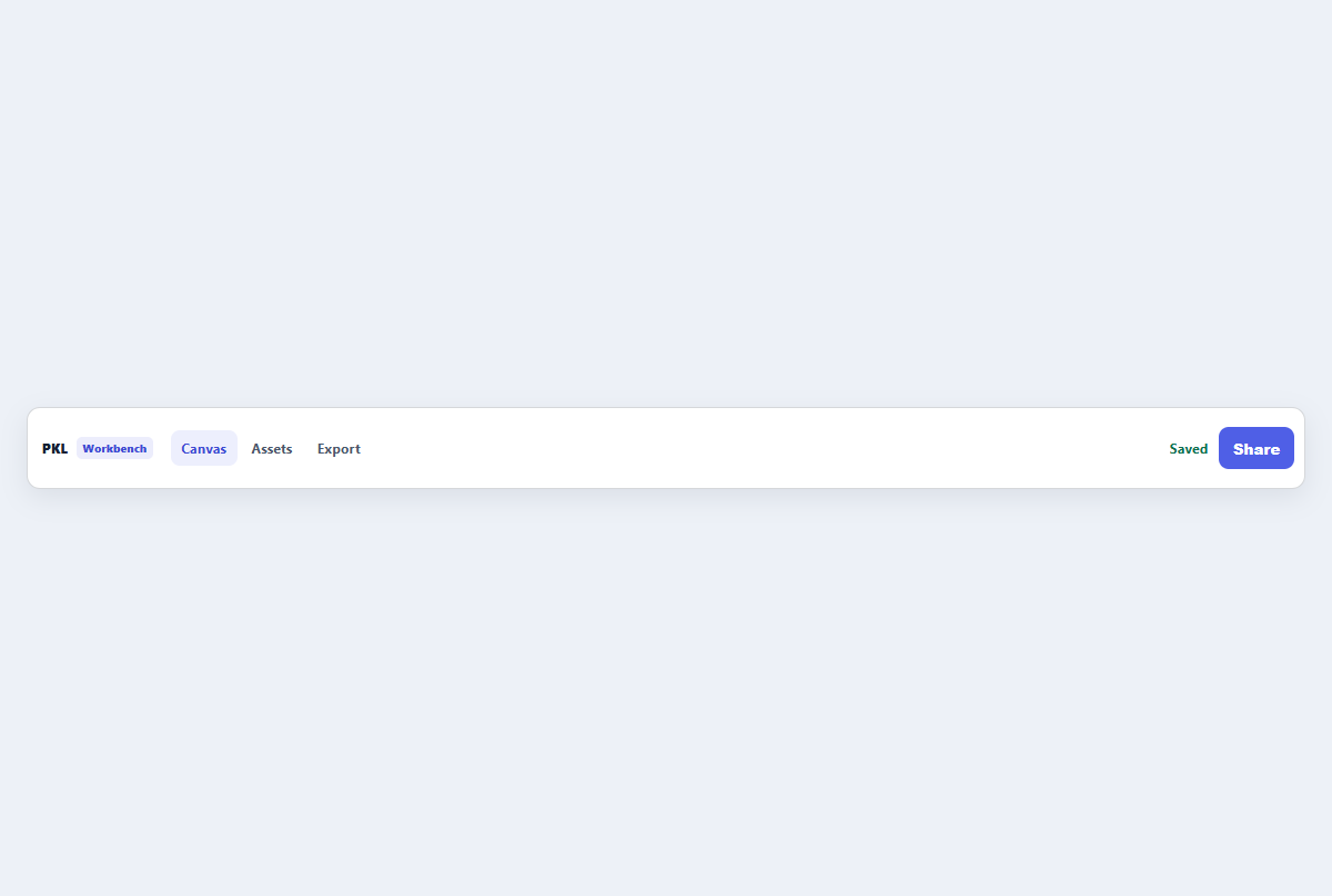
Compact top app bar
A narrow application header with brand, navigation links, status, and one action.
Open component