
Dashboard UI components: a practical architecture checklist
Compose application headers, metrics, tables, navigation, empty states, and alerts into a dashboard that remains understandable across loading and error states.
A dashboard becomes dependable when its components share information hierarchy and state conventions, not merely colors. The architecture should explain what is happening before it asks visitors to inspect individual widgets.
Give metrics context before visual emphasis
A metric card needs a label, value, time range, and comparison basis when change is shown. Color and arrows may reinforce the direction, but text must explain what increased and whether that change is positive. Reserve compact charts for trends that add information rather than using them as decorative texture.
Group metrics that answer the same operational question and limit the first row to the values people need frequently. Detailed charts and tables can follow. A loading skeleton should reserve the final geometry, while an unavailable metric should explain the state instead of collapsing and moving every neighboring card.
- Application shell with labeled navigation and a skip path.
- Page header with current context and one primary action.
- Metrics with time range, comparison basis, and stable loading dimensions.
- Tables with responsive alternatives and explicit sorting state.
- Shared empty, error, warning, and success language across widgets.
Design tables and states as first-class components
Tables should expose headers, sorting state, row actions, and pagination without depending on pointer hover. On narrow screens, preserve the relationships users need instead of turning every row into an unlabeled card. If a task requires only a few attributes, a purpose-built list may be clearer than a complex responsive table.
Empty states, errors, and alerts need the same attention as successful data. Explain what happened, whether data is safe, and what action is available. Use consistent status components so a warning means the same thing in the header, table, and detail panel. That consistency reduces interpretation work during stressful operational tasks.
Test the dashboard as a sequence of state changes
Load the route from a cold start, change filters, open navigation, sort a table, trigger an error, and return to an empty result. Watch focus, announcements, layout shift, and URL state through the sequence. Isolated component tests cannot reveal collisions between sticky headers, dialogs, mobile navigation, and scroll containers.
Measure the full route and keep asynchronous updates inside stable regions. Test at browser zoom, with reduced motion, and with keyboard-only input. The linked components provide a page header, metric group, and application bar that can begin the system without forcing every dashboard concern into one untestable component.
Implementation guides
Turn the strategy into reliable frontend code.
These field guides cover the concrete HTML, CSS, JavaScript, accessibility, and integration work behind the decisions in this article.
Working component examples
Inspect the pattern in standalone source.
Open each component to preview its states, customize documented tokens, and download the portable HTML, CSS, and JavaScript package.
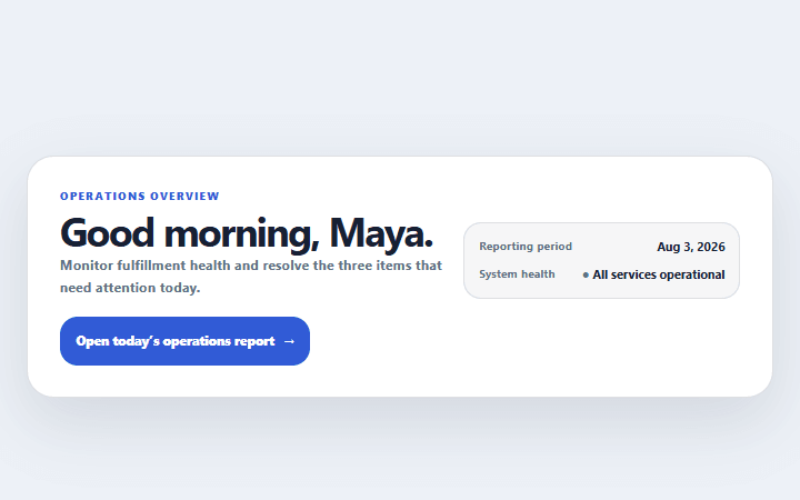
Dashboard welcome header
A compact application header that combines page purpose, reporting period, status, and primary action.
Open component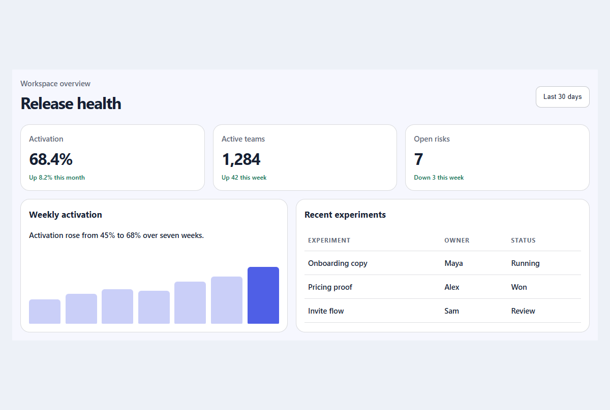
Compact metric dashboard
A responsive dashboard summary with meaningful trends, progress, and a readable activity table.
Open component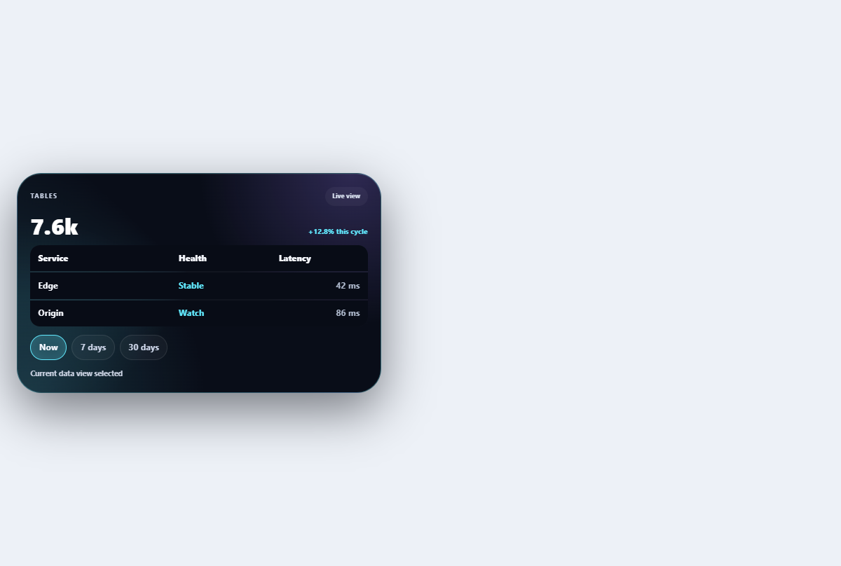
Morphing data table
Adapts a compact table between density modes and mobile card rows without losing headers.
Open component