
Responsive data tables that preserve meaning on mobile
Keep headers, sorting, focus, comparison, and data relationships intact when complex tables move into narrow layouts.
What you will build correctly
- Keep genuine tabular data in table semantics.
- Choose scrolling, prioritization, or alternate views from the comparison task.
- Expose sorting state and preserve header relationships at every width.
Confirm the content is genuinely tabular
A data table supports comparison across rows and columns. Use table, caption, thead, tbody, th, and scope so those relationships remain available to assistive technology. A grid of unrelated cards should not become a table merely to align its edges.
Write a caption that identifies the dataset and move filters or summaries outside the table structure. Keep essential context such as units in headers instead of repeating it inconsistently in cells.
Select a narrow-screen strategy from user intent
Horizontal scrolling preserves columns and is often best when users compare values across the same row. Freeze the first column only if it materially helps orientation and does not consume most of the viewport. Add a visible cue that more columns are available.
Priority columns can hide secondary data behind a row detail control. Card transformation works when users inspect one record at a time, but it weakens column comparison and requires repeated labels. Offer a separate compact view rather than breaking table semantics with CSS display hacks.
- Scrolling preserves direct comparison.
- Row details preserve secondary attributes.
- A card view supports record-by-record scanning.
Make sorting a button with announced state
Place a button inside a sortable header and set aria-sort on the active th. The visible icon, button label, and announced state should agree. Only one column normally carries ascending or descending at a time.
Preserve keyboard focus on the sorting button after rows reorder and announce the result count or current order only when it is not visually obvious. Stable row keys prevent focus and selection from jumping to a different record.
<th scope="col" aria-sort="ascending"><button type="button">Name <span aria-hidden="true">↑</span></button></th>
Handle loading, empty, and error states inside context
A loading skeleton should preserve header and row geometry. An empty state belongs in a spanning cell or directly adjacent region with guidance about filters or creation. A data error should not remove the controls users need to retry or change the query.
Test large row counts, long values, sticky headers, zoom, keyboard navigation, and screen-reader table commands. A responsive table succeeds only if users can still answer the same comparison questions on the smaller layout.
Use the pattern
Study it in working components.
These internal examples connect the guide to standalone HTML, CSS, and JavaScript you can preview, customize, and download.
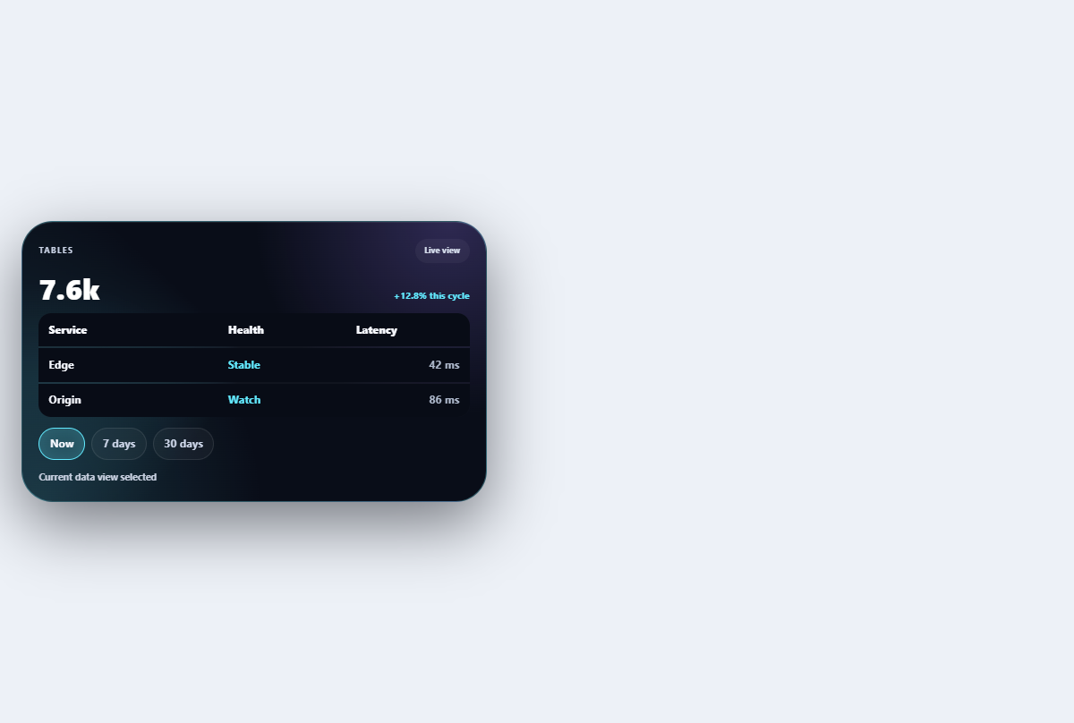
Morphing data table
Adapts a compact table between density modes and mobile card rows without losing headers.
Open component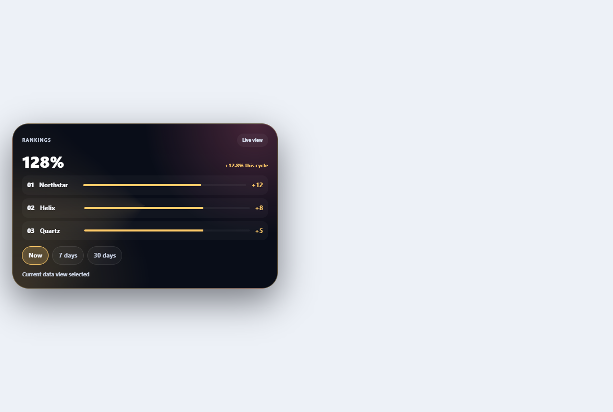
Kinetic ranking list
Ranks entities with movement-aware position changes, deltas, and accessible ordering.
Open component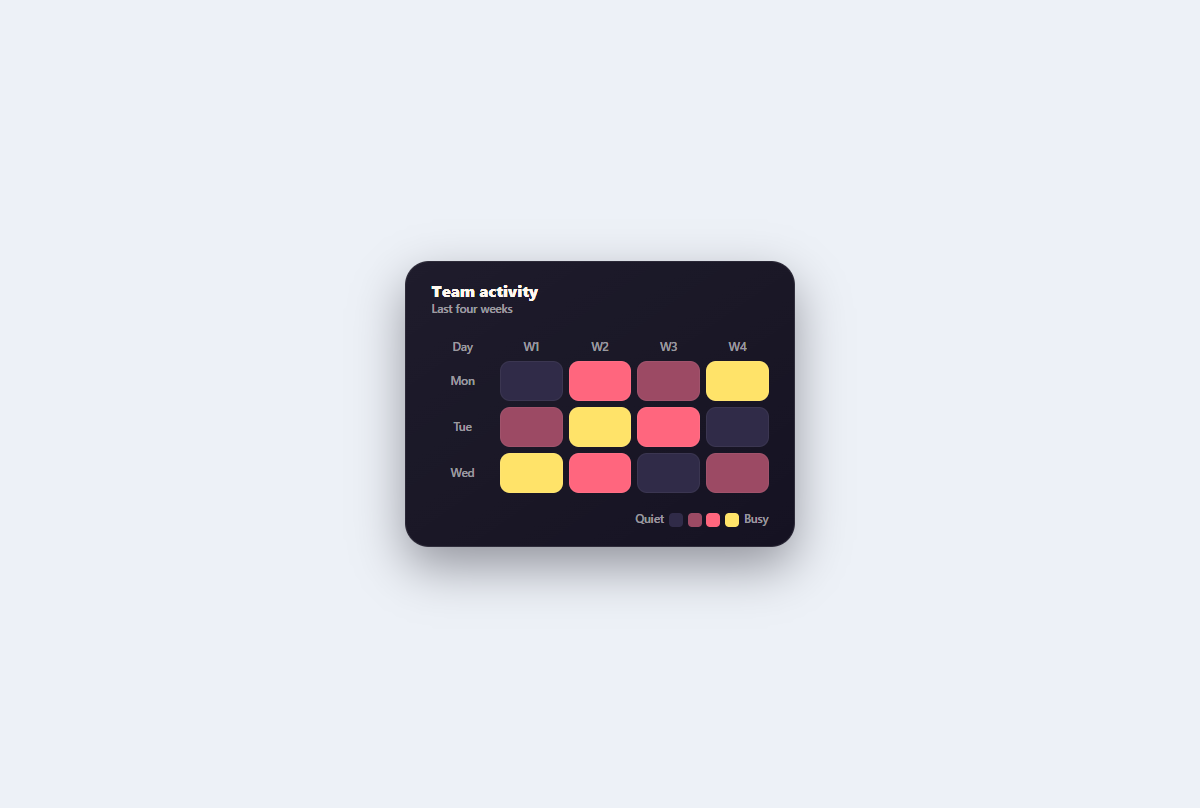
Accessible heatmap grid
A semantic weekly activity heatmap whose focusable cells provide exact text labels alongside thermal color levels.
Open component