
Build a fire effect button with layered CSS
Create a convincing ember-and-flame button with pseudo-elements, clipped layers, crisp labels, accessible states, and reduced motion.
What you will build correctly
- Build the accessible native button before adding decorative fire layers.
- Separate embers, flame bodies, glow, and sparks so each layer has one job.
- Intensify effects on interaction while keeping a complete reduced-motion state.
Start with a readable native action
Use a button element with a direct label, comfortable target size, and visible focus ring. The label must remain above every flame and glow layer with enough contrast in default, hover, focus, and pressed states. The effect should decorate the action rather than become the action’s only explanation.
Keep the root position relative and isolate its stacking context. Clip flames inside a rounded chamber, but draw the focus ring outside that clipped surface so keyboard users never lose the active target.
<button class="cmp-fire-button"><span>Ignite launch</span><i aria-hidden="true"></i></button>
Compose heat from several restrained layers
A convincing effect uses different visual frequencies: a slow warm glow, two or three flame shapes with offset timing, a textured ember bed, and occasional small sparks. If every layer moves at the same speed and height, the button looks like a repeating gradient rather than fire.
Use pseudo-elements and a small number of decorative spans instead of generating dozens of nodes. Border radius, blur, transform origin, and color-mix can create depth while keeping the downloadable markup understandable.
Map interaction to heat and pressure
Hover and focus can increase glow intensity and lift the flame core slightly. Active can compress the button by one or two pixels and deepen the ember color. Keep motion local so the target never escapes the pointer and surrounding layout does not move.
Avoid running the most intense particles continuously. A quiet idle state makes the interaction response feel stronger and reduces paint work. If JavaScript adds sparks, scope the loop to the button, cap the particle count, and stop it when the element leaves the viewport.
- Label remains sharp above all effects.
- Focus is as expressive and visible as hover.
- Pressed feedback is immediate and does not shift layout.
Art-direct the reduced-motion version
When reduced motion is requested, stop rising sparks and continuous flame movement. Keep the ember gradient, inner glow, strong focus ring, and pressed depth so the control retains its identity and feedback.
Test forced colors and high contrast as well. Decorative layers can disappear, but the native button boundary, label, and focus indicator must remain obvious. A special effect succeeds when the plain control underneath is still excellent.
                      @media (prefers-reduced-motion: reduce) {
  .cmp-fire-button i { animation: none; opacity: .65; }
}
Use the pattern
Study it in working components.
These internal examples connect the guide to standalone HTML, CSS, and JavaScript you can preview, customize, and download.
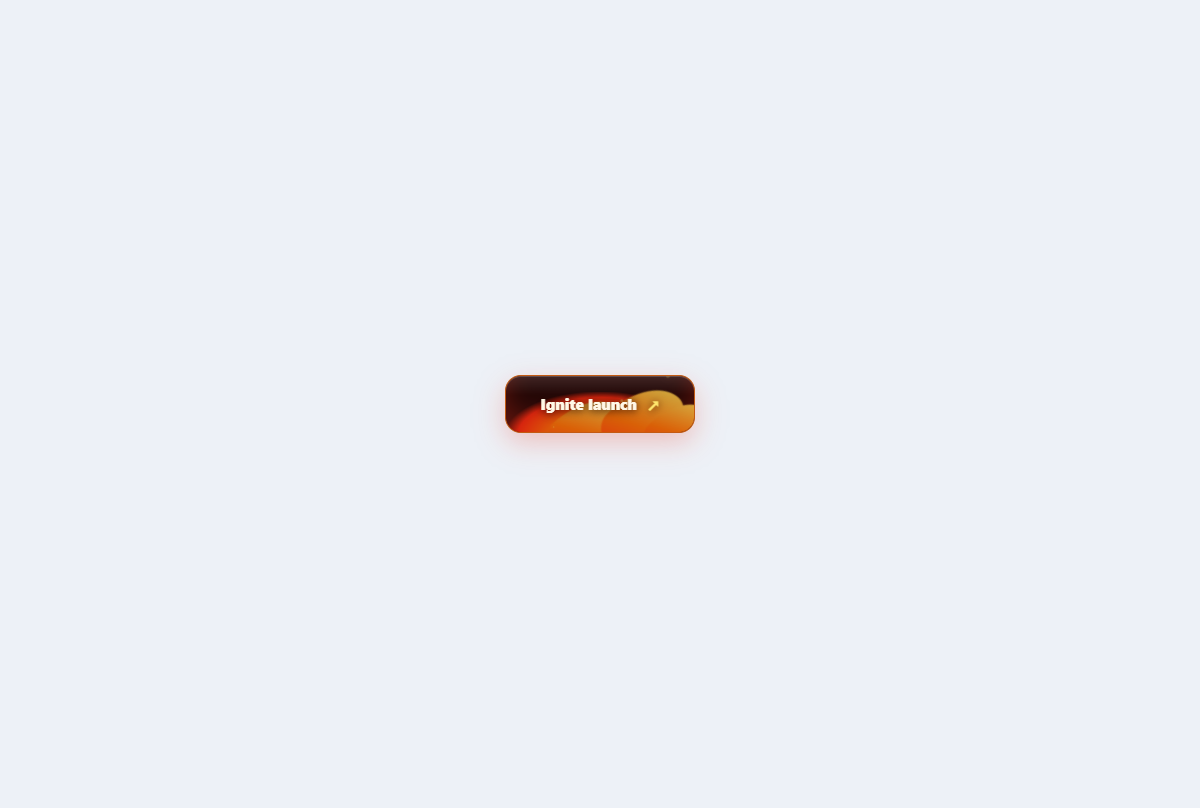
Fire forged button
A cinematic action button with a layered ember bed, licking flames, sparks, and heat-reactive states.
Open component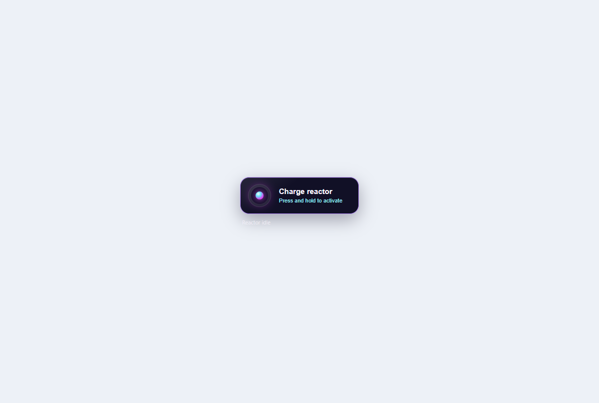
Plasma charge button
A hold-to-confirm control with a live conic charge ring, cancellable progress, and reactor-complete state.
Open component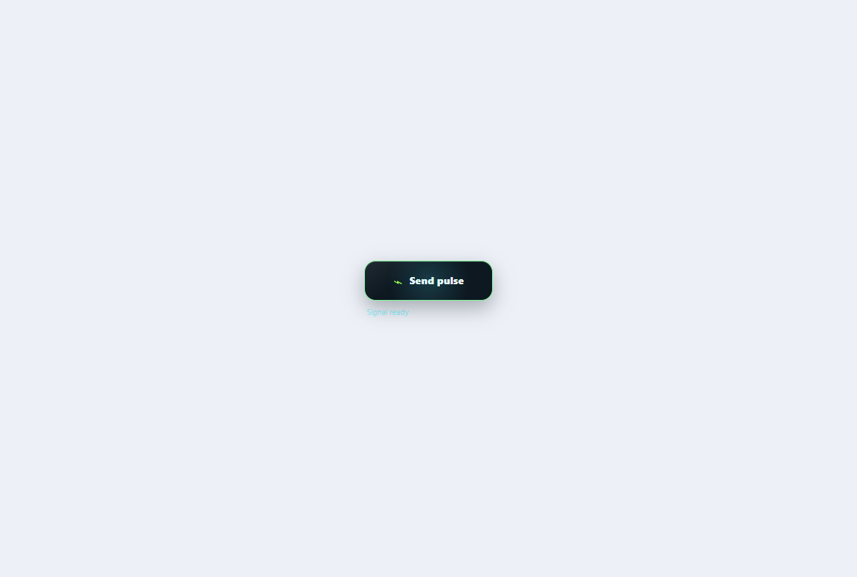
Shockwave action button
An activation control that emits a fresh bounded wave from every click and confirms the signal in text.
Open component