
Create a water drop button with CSS and pointer feedback
Layer highlights, refraction, ripples, and surface tension into a liquid button that remains responsive, readable, and keyboard accessible.
What you will build correctly
- Use shape, highlight, refraction, and shadow together to suggest liquid volume.
- Keep pointer ripples bounded and provide equivalent keyboard feedback.
- Preserve a solid label and focus boundary over transparent effects.
Construct the droplet silhouette first
A water-like control needs a clear edge before it needs animation. Use an asymmetric rounded shape or familiar pill, a translucent fill, an inner highlight near the light source, and a darker lower edge. The highlight and shadow should agree about direction or the surface will look metallic instead of liquid.
Place the visible label in its own stacking layer and keep contrast independent from whatever sits behind the translucent button. A tinted internal surface is more reliable than blending directly with arbitrary page content.
Suggest refraction without distorting the label
Gradients and pseudo-elements can bend color around the edge while a small blurred highlight creates a wet specular point. Backdrop-filter can enrich the effect, but it should be optional because support, contrast, and performance vary.
Never apply blur or displacement to the text. The label is interface content, not part of the simulated material. Keep effect layers aria-hidden and pointer-events none so they cannot block activation.
                      .water-button::before {
  content: "";
  position: absolute;
  inset: 8% 14% auto;
  block-size: 34%;
  border-radius: 999px;
  background: linear-gradient(#fff9, transparent);
}
Create a ripple from the interaction point
JavaScript can set custom properties for the pointer coordinates, then restart one pseudo-element animation from that location. Cap the ripple at the button boundary and remove transient state after the animation so repeated activation stays predictable.
Keyboard activation has no pointer coordinate, so center the ripple or use a full-surface pressure pulse for Enter and Space. Both input modes should receive equally clear feedback even if their visual origin differs.
- Effect layers ignore pointer events.
- Ripple origin has a keyboard fallback.
- Repeated clicks do not accumulate DOM nodes.
Use the pattern
Study it in working components.
These internal examples connect the guide to standalone HTML, CSS, and JavaScript you can preview, customize, and download.
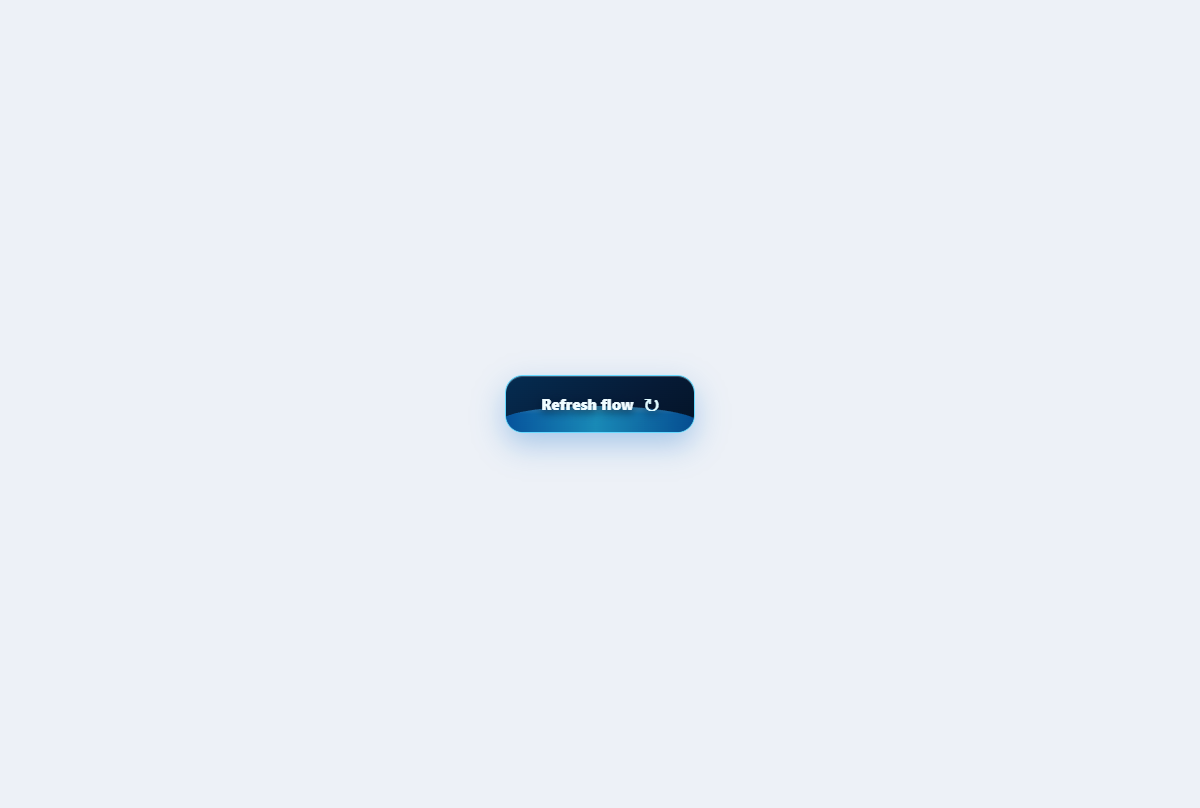
Water drop button
A glassy aqua button with a suspended droplet, moving waterline, splash crown, and surface ripples.
Open component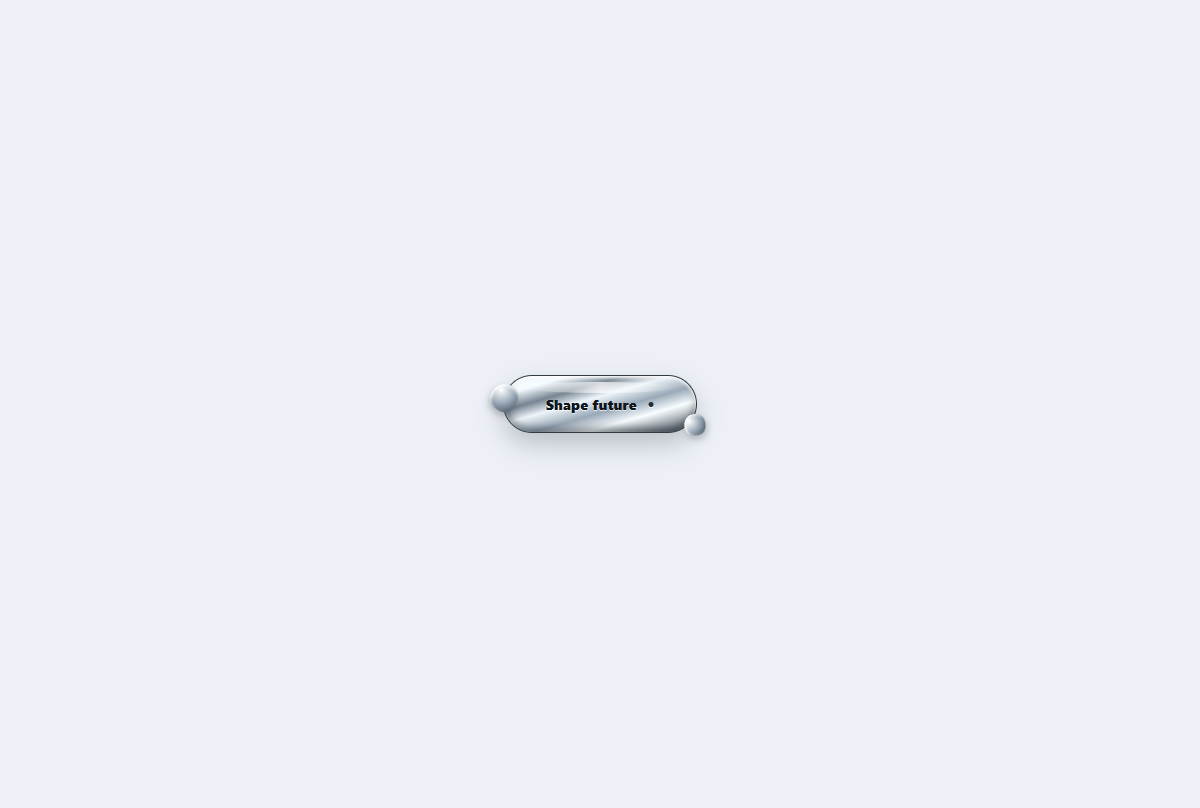
Liquid metal button
A reflective mercury action whose edge blobs stretch and fuse into a polished chrome capsule.
Open component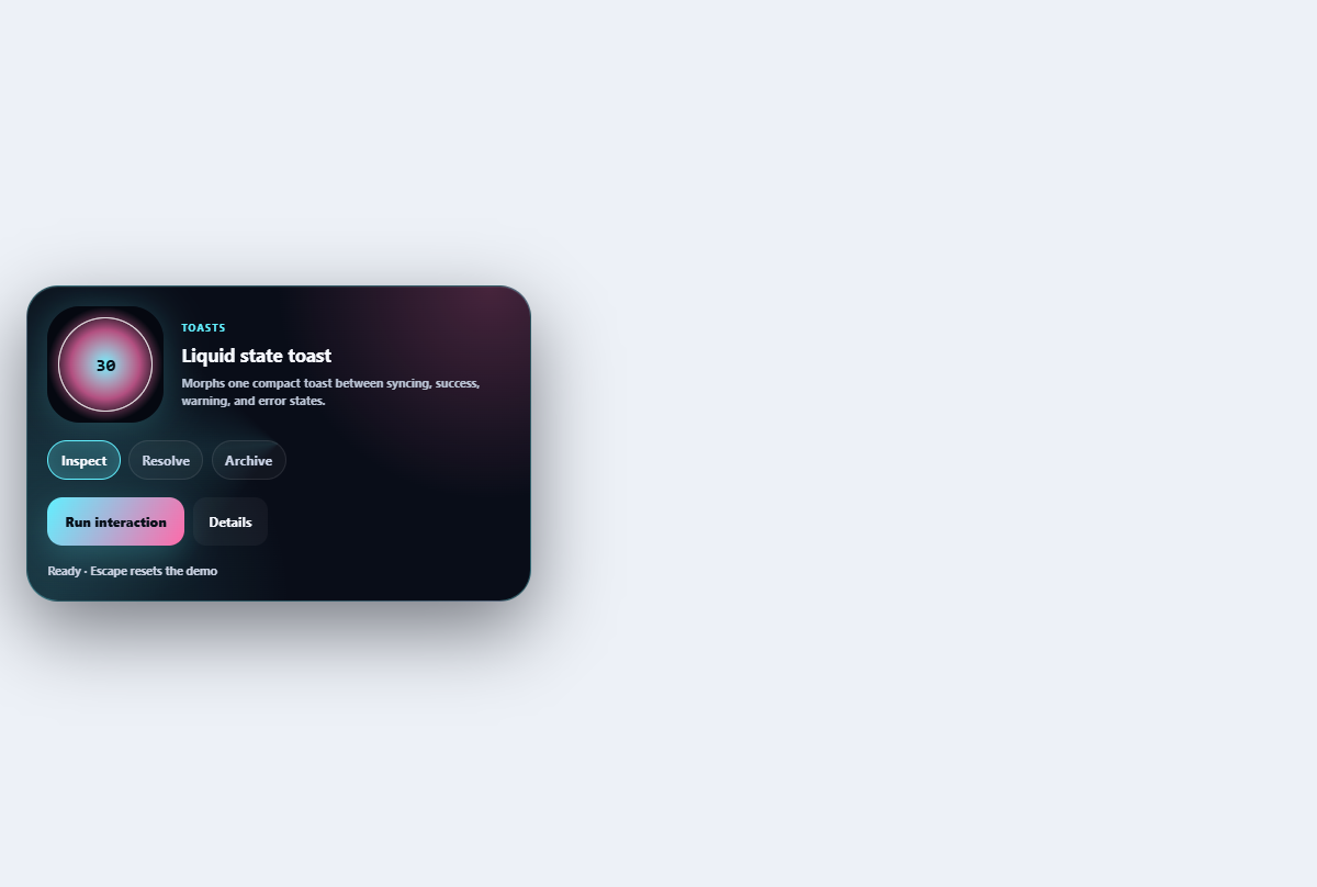
Liquid state toast
Morphs one compact toast between syncing, success, warning, and error states.
Open component