
Build an accessible range slider with useful values
Design native and custom range controls with keyboard support, visible values, semantic units, touch targets, and stable feedback.
What you will build correctly
- Prefer a native range input unless the interaction truly needs a custom composite.
- Show the current value and expose its human meaning, not only a raw number.
- Test arrow, page, home, end, touch, and zoom behavior.
Use the native range input as the baseline
Input type="range" provides keyboard controls, touch behavior, form participation, and platform semantics with very little code. Label it explicitly, set meaningful min, max, and step values, and display the current value nearby so users do not have to infer it from thumb position.
A custom ARIA slider requires you to implement focus, value changes, orientation, touch, keyboard commands, and announcements. Choose that cost only for interactions such as multiple thumbs or non-linear scales that cannot be expressed clearly with native controls.
                      <label for="volume">Volume <output id="volume-value">40%</output></label>
<input id="volume" type="range" min="0" max="100" step="5" value="40">
Translate numbers into domain meaning
A value of 3 might mean “three seats,” “medium pressure,” or “three months.” Include units in the visible output and use aria-valuetext when the spoken meaning differs from the numeric value. Mark important thresholds or presets without crowding every possible step.
Format currency, dates, and percentages with locale-aware tools. Keep the underlying numeric value suitable for forms while presenting a readable label to users.
Style the track without shrinking the target
The visible track can be slim, but the interactive input and thumb need a comfortable hit area. Keep focus visible around the complete control and ensure selected and unselected track segments differ through more than a subtle hue shift.
Do not place a floating tooltip where it clips at minimum or maximum values. The current output can remain in normal layout on small screens, where a thumb-attached bubble may cover labels or leave the viewport.
- Thumb remains easy to acquire on touch.
- Focus ring is not clipped by the track wrapper.
- The current value stays visible while dragging.
Test every input path and boundary
Verify arrow keys, Home, End, Page Up, Page Down, touch dragging, mouse dragging, and form reset. Values must never exceed boundaries or drift off the declared step because of floating-point calculations.
For two-thumb ranges, prevent the thumbs from becoming indistinguishable and announce lower and upper values separately. If the selected interval becomes invalid, correct it predictably instead of silently swapping the user’s controls.
Use the pattern
Study it in working components.
These internal examples connect the guide to standalone HTML, CSS, and JavaScript you can preview, customize, and download.
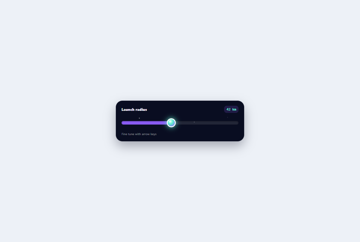
Galaxy range slider
A native orbital range control with a star-filled track, planet thumb, and visible numeric output.
Open component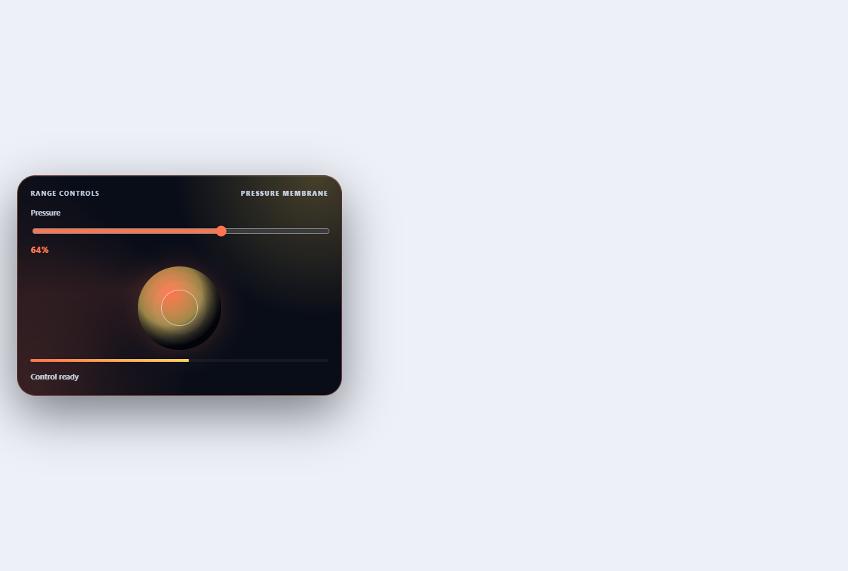
Pressure range control
Maps a range value to membrane depth, color pressure, numeric output, and haptic-looking rings.
Open component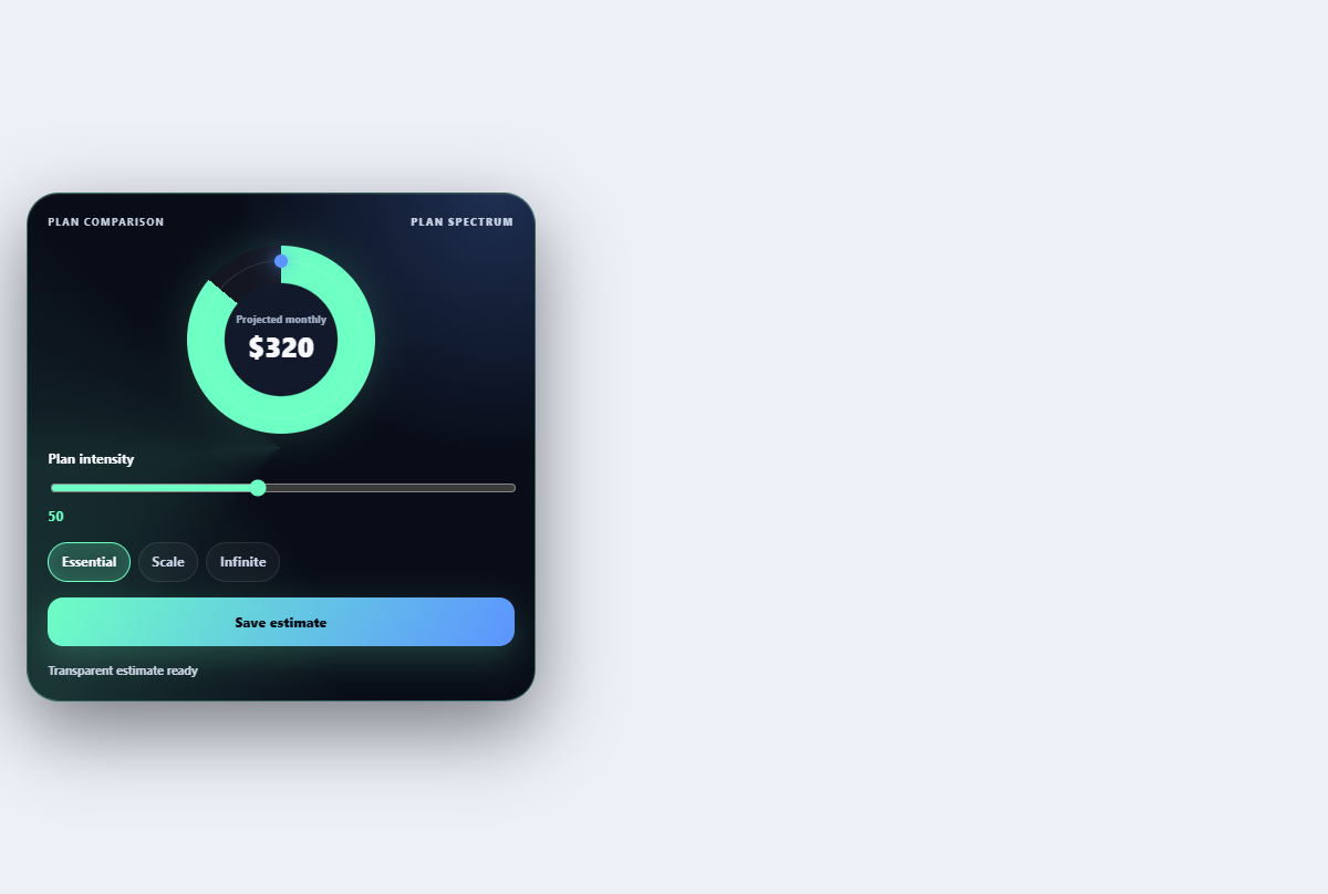
Tier comparison slider
Moves a shared comparison lens across plan tiers to emphasize changing limits and features.
Open component