
Accessible carousel design without autoplay traps
Build carousels with clear controls, stable focus, optional autoplay, semantic slide labels, swipe support, and reduced motion.
What you will build correctly
- Default to user-controlled movement and stop autoplay after interaction.
- Label the region, slides, and previous/next controls clearly.
- Keep focus stable while visual slides change around it.
Decide whether a carousel is the right pattern
Carousels hide content and require interaction to reveal it. Use one when the items form a meaningful sequence or when a compact gallery supports the main task. A grid is usually better for unrelated promotions users should compare at once.
Do not use autoplay to compensate for hidden content. If every slide must be seen, place it in normal page flow. When autoplay is valuable for a story or ambient showcase, provide a visible pause control and stop movement when users interact or request reduced motion.
Give the region and controls direct names
Label the carousel by its content, such as “Customer stories” or “Product photos.” Use buttons named “Previous slide” and “Next slide,” and expose the current position with concise text such as “Slide 2 of 5.” Dot controls need names that identify their destination.
Keep controls in a predictable location and large enough for touch. Disabled boundaries in a non-looping carousel should be visible, while an infinite loop must not create duplicated focusable content from cloned slides.
                      <section aria-roledescription="carousel" aria-label="Product photos">
  <button aria-label="Previous slide">…</button>
  <p aria-live="polite">Slide 2 of 5</p>
  <button aria-label="Next slide">…</button>
</section>
Combine swipe, buttons, and motion preferences
Swipe can enhance touch interaction but cannot replace visible buttons. Distinguish a horizontal swipe from vertical page scrolling and avoid hijacking small movements. Mouse drag is optional and should not break text selection inside content-heavy slides.
Use a short transition that indicates direction, then replace it with an immediate state change under reduced motion. Test zoom, keyboard, touch, screen readers, and a slide with long content to ensure the carousel height does not create disruptive page shifts.
Use the pattern
Study it in working components.
These internal examples connect the guide to standalone HTML, CSS, and JavaScript you can preview, customize, and download.
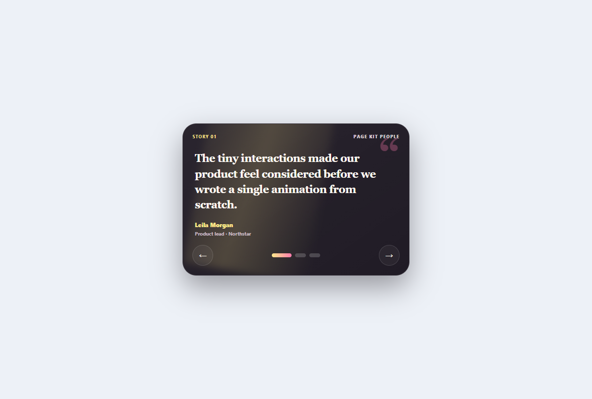
Spotlight testimonial carousel
A no-autoplay testimonial rotator with editorial spotlight depth, direct dots, arrow controls, and live position.
Open component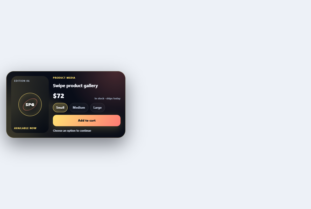
Swipe product gallery
Browses product views with swipe, arrow, and thumbnail controls plus a depth transition.
Open component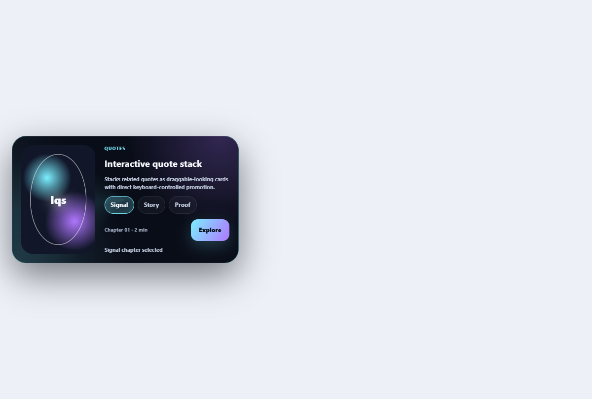
Interactive quote stack
Stacks related quotes as draggable-looking cards with direct keyboard-controlled promotion.
Open component