
Build a fast responsive dashboard header that avoids layout shift
Create an application header with stable dimensions, useful hierarchy, responsive actions, and loading behavior that protects Core Web Vitals.
What you will build correctly
- Render the page title, essential context, and primary action in stable server-delivered markup.
- Reserve predictable space for avatars, badges, and asynchronous status without freezing the whole header.
- Move secondary actions into an accessible menu before primary information becomes cramped.
Reserve dimensions for asynchronous interface data
Avatars, status badges, and loaded metrics can shift the header when their final size is unknown. Give media explicit dimensions, use a stable fallback, and reserve a reasonable inline size for values that arrive after initial render. A skeleton should match the final geometry rather than becoming a larger placeholder that collapses later.
Avoid hiding the entire header until personalization completes. Server-render the stable title, navigation context, and default action, then replace only the small regions that need data. This approach improves perceived speed and reduces cumulative layout shift while keeping the page useful when an API request is slow or unavailable.
                      .dashboard-header {
  display: grid;
  grid-template-columns: minmax(0, 1fr) auto;
  gap: 1rem;
  align-items: center;
}

.dashboard-header__avatar {
  inline-size: 2.5rem;
  block-size: 2.5rem;
  border-radius: 50%;
}

.dashboard-header__status {
  min-inline-size: 8rem;
}
Collapse actions without hiding the current task
At narrow widths, keep the page title and primary action visible when possible. Secondary actions can move into a clearly labeled menu, but they must remain keyboard accessible and preserve the same destination or command. Truncation is acceptable for repeated context such as a long workspace name when the full value remains available elsewhere.
Use container queries when the header lives beside a collapsible sidebar because the component width may change without a viewport resize. Test with long action labels and browser zoom before choosing the breakpoint. The mobile state should be an intentional hierarchy, not the desktop header with text hidden until it happens to fit.
Measure the header as part of the full route
A component preview cannot reveal every layout shift caused by route data, fonts, shell navigation, and authentication state. Measure the complete dashboard navigation from a cold load and record which element moved. Confirm that fonts use sensible fallbacks and that late icons or account data cannot change the height of the sticky region.
Test loading, success, empty, and error states at mobile and desktop sizes. Navigate by keyboard through the shell and page actions, then verify that sticky positioning does not cover focused controls. The component examples below provide a stable header, metric summary, and application bar that can be composed without coupling their loading states.
Use the pattern
Study it in working components.
These internal examples connect the guide to standalone HTML, CSS, and JavaScript you can preview, customize, and download.
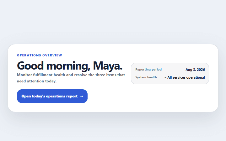
Dashboard welcome header
A compact application header that combines page purpose, reporting period, status, and primary action.
Open component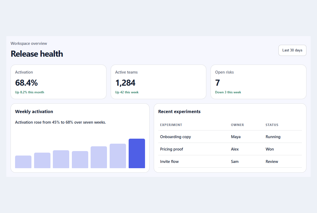
Compact metric dashboard
A responsive dashboard summary with meaningful trends, progress, and a readable activity table.
Open component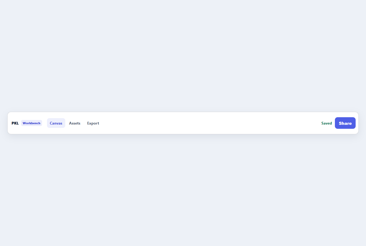
Compact top app bar
A narrow application header with brand, navigation links, status, and one action.
Open component