
Optimize hero images for faster Largest Contentful Paint
Deliver correctly sized hero media with responsive sources, priority hints, stable dimensions, modern formats, and useful fallbacks.
What you will build correctly
- Make the likely LCP image discoverable in the initial HTML and request it early.
- Send dimensions close to the rendered size for each responsive layout.
- Reserve space and preserve the subject with intentional art direction.
Confirm the hero image is actually the LCP element
Measure instead of assuming. A large heading may become LCP when the image is a CSS background, and a poster can replace the expected candidate at another breakpoint. Use performance tooling and field attribution to identify the element on the routes and devices that matter.
If the asset is decorative, consider whether it should dominate the first viewport at all. Removing an oversized visual can improve clarity and performance more than optimizing a file users do not need.
Put important media in discoverable HTML
An img or picture element in server-rendered markup can be discovered by the preload scanner before JavaScript runs. A background image injected by a hydrated component creates a longer request chain. Use fetchpriority="high" sparingly for the one likely LCP image and never mark it for lazy loading.
Preload only when discovery remains delayed after fixing markup, and keep the preload attributes aligned with the eventual image request. Mismatched sources or credentials can cause the browser to fetch the asset twice.
<img src="hero-1280.avif" srcset="hero-640.avif 640w, hero-1280.avif 1280w" sizes="100vw" width="1280" height="720" fetchpriority="high" alt="Product workspace showing the completed dashboard">
Send the right pixels for the layout
Generate several widths and describe the rendered slot accurately with sizes. The browser can then choose an asset based on viewport, density, and supported format. A 2400-pixel image sent to a 360-pixel phone wastes bandwidth even when compression is excellent.
Use picture for art direction when a narrow layout needs a different crop rather than a smaller version of the same composition. Keep meaningful subjects visible and write alternative text for the information the image contributes, not for decorative details.
Protect stability and visual quality
Width and height attributes establish an aspect ratio before the file downloads, preventing the following content from shifting. CSS can still make the image fluid with max-inline-size: 100% and block-size: auto.
Compare AVIF, WebP, and optimized JPEG at the sizes users receive. Aggressive compression around product text or interface screenshots can make the page look broken. Performance work should reduce bytes without erasing the content that made the hero useful.
- Keep intrinsic dimensions in the markup.
- Test the crop at every art-directed breakpoint.
- Cache immutable generated variants for a long duration.
Use the pattern
Study it in working components.
These internal examples connect the guide to standalone HTML, CSS, and JavaScript you can preview, customize, and download.
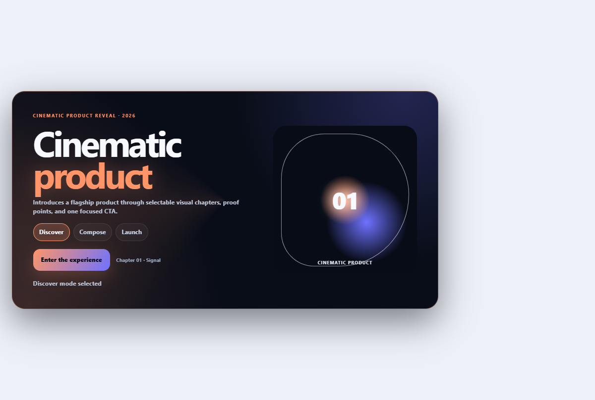
Cinematic product hero
Introduces a flagship product through selectable visual chapters, proof points, and one focused CTA.
Open component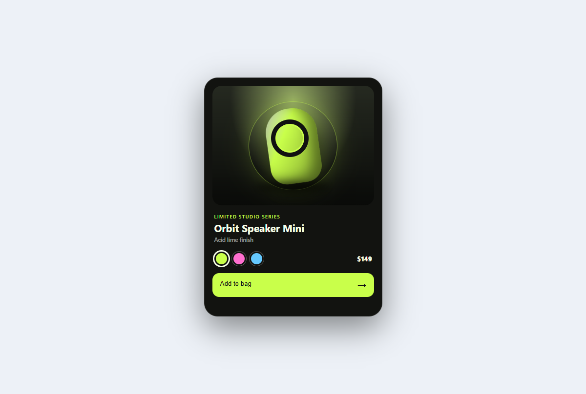
Product spotlight card
A studio-lit product card with tactile color variants, a dimensional CSS sculpture, price, and purchase feedback.
Open component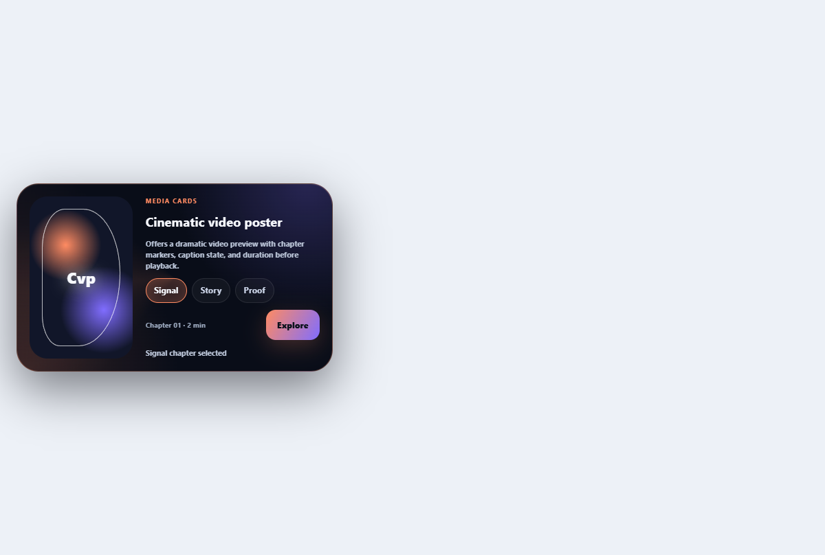
Cinematic video poster
Offers a dramatic video preview with chapter markers, caption state, and duration before playback.
Open component