
Design an accessible documentation search interface
Build a documentation search experience with a clear label, predictable keyboard behavior, useful empty states, and links that remain crawlable and shareable.
What you will build correctly
- Choose a plain search form for submitted results and a combobox only when suggestions appear while typing.
- Keep result destinations as real links with useful titles, descriptions, and stable URLs.
- Announce result counts and empty states without repeating the complete result list on every keystroke.
Choose the simplest search pattern that fits
A documentation search box that submits a query can be a normal search form with a labeled input and submit button. Use a combobox pattern only when the interface displays selectable suggestions as the visitor types. Adding combobox roles to a plain input creates keyboard and announcement expectations the interface does not satisfy.
Place the search landmark near the documentation heading and give it a name when the page contains more than one search region. The visible label can explain scope, such as Search Coding Laboratory guides. Placeholder text may offer an example query, but it disappears during input and should not be the only accessible name.
- Use input type search and a persistent label for a submitted search form.
- Provide a real submit button even when Enter also submits the query.
- Use autocomplete off only when browser history would genuinely disrupt the experience.
- Do not use role application around search controls or results.
Keep suggestions and result focus predictable
For an autocomplete, keep DOM focus in the input while arrow keys change the active suggestion, then expose that suggestion through the complete ARIA combobox pattern. Escape should close the popup without clearing a useful query. Enter should follow the active option or submit the current text, depending on the state users can perceive.
If the design only filters an on-page list, let Tab move through the resulting links normally. Do not automatically focus the first result after every keystroke because visitors may still be editing the query. A concise live result count can confirm that filtering occurred while leaving navigation under the visitor's control.
                      <form role="search" action="/guides" method="get" class="docs-search">
  <label for="docs-query">Search frontend guides</label>
  <div>
    <input id="docs-query" name="q" type="search" autocomplete="off" />
    <button type="submit">Search</button>
  </div>
</form>
<p role="status" aria-live="polite" data-search-status></p>
Write results that work for people and crawlers
Every result should use a normal anchor with a stable destination, a descriptive title, and enough supporting text to distinguish similar topics. Highlighting query terms can aid scanning, but the title must remain understandable without the highlight. Avoid click handlers that navigate from generic containers because they weaken keyboard access and link discovery.
Keep important documentation reachable from topic navigation even if search is unavailable. Search is a retrieval shortcut, not the only information architecture. Category pages, related guides, and component links help visitors browse unfamiliar terminology and give crawlers direct paths to the same useful content.
Test incomplete, empty, and interrupted searches
Try a single character, a long pasted query, punctuation, no matches, slow results, and a failed request. Empty states should suggest a broader term or a useful category instead of blaming the visitor. When results load remotely, preserve the current query and explain the retry path without replacing the entire page with a spinner.
Complete keyboard and screen-reader checks for input naming, popup state, result counts, and link destinations. Test at mobile zoom and with reduced motion. Analytics should record broad search terms only when your privacy policy and implementation support it; never expose sensitive text that visitors may paste into a documentation search field.
Use the pattern
Study it in working components.
These internal examples connect the guide to standalone HTML, CSS, and JavaScript you can preview, customize, and download.
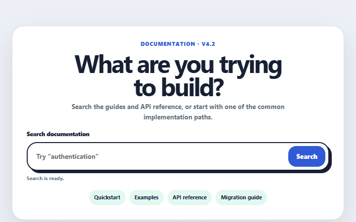
Documentation search hero
A documentation header with a labeled search form, common destinations, and a visible release status.
Open component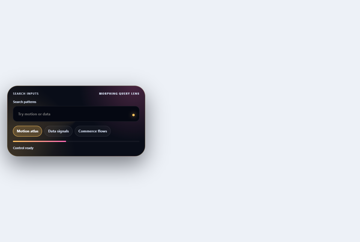
Morphing search combobox
Turns a compact search field into a filtered, keyboard-navigable suggestion lens.
Open component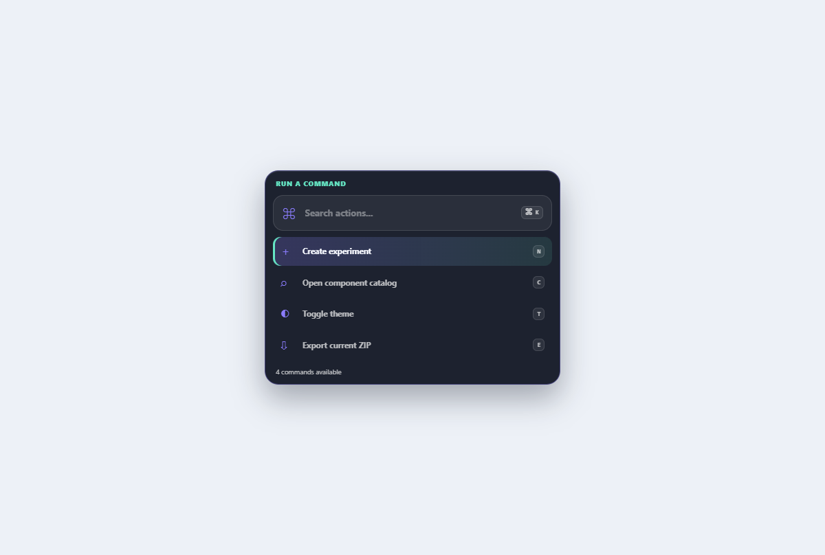
Searchable command menu
A grouped command palette with live filtering, active-descendant keyboard navigation, and shortcut hints.
Open component