
Responsive ecommerce hero section with HTML and CSS
Build a responsive ecommerce hero section with HTML and CSS: a conversion-ready layout with a clear CTA, product media, and mobile-safe styling.
What you will build correctly
- Write the promise and primary action before deciding whether the hero needs media or animation.
- Use grid, fluid type, and intrinsic sizing so the layout adapts to content rather than device labels.
- Keep meaningful text in HTML and treat decorative visual effects as optional enhancement layers.
Give the first viewport one clear job
A hero should identify the product or person, state the useful outcome, and offer a sensible next step. It does not need to summarize every feature. Start with a specific heading and one supporting paragraph, then add a secondary action only when visitors genuinely need an alternate path such as viewing documentation before starting a trial.
Match the hero to the page intent. A developer tool can lead with a technical workflow, a portfolio can show availability and specialization, and an ecommerce promotion should state the offer and its limits. Reusing one generic headline pattern across those pages produces attractive but unhelpful content that visitors must decode before they can act.
- Keep one page-level h1 that summarizes the specific page.
- Write action labels that describe the destination or result.
- Place proof close to the promise it supports.
- Remove decorative content that pushes the primary action below the first useful viewport.
Build a semantic and resilient content shell
Use a section with an accessible heading relationship when the hero is one part of a larger page, or place the content directly inside the main landmark when it introduces the entire document. Keep navigation outside the hero unless it is genuinely part of that section. Links should navigate, while buttons should trigger an action on the current page.
Render the headline, description, and important link in the initial HTML. A decorative canvas, video, or animated background may load later without delaying the core message. If media communicates information, give it an appropriate image element, dimensions, alternative text, and a position near the text that explains it.
                      <section class="product-hero" aria-labelledby="product-hero-title">
  <div class="product-hero__copy">
    <p class="eyebrow">Developer workflow</p>
    <h1 id="product-hero-title">Ship accessible interfaces without rebuilding the basics.</h1>
    <p>Preview, customize, and download framework-free components.</p>
    <div class="product-hero__actions">
      <a href="/components">Browse components</a>
      <a href="/guides">Read implementation guides</a>
    </div>
  </div>
</section>
Let content determine the responsive breakpoint
Use a single-column layout by default and introduce a second column when both the copy and media have enough room to remain useful. Grid with minmax and a measured content width usually adapts more reliably than several device-specific breakpoints. Fluid type can scale the headline while a maximum size prevents it from overwhelming large screens.
Test long headings, translated actions, browser zoom, and narrow containers rather than only resizing a full desktop window. A component may sit inside a documentation shell or dashboard column that is much narrower than the viewport. Container queries are useful when the hero must respond to that available space instead of the device width.
Protect loading performance and motion preferences
Measure the hero because its largest text or media often becomes the Largest Contentful Paint element. Avoid blocking font requests, oversized background images, and client-rendered primary copy. When an image is important, provide correct dimensions and an appropriately sized source; when it is decorative, consider whether CSS shapes can create the same atmosphere with less transfer.
Animations should never delay the headline or action. Respect reduced-motion preferences and keep movement away from reading tasks. Finish by testing the hero with images disabled, JavaScript blocked, a keyboard, and a slow connection. The component examples below show different content strategies while preserving the same dependable foundation.
Use the pattern
Study it in working components.
These internal examples connect the guide to standalone HTML, CSS, and JavaScript you can preview, customize, and download.
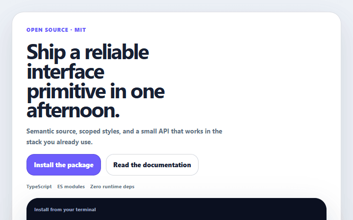
Developer tool hero
A code-led product hero with a concrete command, compatibility proof, and separate learn and install paths.
Open component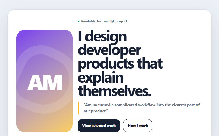
Portfolio availability hero
A personal portfolio header that combines a clear specialty, selected proof, and honest availability.
Open component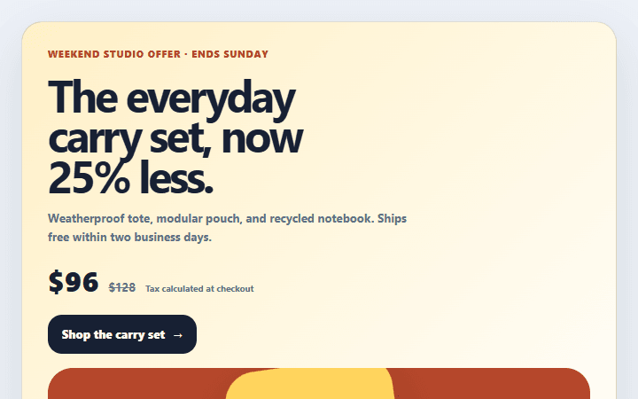
Ecommerce promotion hero
A product promotion header with offer terms, original price context, delivery details, and a focused shop path.
Open component