
CSS cascade layers for predictable component styling
Organize resets, tokens, components, utilities, and overrides with cascade layers so selector strength stops becoming an arms race.
What you will build correctly
- Declare layer order once so architecture outranks selector accidents.
- Keep component selectors intentionally low in specificity.
- Treat unlayered third-party CSS and important declarations as explicit risks.
Make precedence visible at the top of the stylesheet
Without layers, later rules and stronger selectors gradually become the architecture. A single declaration can require a more specific correction, which then requires another correction. Layers let you define broad precedence independently from selector specificity inside each layer.
Declare the order before any layer content. A practical sequence might include reset, tokens, base, components, utilities, and overrides. Teams can then see whether a rule belongs to the component itself or to an intentional consumer override.
                      @layer reset, tokens, base, components, utilities, overrides;
@layer components {
  .cmp-card { background: var(--cmp-surface); }
}
Keep each layer responsible for one kind of decision
Reset normalizes owned elements, tokens provide values, base establishes document defaults, components define isolated patterns, and utilities apply narrow opt-in changes. When a component needs ten utility overrides to look correct, the component layer probably owns those rules.
Do not create a layer for every file. The layer order is an architectural map, and excessive layers make precedence difficult to remember. Use nested layers only when a large system genuinely needs internal sequencing.
Understand how layers interact with specificity
A rule in a later normal layer wins over a more specific rule in an earlier layer. Inside the same layer, normal specificity and source order still apply. This makes low-specificity component selectors easier to customize without resorting to ids or !important.
Unlayered author styles outrank normal layered styles, so imported legacy CSS can unexpectedly sit above the system. Place third-party or old styles in an explicit layer when possible, then reserve the unlayered space for deliberate top-level exceptions.
- Order layers before importing layered files.
- Avoid important declarations in component APIs.
- Document where consumer overrides belong.
Combine layers with a token-based customization API
Users should usually customize a component by changing documented custom properties, not by overriding internal descendants. Layers protect the broader cascade, while tokens keep normal visual changes close to the component root.
Test a component inside a page that includes resets, utilities, and a theme override. The component should preserve its semantics and layout while accepting documented changes without selector escalation.
Use the pattern
Study it in working components.
These internal examples connect the guide to standalone HTML, CSS, and JavaScript you can preview, customize, and download.
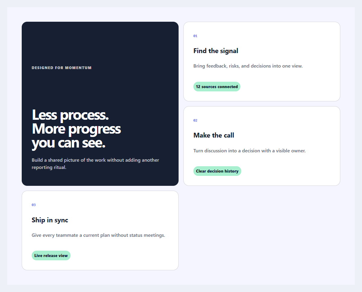
Outcome feature grid
An editorial feature section organized around user outcomes instead of product jargon.
Open component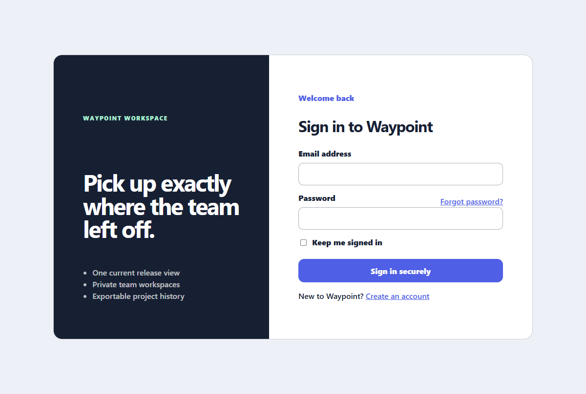
Split sign-in panel
A focused sign-in experience with helpful recovery links and a compact product benefit panel.
Open component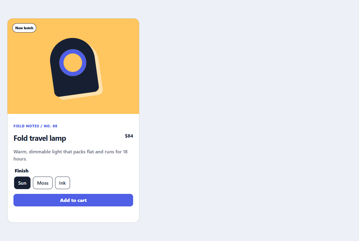
Editorial product card
A product card with a CSS-only visual, useful variant controls, and direct purchase action.
Open component