
Design component color systems that survive customization
Turn raw colors into semantic design tokens with reliable foreground pairs, state roles, contrast checks, and dark-theme behavior.
What you will build correctly
- Name tokens by purpose instead of embedding a hue in the API.
- Pair every editable surface with an intentional foreground.
- Separate semantic state from decorative effects and test both themes.
Expose roles instead of color names
A token named --blue-500 becomes misleading when a consumer switches the component to green. Roles such as --cmp-accent, --cmp-surface, --cmp-text, --cmp-muted, and --cmp-border describe where a value is used and remain meaningful across palettes.
Keep the public token set small. Internal shades for glows, gradients, and chart interpolation can derive from the public roles with color-mix, while critical text and control states should use explicit values that can be checked reliably.
                      .cmp-card {
  --cmp-surface: #ffffff;
  --cmp-text: #172033;
  --cmp-accent: #4f5fe6;
  --cmp-on-accent: #ffffff;
}
Treat foreground and surface as one decision
Letting users change a background without its text pair creates predictable contrast failures. Expose pairs together, derive a safe foreground only when the color space and browser support make that reliable, or warn users when a customized pair falls below the project threshold.
Test normal text, large text, icons, borders, focus rings, placeholder text, and disabled states separately. A single passing headline does not prove the whole component palette is readable.
Reserve state colors for state meaning
Success, warning, danger, and information colors communicate product meaning. Do not reuse danger red as a decorative brand accent inside the same component because users will read urgency into it. Add text or an icon so state never depends on hue alone.
Interactive states need enough distinction without causing the component to jump. Hover can shift surface or border, active can change depth, selected can add a mark, and focus should keep its own consistent ring role.
- Document the purpose of every public token.
- Keep state labels visible next to state colors.
- Check customized values in context, not as isolated swatches.
Build dark mode as a separate palette
Dark mode is not an inversion filter. Elevated surfaces often become lighter than the page, shadows become less useful, borders need different contrast, and saturated accents can appear brighter. Remap semantic roles while preserving hierarchy rather than mechanically reversing values.
Place theme values at the component or application boundary and let the component consume the same roles in either mode. This keeps the implementation stable and makes user customization easier to export.
Use the pattern
Study it in working components.
These internal examples connect the guide to standalone HTML, CSS, and JavaScript you can preview, customize, and download.
Chroma color picker
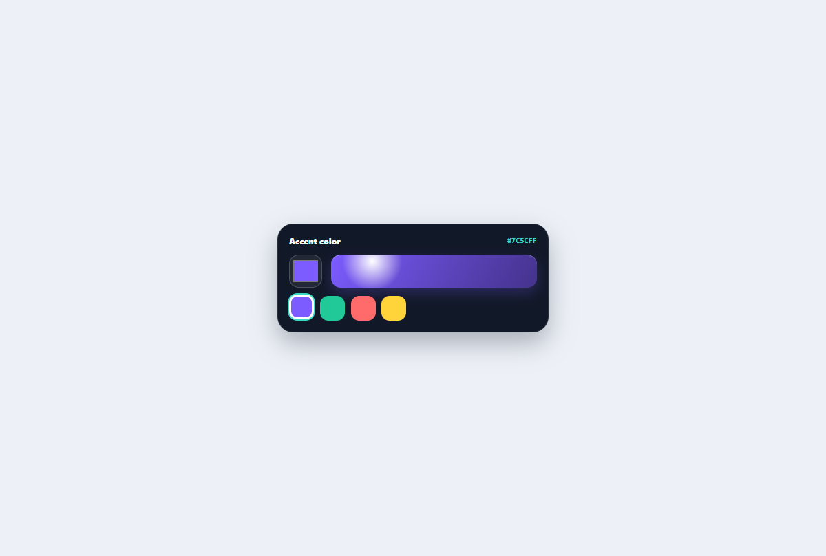
A native color picker with named preset swatches, selected state, preview chip, and synchronized hex value.
Open component
Liquid metal button
A reflective mercury action whose edge blobs stretch and fuse into a polished chrome capsule.
Open component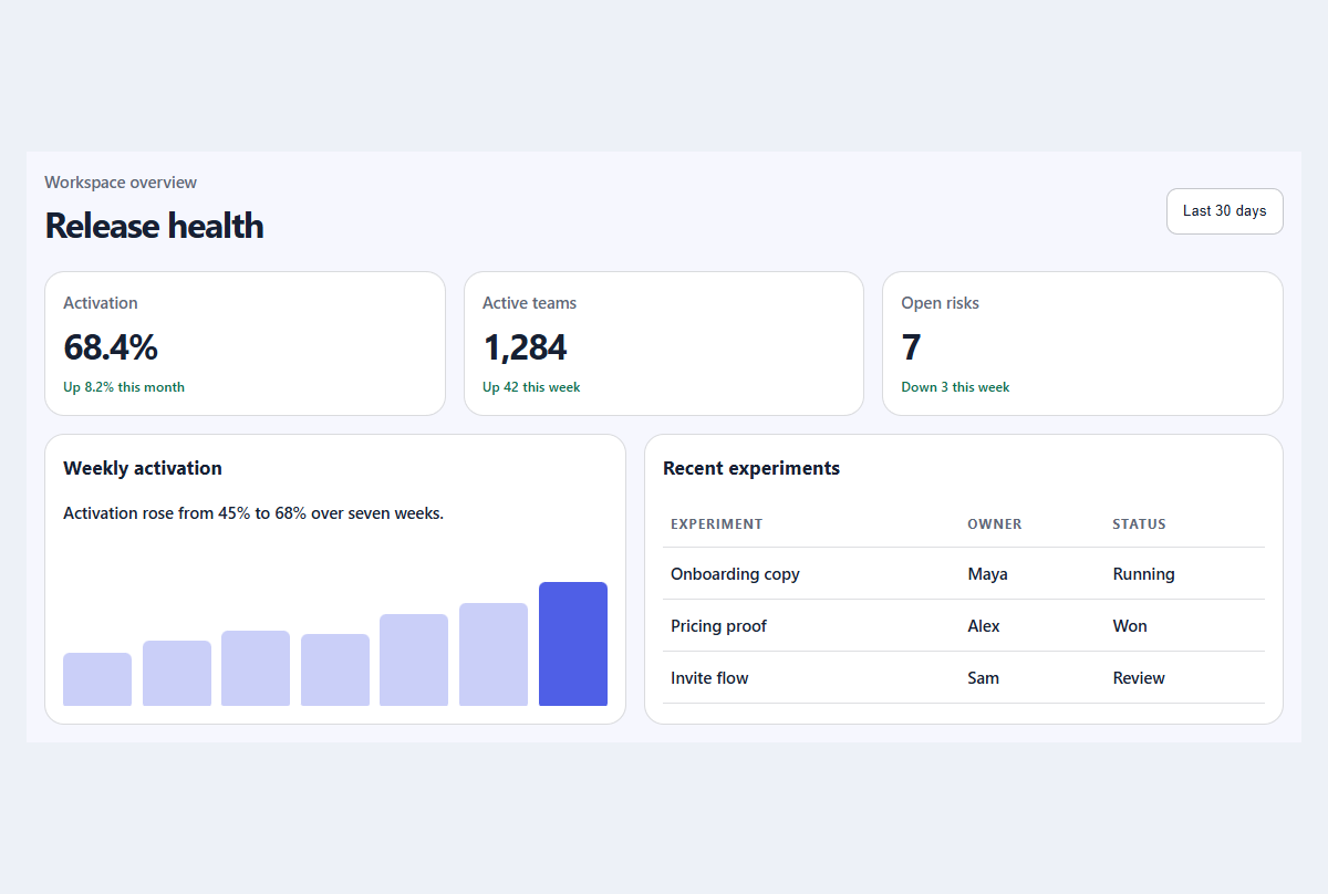
Compact metric dashboard
A responsive dashboard summary with meaningful trends, progress, and a readable activity table.
Open component