
Avoid CSS collisions in reusable frontend components
Scope component selectors, control inheritance, document customization tokens, and prevent resets or utilities from leaking across page boundaries.
What you will build correctly
- Give every downloadable component one unique root and scope below it.
- Keep resets local and selector specificity low.
- Expose customization through documented --cmp-* properties.
Own one unmistakable component root
A portable component cannot assume it is the only card, button, or navigation on the page. Start with a unique cmp-prefixed root and place every internal selector beneath it. The root becomes both a namespace and the location for the customization API.
Choose role-based descendant names such as __title, __actions, and __media instead of positional names such as __left. The class should remain accurate when responsive styles move an element or writing direction changes.
                      .cmp-signal-card { … }
.cmp-signal-card__title { … }
.cmp-signal-card__actions { … }
Reset only elements the component owns
Rules for body, button, img, or h2 can alter unrelated page content. If a component needs border-box sizing or a button reset, apply it below the root. Be careful with universal selectors because pseudo-elements and embedded third-party widgets may inherit more than expected.
Inheritance still crosses the boundary. Set the component’s font, color, and line height deliberately when portability matters, then let useful inherited user preferences such as direction and reduced motion continue to work.
Keep specificity easy to override
A single class per rule is often enough once the root scopes the component. Use :where when grouping descendants should contribute no extra specificity, and avoid ids, deeply nested element selectors, and important declarations in normal component styling.
Consumers should not need to understand the private DOM to change radius, color, spacing, or motion. Put those decisions into custom properties and keep structural overrides exceptional.
- No global element selectors in the package.
- No ids used for styling.
- Every public custom property affects a visible result.
Test several components in the same document
A component that looks correct in an isolated preview can still collide in production. Render multiple packages together, repeat the same component twice with different token values, and place them inside a page with opinionated typography and form styles.
Inspect both directions of leakage: whether the page changes the component unexpectedly and whether the component changes the page. Export the standalone files and run the same coexistence test against the actual download, not only the library wrapper.
Use the pattern
Study it in working components.
These internal examples connect the guide to standalone HTML, CSS, and JavaScript you can preview, customize, and download.

Icon action button
A square toolbar button with an accessible name and a lightweight hover tooltip.
Open component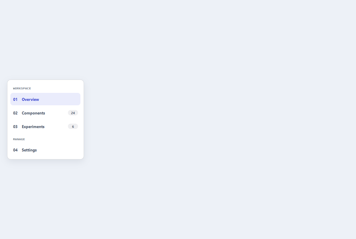
Compact sidebar menu
A slim dashboard navigation rail with section labels, active state, and item counts.
Open component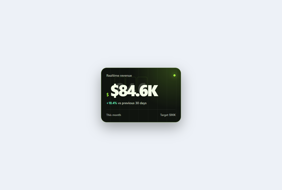
Kinetic stat card
A mechanical KPI card with stacked number plates, a precise trend label, and tactile hover depth.
Open component