
Build a responsive card grid without fragile breakpoints
Create resilient CSS card grids with grid, minmax, auto-fit, intrinsic sizing, consistent spacing, and content-aware mobile behavior.
What you will build correctly
- Let cards wrap from a meaningful minimum rather than device labels.
- Keep card height flexible and align internal actions intentionally.
- Reduce content or recompose cards when narrow space changes the task.
Start with an intrinsic track formula
Grid can create as many columns as fit without a list of viewport breakpoints. Choose the narrowest width at which the card content remains useful, then let minmax protect that minimum and 1fr distribute remaining space.
Use min with 100% when the minimum could exceed a very narrow container. This avoids horizontal overflow while keeping the preferred card width everywhere else.
                      .card-grid {
  display: grid;
  grid-template-columns: repeat(auto-fit, minmax(min(100%, 18rem), 1fr));
  gap: clamp(1rem, 2vw, 1.5rem);
}
Make the card interior flexible
A grid only solves the outer tracks. Inside each card, use a column layout and push actions to the end when consistent alignment helps scanning. Do not lock every card to a fixed height; translated descriptions and user font settings need room to grow.
Use aspect-ratio for media placeholders, object-fit for images, and line clamping only when the full text remains available elsewhere. A card title should not disappear because another card happened to have shorter copy.
Decide between auto-fit and auto-fill
Auto-fit collapses empty tracks and lets existing cards stretch, which works well for most content grids. Auto-fill preserves the potential tracks, which can keep card widths stable when a row contains fewer items. Choose based on the final row rather than copying a formula blindly.
For very wide layouts, cap the grid or card width so text does not become excessively long. Extra page space can become margins instead of oversized cards.
- Test one card, two cards, and an incomplete final row.
- Add a long unbroken word and long localized title.
- Verify focus and hover states do not shift track sizes.
Recompose feature-heavy cards on small screens
A card with media, tags, price, description, rating, and three actions may remain technically responsive while becoming overwhelming. Prioritize the decision users make in that context and hide only secondary decoration, not essential information.
Container queries can switch media beside content when the card receives enough room. Test the same card in search results, a sidebar, and a full-width recommendation slot to confirm it adapts to placement rather than only the browser width.
Use the pattern
Study it in working components.
These internal examples connect the guide to standalone HTML, CSS, and JavaScript you can preview, customize, and download.
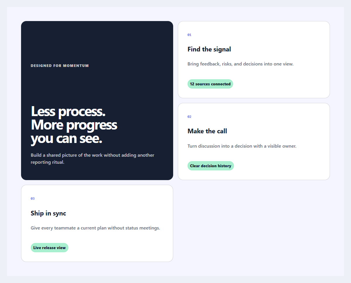
Outcome feature grid
An editorial feature section organized around user outcomes instead of product jargon.
Open component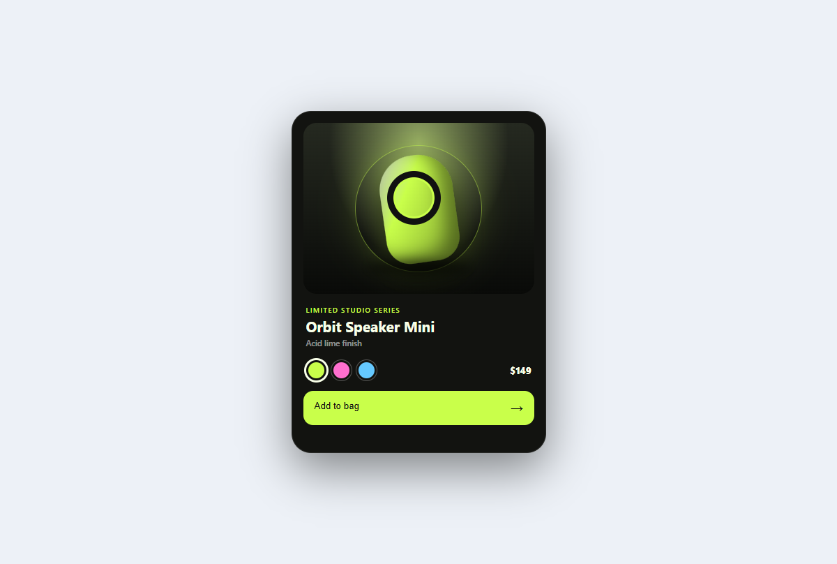
Product spotlight card
A studio-lit product card with tactile color variants, a dimensional CSS sculpture, price, and purchase feedback.
Open component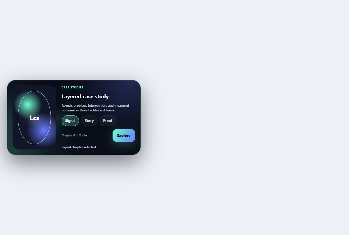
Layered case study card
Reveals problem, intervention, and measured outcome as three tactile card layers.
Open component