
CSS logical properties for resilient international layouts
Use inline and block properties to support right-to-left text, vertical writing, responsive spacing, and direction-aware component icons.
What you will build correctly
- Describe spacing by reading flow instead of physical left and right edges.
- Use logical size properties for portable components.
- Test direction, alignment, icon meaning, and mixed-direction content together.
Replace physical edges with flow-relative edges
Margin-inline-start means the beginning of a line in the current writing direction. In English it maps to the left; in Arabic it maps to the right. This lets a component follow document direction without a duplicate RTL override for every spacing rule.
The same model applies to padding, borders, inset positioning, sizes, and corner radii. Adopt logical properties in new component code first, then migrate physical rules when a layout genuinely depends on reading flow.
                      .breadcrumb__icon {
  margin-inline: 0.35rem;
}
.panel {
  padding-block: 1rem;
  padding-inline: 1.25rem;
}
Use inline-size and block-size for component constraints
Max-inline-size limits the readable line dimension, while min-block-size protects control height in the normal horizontal writing mode. These names describe intent more accurately than width and height and can adapt if the writing mode changes.
Logical sizing also pairs naturally with container queries, which usually inspect inline-size. A card can remain portable across layout directions without mixing physical and logical mental models.
Mirror directional icons, not universal symbols
A chevron that means “next in reading order” should mirror in RTL. A media play triangle, brand mark, check mark, clock direction, or download icon normally should not. Tie transformations to semantic direction instead of flipping every SVG in a container.
Keep icon order and text alignment flexible with flexbox rather than absolute positioning. Mixed-direction content such as an English product code inside Arabic text may also need bdi to isolate its direction safely.
- Set dir="rtl" on a realistic page, not only the component root.
- Check breadcrumbs, pagination, drawers, and progress sequences.
- Use start and end language in documentation.
Test real translated content
Mirroring a short English placeholder does not expose expansion, punctuation, numerals, or mixed scripts. Load realistic Arabic or Hebrew labels, increase text size, and test keyboard movement through ordered controls.
Direction support is a combination of HTML, CSS, iconography, and content. Logical properties remove a large class of layout bugs, but the complete interaction still needs review by people familiar with the language and reading conventions.
Use the pattern
Study it in working components.
These internal examples connect the guide to standalone HTML, CSS, and JavaScript you can preview, customize, and download.
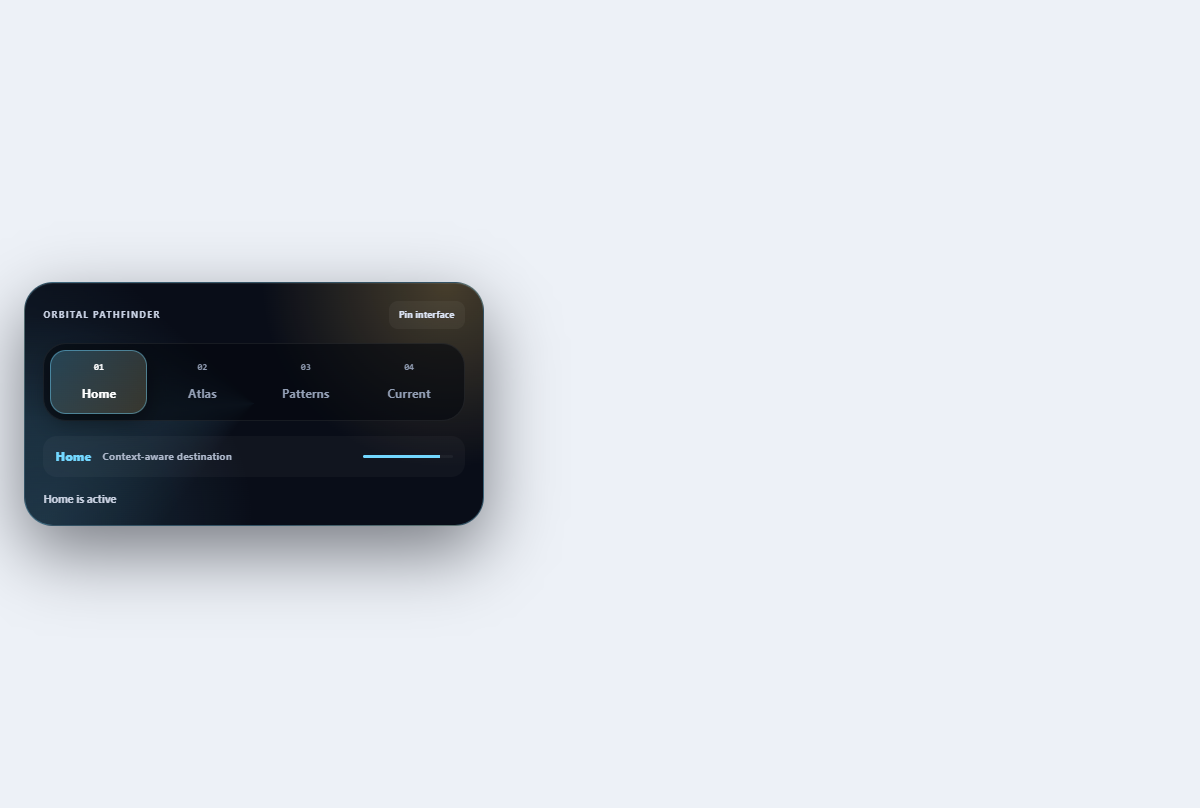
Orbital breadcrumb navigation
Shows a navigational path as connected planetary nodes with an unmistakable current destination.
Open component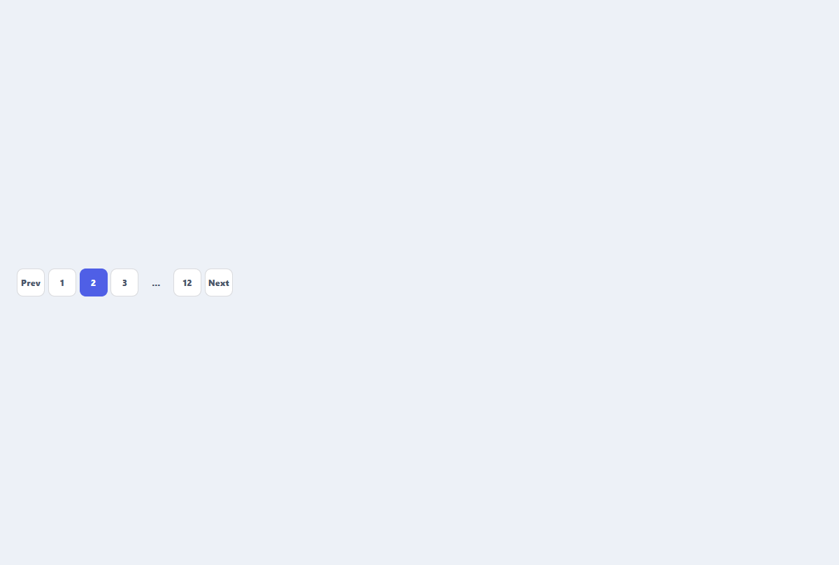
Pagination control
A compact page navigator with previous, next, current, and condensed page links.
Open component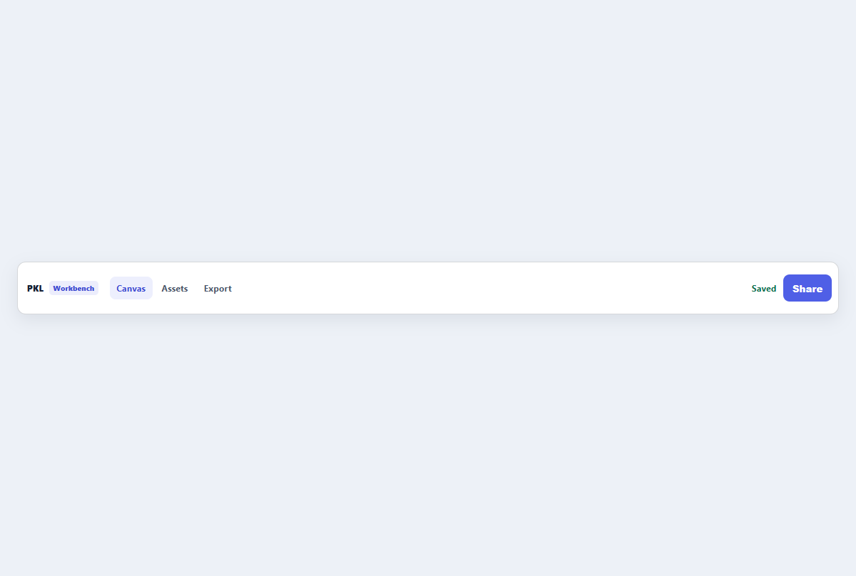
Compact top app bar
A narrow application header with brand, navigation links, status, and one action.
Open component