
Implement dark mode without flashes or unreadable components
Build a system-aware theme switcher with semantic tokens, early preference resolution, durable storage, and accessible control states.
What you will build correctly
- Resolve system and saved preferences before the first painted interface when possible.
- Theme semantic roles rather than overriding individual components.
- Expose system, light, and dark as understandable user choices.
Model preference separately from resolved appearance
Users may choose light, dark, or system. The stored preference is not always the rendered theme: system must resolve against prefers-color-scheme and update when the operating-system setting changes. Keep both values explicit so the toggle can explain the current choice correctly.
Use a data attribute on the document root to switch semantic tokens. Components should consume surface, text, border, muted, and accent roles without knowing whether the active palette is called dark or light.
Resolve the theme before content paints
When theme selection runs only after a hydrated application mounts, users may see a bright page flash before dark styles arrive. A tiny inline head script can read the saved local preference, resolve system mode, and set the root attribute before the stylesheet renders the full interface.
Keep the script defensive because storage can be unavailable. The server-rendered default should remain readable, and color-scheme should tell built-in form controls and scrollbars which palette they should use.
                      const mode = localStorage.getItem('theme') || 'system';
const dark = matchMedia('(prefers-color-scheme: dark)').matches;
document.documentElement.dataset.theme = mode === 'system' ? (dark ? 'dark' : 'light') : mode;
Remap elevation and contrast intentionally
Dark surfaces need more than inverted hex values. Elevation may use lighter surfaces or borders instead of darker shadows, muted text still needs sufficient contrast, and saturated neon effects may need reduced intensity to avoid halation.
Preview every component state in both themes: default, hover, focus, selected, disabled, success, warning, and code blocks. Images and screenshots may also need a subtle boundary so white content does not merge with a light surface or disappear against dark surroundings.
- Set color-scheme on the root.
- Check native inputs and autofill colors.
- Avoid animating the entire palette over a long duration.
Make the theme control understandable
A sun or moon icon alone can describe the current theme or the action that will happen next, and users may interpret it differently. Add an accessible label that states the action, or use a three-option control where system, light, and dark are visible choices.
Preserve the preference across pages, synchronize open tabs when practical, and test without JavaScript. Theme is a preference enhancement; core content and controls must remain readable in the default mode.
Use the pattern
Study it in working components.
These internal examples connect the guide to standalone HTML, CSS, and JavaScript you can preview, customize, and download.
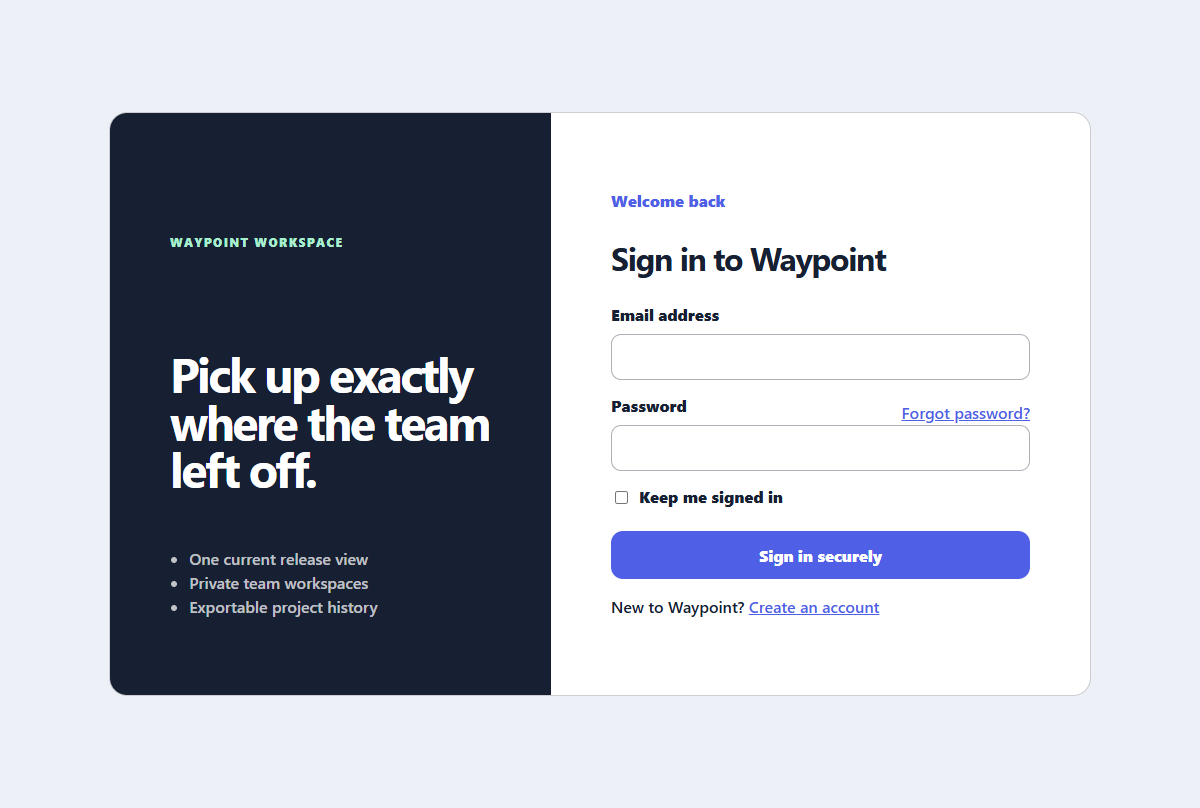
Split sign-in panel
A focused sign-in experience with helpful recovery links and a compact product benefit panel.
Open component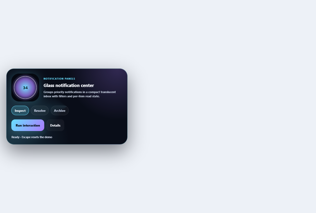
Glass notification center
Groups priority notifications in a compact translucent inbox with filters and per-item read state.
Open component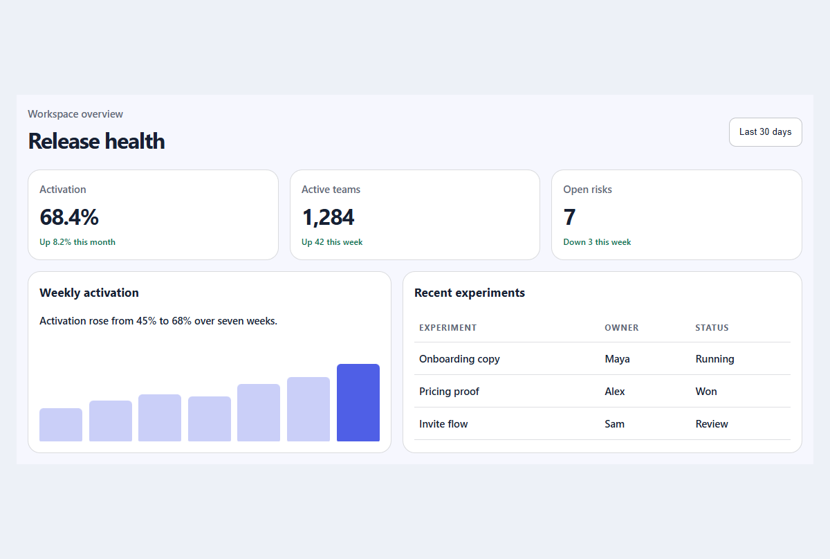
Compact metric dashboard
A responsive dashboard summary with meaningful trends, progress, and a readable activity table.
Open component