
CSS container queries for truly reusable components
Use container queries to make cards, toolbars, forms, and dashboards respond to their available space instead of the viewport.
What you will build correctly
- Use media queries for page composition and container queries for component composition.
- Name important containers and query the smallest layout boundary that owns the change.
- Design intrinsic defaults before adding width-based enhancements.
Respond to the component slot, not the browser
A card may appear in a wide marketing grid, a narrow sidebar, or a resizable dashboard panel while the viewport remains unchanged. Media queries cannot see that difference. Container queries let the card change its internal layout based on the space its parent actually provides.
Keep viewport queries for global decisions such as switching the page shell from columns to a single stack. Use container queries when a reusable unit must decide whether its own image, metadata, controls, or labels fit side by side.
                      .card-slot { container: card / inline-size; }
@container card (min-width: 32rem) {
  .card { grid-template-columns: 12rem 1fr; }
}
Choose a stable containment boundary
Apply container-type to the wrapper that allocates space, not to the component that needs to query itself. Querying a component’s own inline size creates a circular dependency because its styles can change the dimension being measured.
Named containers make nested layouts easier to reason about. A pricing card can query the card slot while an inner action row queries its own toolbar container. Use names that describe layout ownership rather than a particular breakpoint.
Build from intrinsic layout first
Before adding a query, let flex wrapping, grid auto-fit, minmax, and content-driven sizing do as much work as possible. Queries should handle meaningful composition changes, not compensate for rigid widths that could have been fluid.
Prefer thresholds discovered from the content. Increase the available width until the design has enough room for the intended columns, then place the query there. Device labels such as tablet or desktop are less useful inside a portable component.
- Allow labels and buttons to wrap safely.
- Use minmax to protect readable minimum widths.
- Query only when the composition should materially change.
Test components inside hostile containers
Place the component in a narrow sidebar, a medium card grid, a wide main column, and a resizable panel. Add long content, increase text size, and switch writing direction. The query should respond to usable space without clipping or oscillating around a fragile threshold.
Container query units such as cqi can scale local spacing or type, but cap them with clamp so extreme containers do not produce extreme results. The component should still have a clear, stable default when containment is unavailable.
Use the pattern
Study it in working components.
These internal examples connect the guide to standalone HTML, CSS, and JavaScript you can preview, customize, and download.
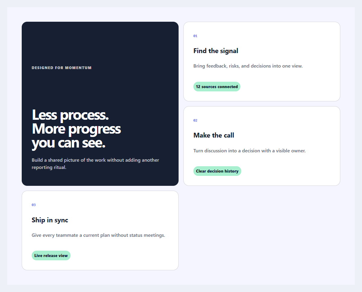
Outcome feature grid
An editorial feature section organized around user outcomes instead of product jargon.
Open component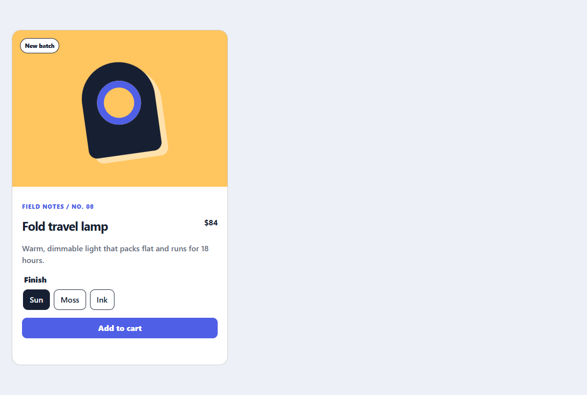
Editorial product card
A product card with a CSS-only visual, useful variant controls, and direct purchase action.
Open component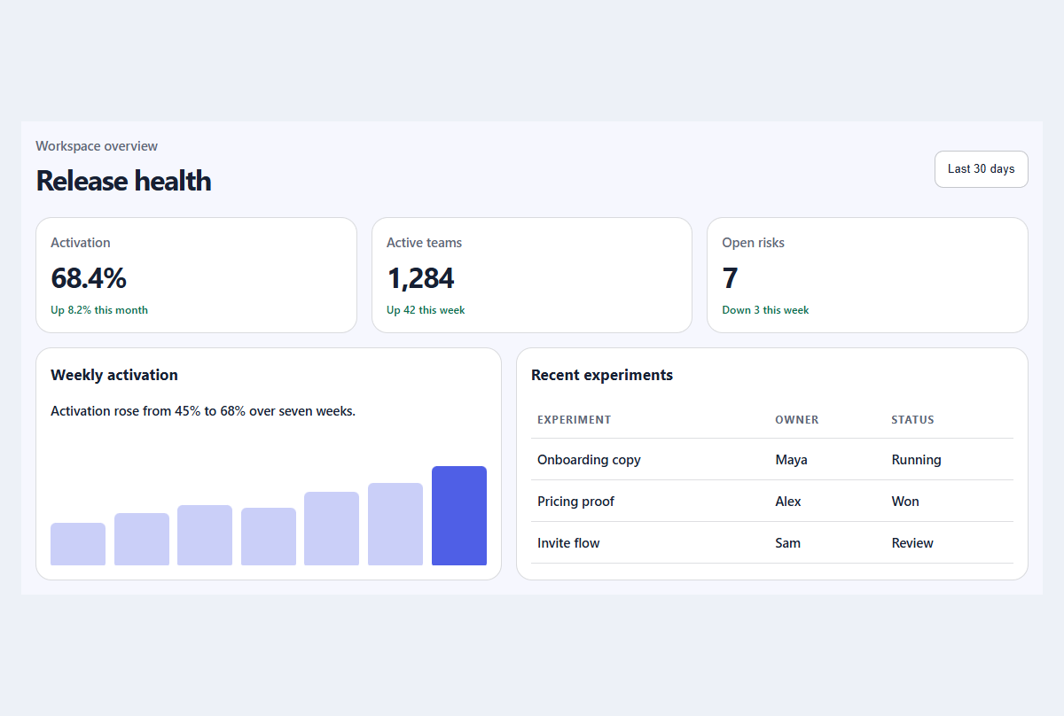
Compact metric dashboard
A responsive dashboard summary with meaningful trends, progress, and a readable activity table.
Open component