
Fluid typography with CSS clamp without breaking readability
Create responsive type scales with clamp, bounded viewport units, readable line lengths, and safe behavior at browser zoom levels.
What you will build correctly
- Combine relative units with viewport influence instead of using viewport units alone.
- Bound every fluid value with a deliberate minimum and maximum.
- Tune line length and line height alongside font size.
Define a useful range before writing the formula
Choose the smallest and largest size from the real layout, not from a mathematical scale in isolation. A hero heading may need to remain at least 2.75rem on a narrow phone and should stop growing around 6rem before it overwhelms the surrounding copy.
The middle clamp value blends a relative base with a viewport contribution. Including rem preserves some response to user font preferences, while vw adds controlled fluidity. Pure vw sizing can undermine zoom and should not carry the entire formula.
                      font-size: clamp(2.75rem, 1.6rem + 5vw, 6rem);
line-height: 0.94;
letter-spacing: -0.045em;
Create roles instead of isolated values
Define a small set of text roles—body, small, lead, section title, and display—then reuse them across components. This produces hierarchy without letting every card invent a new scale. Custom properties make the roles adjustable at a theme or page-shell boundary.
Keep body text conservative. Fluidity is most valuable for display headings and large section titles where available width changes dramatically. Dense controls, metadata, and form labels usually benefit from stable rem-based sizes.
Control measure, wrapping, and rhythm
Larger type needs a shorter line length and often a tighter line height. Use max-inline-size in characters to keep paragraphs readable and balance headings only as a progressive enhancement. Verify that long words, product names, and translated labels wrap without overflowing.
Fluid spacing can follow the same bounded approach, but avoid scaling every gap simultaneously. When type, padding, and columns all grow together, the page can become sparse on large displays and cramped at intermediate widths.
- Keep body copy near 55–75 characters per line.
- Allow headings to wrap naturally before shrinking them.
- Use consistent vertical spacing between text roles.
Test zoom instead of checking only breakpoints
Browser zoom changes the relationship between rem and viewport units. Test at 200% and 400%, where a layout can reach narrow effective widths while the physical window remains large. Text must grow, reflow, and remain available without horizontal scrolling.
Also test minimum font preferences and mobile text inflation. A polished type system is not the one with the most elaborate formula; it is the one that keeps hierarchy and readability when user settings challenge the default composition.
Use the pattern
Study it in working components.
These internal examples connect the guide to standalone HTML, CSS, and JavaScript you can preview, customize, and download.
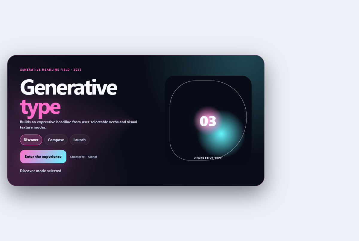
Generative type hero
Builds an expressive headline from user-selectable verbs and visual texture modes.
Open component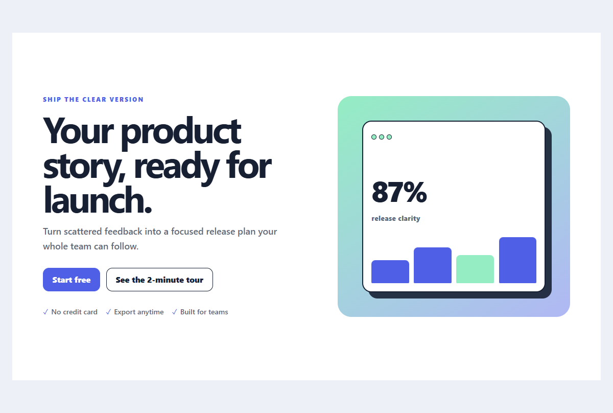
Split launch hero
A product launch hero pairing concise positioning with a layered interface preview.
Open component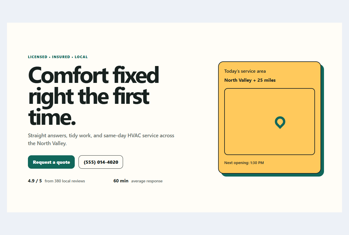
Local service hero
A trust-first local business hero with service availability and a direct quote path.
Open component