
Prevent Cumulative Layout Shift in component-heavy pages
Reserve media, preview, font, banner, and personalized content space so users never chase controls that move after loading.
What you will build correctly
- Reserve the final aspect ratio or minimum space before delayed content arrives.
- Match placeholders to real component geometry.
- Trace the element that caused a shift, not only the element that moved.
Give replaced content intrinsic geometry
Images, video, iframes, ads, and embedded previews should contribute an aspect ratio before their resources load. Width and height attributes or CSS aspect-ratio let the browser place the following content correctly during the first layout.
Responsive CSS can still resize the element. The intrinsic ratio is a reservation, not a fixed visual size. For art-directed sources with different ratios, ensure the selected breakpoint does not unexpectedly change the slot after initial paint.
                      .preview { aspect-ratio: 3 / 2; overflow: hidden; }
.preview > iframe { inline-size: 100%; block-size: 100%; border: 0; }
Build skeletons from the final layout
A generic gray rectangle rarely matches the loaded title, metadata, controls, and image. Create the placeholder inside the same grid and spacing system so content replacement changes paint, not geometry. Keep the placeholder accessible but quiet; it should not add dozens of announcements.
If content height genuinely varies, reserve a sensible minimum and let the page grow below the current viewport. Avoid collapsing a placeholder before the real content is ready because that creates two shifts instead of one.
Handle banners and personalization without pushing content
Late cookie banners, install prompts, account notices, and experiments often enter above the main content. Use an overlay when appropriate, reserve a known slot from the start, or insert new material below the user’s current position. Never move the button a user is about to activate.
Server-render predictable personalized shells when possible. A greeting changing within a fixed region is stable; a new navigation row inserted after hydration is not. Test first visits and returning visits separately.
- No content is injected above an active reading position.
- Loading and loaded states share the same outer layout.
- Font swaps do not change heading dimensions dramatically.
Use shift clusters to find the real cause
Performance tooling groups related shifts and shows which nodes moved. Expand the event to find a late image, font, class change, or inserted element that triggered the movement. The largest moving node is often an innocent neighbor.
Reproduce with an empty cache, slow network, mobile viewport, and realistic content. Once fixed, add a visual or browser test that verifies the reserved size so the instability does not return during a component redesign.
Use the pattern
Study it in working components.
These internal examples connect the guide to standalone HTML, CSS, and JavaScript you can preview, customize, and download.
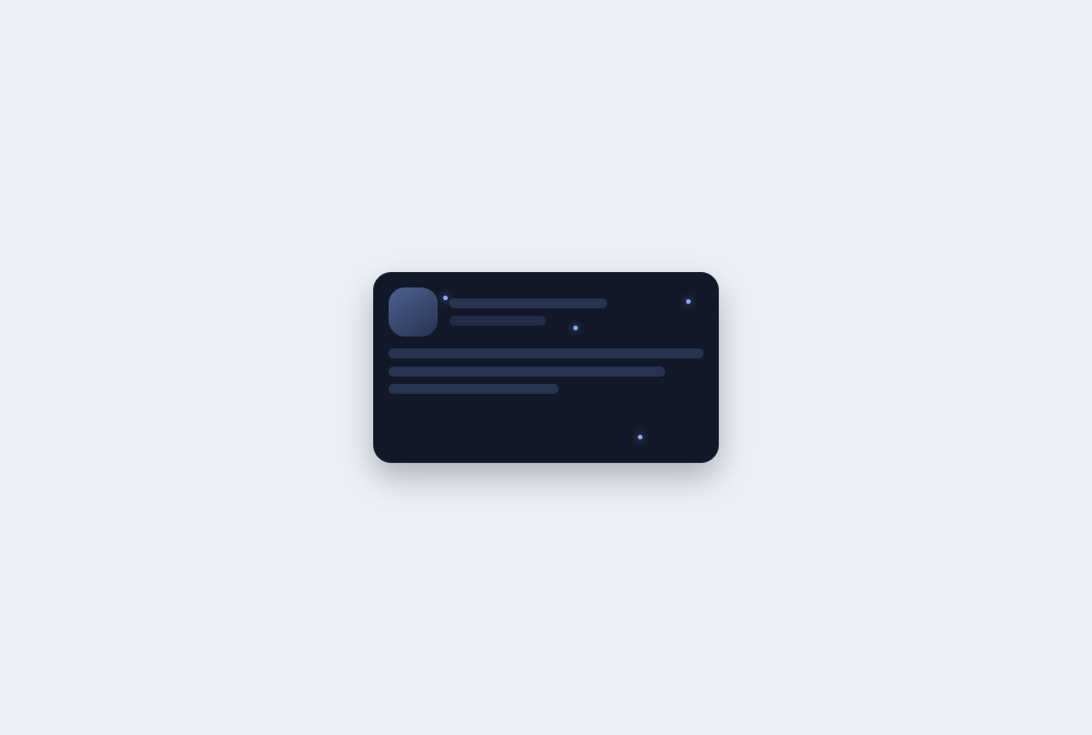
Constellation skeleton loader
An indeterminate content placeholder with connected star nodes, structured copy lines, and reduced shimmer.
Open component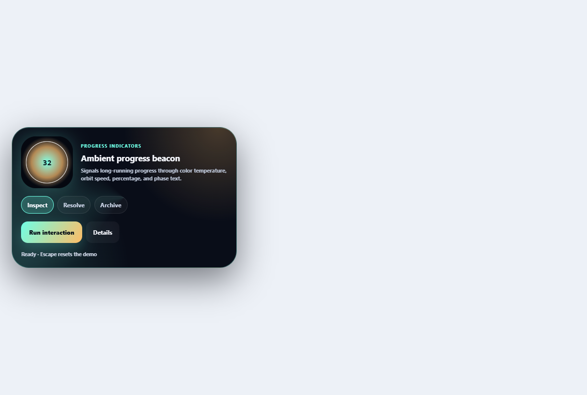
Ambient progress beacon
Signals long-running progress through color temperature, orbit speed, percentage, and phase text.
Open component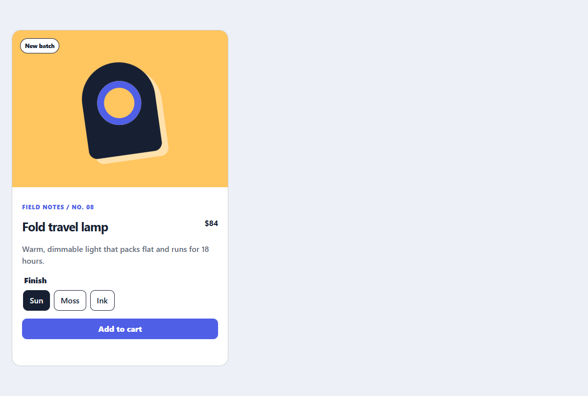
Editorial product card
A product card with a CSS-only visual, useful variant controls, and direct purchase action.
Open component