
Web font loading performance: avoid invisible text and layout shifts
Choose font subsets, preload only critical files, tune fallback metrics, and balance brand typography with fast, stable rendering.
What you will build correctly
- Load only the families, weights, styles, and character sets the route needs.
- Use font-display and a metric-compatible fallback to keep text visible and stable.
- Preload a small number of critical local font files only.
Reduce the font request before tuning its timing
A variable font can replace several static weights, but it may still contain axes and scripts the product never uses. Subset carefully, retain the language coverage you promise, and choose WOFF2 for modern web delivery. Self-hosting can simplify caching and remove third-party connection setup.
Audit every declared weight and style against actual CSS. Synthetic bold or italic may be undesirable, but downloading eight files for two visible roles is also wasteful. Typography systems with a small deliberate role set are easier to optimize.
Choose a font-display strategy from content priority
Swap keeps text visible immediately and replaces the fallback when the font arrives. Optional allows the browser to keep the fallback on slow connections, which can be appropriate when brand type is not essential. Block risks invisible text and should be used only with a very clear reason.
The right strategy can differ between a display face and the body family. Body content should remain readable, while a compact brand mark may tolerate different behavior if its dimensions are reserved.
                      @font-face {
  font-family: 'Lab Sans';
  src: url('/fonts/lab-sans.woff2') format('woff2');
  font-display: swap;
  font-weight: 100 900;
}
Match fallback metrics to reduce reflow
A fallback with very different character widths changes line breaks when the web font swaps, moving the rest of the page. Choose a system fallback with similar proportions and use size-adjust, ascent-override, descent-override, and line-gap-override when measurements justify them.
Test real headings, buttons, numbers, and long paragraphs. A metric match based on one alphabet sample may not protect the content patterns that dominate the product.
- Compare line breaks before and after the swap.
- Check numeric dashboards and compact controls.
- Keep fallback text visually acceptable on its own.
Preload with restraint and verify caching
Preload the one or two files needed for above-the-fold text when normal stylesheet discovery is too late. Every preload competes with images, CSS, and other critical resources, so preloading the full font library can make LCP worse.
Use immutable caching for versioned font assets, correct CORS attributes, and a repeat-visit test. Then measure whether the font is still on the critical path; do not keep a preload simply because it sounds faster.
Use the pattern
Study it in working components.
These internal examples connect the guide to standalone HTML, CSS, and JavaScript you can preview, customize, and download.
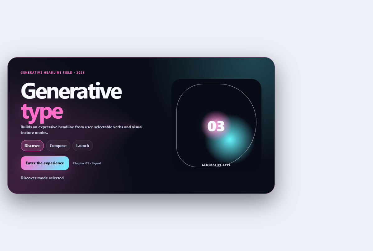
Generative type hero
Builds an expressive headline from user-selectable verbs and visual texture modes.
Open component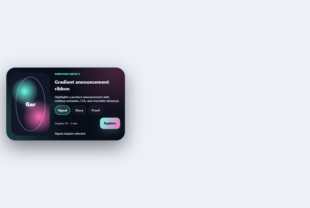
Gradient announcement ribbon
Highlights a product announcement with orbiting metadata, CTA, and reversible dismissal.
Open component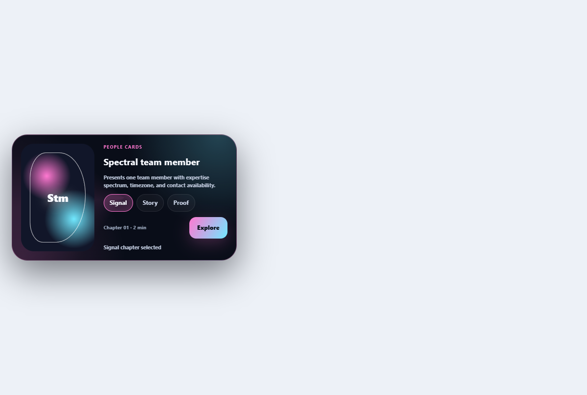
Spectral team member card
Presents one team member with expertise spectrum, timezone, and contact availability.
Open component