
Build smooth CSS animation without jank or wasted battery
Animate transform and opacity thoughtfully, avoid layout-heavy properties, contain effects, and verify frame performance under real load.
What you will build correctly
- Prefer transform and opacity, but verify compositing instead of assuming it.
- Limit continuous effects and isolate paint-heavy decoration.
- Test animation while the rest of the page is doing realistic work.
Understand the rendering work an animation triggers
Changing width, height, top, or margin can require layout, paint, and compositing every frame. Transform and opacity often avoid layout and can run on a compositor layer, making them the safest starting point for motion. Filters, masks, blend modes, and large shadows may still be paint-heavy even when the element moves with transform.
Record a performance trace and inspect the rendering pipeline. A smooth demo on an empty page does not prove the effect will stay smooth beside video, charts, scrolling, and other animated components.
Promote layers only when the browser needs help
Will-change can prepare a layer for an upcoming transform, but leaving it on hundreds of elements consumes memory and can make performance worse. Apply it shortly before a known interaction or rely on the browser when the animation is simple.
Large transparent layers and blurred effects are expensive to composite. Keep the animated region small, clip decorative particles inside the component, and avoid full-viewport filters for local feedback.
                      .card { transition: transform 180ms ease, box-shadow 180ms ease; }
.card:hover { transform: translateY(-4px); }
Use duration and easing to communicate state
Short feedback can feel immediate around 120–220 milliseconds, while larger panel movement may need more time to remain legible. Ease-out helps entering elements settle quickly; ease-in can support exits. Avoid long spring effects on controls users activate repeatedly.
Press feedback should not move a button away from the pointer, and hover effects should not shift surrounding layout. When several properties animate, coordinate them around one clear state change instead of creating unrelated motion.
- No layout movement around the animated component.
- No endless animation without a meaningful reason.
- The reduced-motion state preserves feedback.
Use the pattern
Study it in working components.
These internal examples connect the guide to standalone HTML, CSS, and JavaScript you can preview, customize, and download.
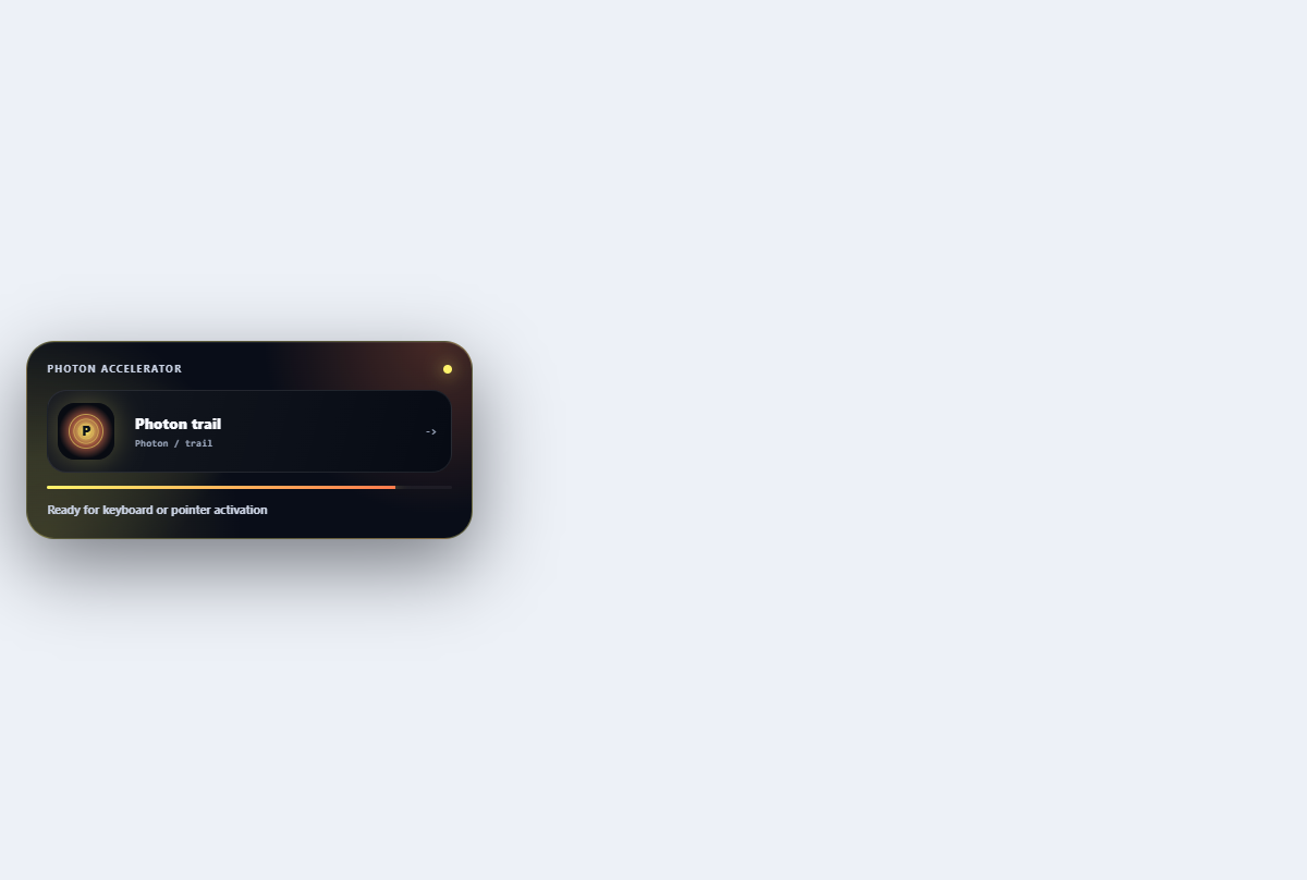
Photon trail button
Carries a bright photon around the perimeter to communicate a fast send action.
Open component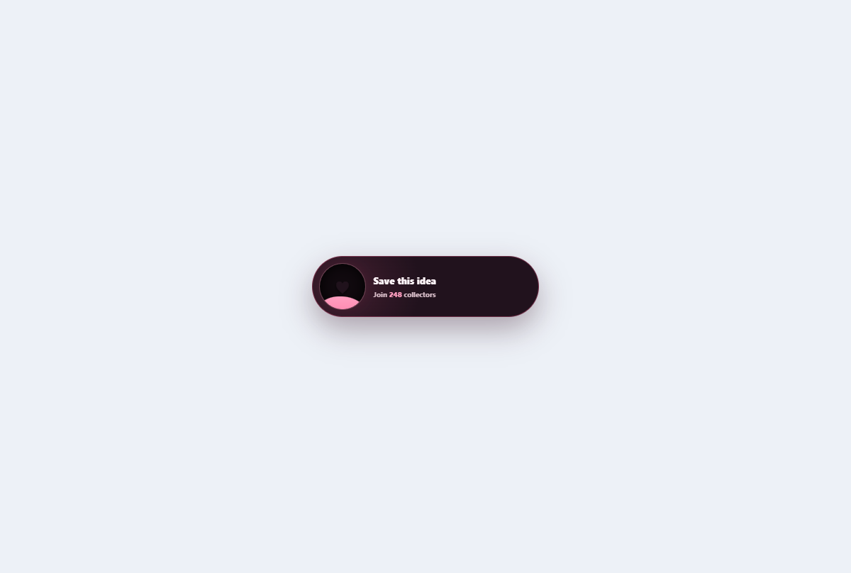
Liquid favorite button
A saved-content toggle with a rising liquid heart, aggregate count, and contained celebration ripple.
Open component
Comet toast stack
A replayable toast stack with comet-tail arrival, named dismiss actions, and pause-aware progress.
Open component