
Accessible file upload with drag-and-drop enhancement
Create a keyboard-operable file picker with drag-and-drop, validation, upload progress, cancellation, retry, and clear file states.
What you will build correctly
- Keep a native file input and treat drag-and-drop as an enhancement.
- Validate type and size with messages that explain the correction.
- Represent each file with explicit pending, uploading, success, error, and cancelled states.
Start with a labelled native file input
A native file input opens the platform picker, supports keyboard and assistive technology, and works without drag-and-drop. Style a label as the visible action when necessary, but keep the input available and avoid hiding it with display none when that removes expected focus behavior.
Use accept as a picker hint, not a security boundary. The server must inspect the uploaded content, enforce size limits, generate safe filenames, and reject unsupported files regardless of the client declaration.
                      <label for="assets">Choose images</label>
<input id="assets" name="assets" type="file" accept="image/png,image/jpeg" multiple aria-describedby="asset-help">
Enhance the same region for drag-and-drop
The dropzone should include the visible choose-files action, instructions, accepted formats, and size limit. Highlight dragover without replacing the instructions, and process dropped files through the same validation and upload pipeline as picker files.
Dragging is a pointer convenience, not a required path. Do not make users drag precisely onto a small target, and do not block the browser from opening dropped files outside the intentional dropzone.
Give every file a state and available action
List selected filenames, human-readable sizes, and statuses. Pending files can be removed, uploading files may be cancellable, failed files need a reason and retry, and successful files should remain identifiable. Progress bars need accessible names and values.
Avoid announcing progress on every percentage point. Announce state transitions such as upload started, completed, failed, or cancelled, while keeping visual progress available for sighted users.
- Duplicates are handled predictably.
- Retry does not create a second list item.
- Focus stays near the action that changed the file.
Test large, invalid, duplicate, and interrupted files
Select files that exceed limits, use unsupported types, drop the same file twice, cancel mid-upload, and disconnect the network. The interface should preserve valid files and explain the next step for each failure instead of resetting the whole queue.
On mobile, verify camera and photo-library choices, long filenames, touch targets, and background interruptions. Upload UX is complete only when recovery paths receive the same attention as the successful animation.
Use the pattern
Study it in working components.
These internal examples connect the guide to standalone HTML, CSS, and JavaScript you can preview, customize, and download.
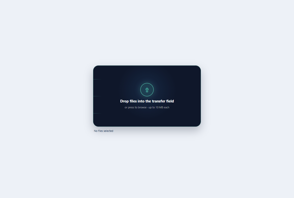
Kinetic file dropzone
A keyboard-ready file dropzone with animated transfer rails, drag state, and selected-file summary.
Open component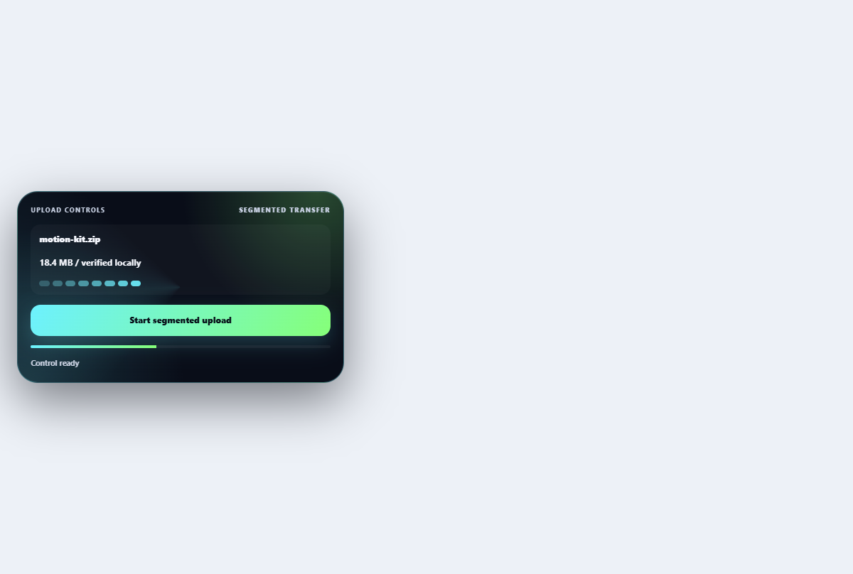
Segmented file uploader
Shows chunk-level upload progress, verification, pause, and retry without a full dropzone.
Open component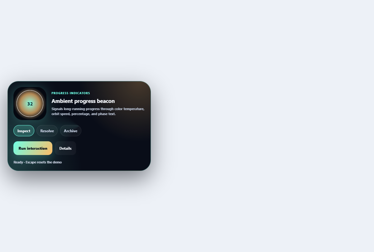
Ambient progress beacon
Signals long-running progress through color temperature, orbit speed, percentage, and phase text.
Open component