
Checkout form UX that reduces errors and abandonment
Design clear checkout steps, address and payment fields, price summaries, delivery choices, validation, and resilient submission states.
What you will build correctly
- Ask only for information required to complete the current transaction.
- Keep total price, delivery consequences, and error recovery visible before submission.
- Protect against duplicate payment while preserving a clear pending state.
Make the transaction understandable before collecting data
Show what is being purchased, quantity, subtotal, discounts, delivery cost, tax behavior, and the final total before the primary payment action. If a cost depends on an address or delivery choice, update it in place and explain the change.
Guest checkout should remain available unless an account is essential to the product. Account creation can follow a successful purchase, when users already have a reason to save their details.
Use field semantics that support autofill
Use real labels, appropriate input modes, and precise autocomplete tokens for name, address, postal code, country, email, and payment fields. Preserve user capitalization and formatting where the destination system allows it instead of rejecting natural input unnecessarily.
Change address structure when country rules genuinely require it, but avoid clearing existing values. Optional fields should be marked as optional, and address line two should not look required through layout or validation.
<input name="postal-code" autocomplete="shipping postal-code" inputmode="numeric">
Connect delivery choices to price and timing
Delivery options should show a readable date or range, cost, and any cutoff that affects the promise. A calendar picker is useful only when users can choose a real available window; otherwise a short radio group is faster and clearer.
Update the order summary without moving the payment button unexpectedly. Announce meaningful total changes politely and keep the selected option visible when users return to correct another field.
- Every delivery choice includes cost and timing.
- The summary uses the same currency formatting as the fields.
- Discount errors do not erase valid checkout data.
Handle payment submission as an irreversible action
Once payment begins, disable duplicate activation while keeping the button label and pending state clear. Do not claim success until the server confirms the transaction. Network uncertainty needs an idempotent request and a recovery message that prevents users from paying twice.
On failure, return focus to a summary, preserve non-sensitive fields, and point to the exact correction. On success, show a stable confirmation page with order identifier, next steps, and a route users can revisit.
Use the pattern
Study it in working components.
These internal examples connect the guide to standalone HTML, CSS, and JavaScript you can preview, customize, and download.
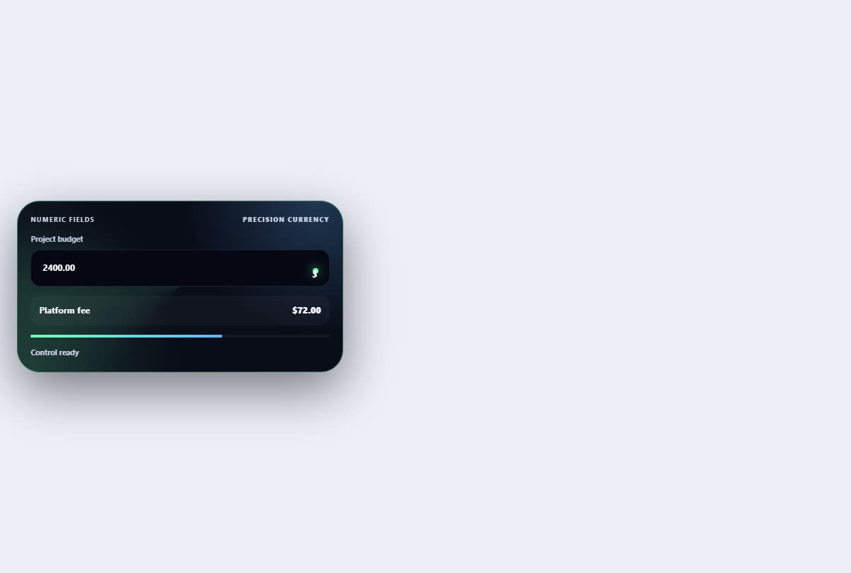
Smart currency field
Formats monetary input while preserving caret-friendly editing and showing a fee calculation.
Open component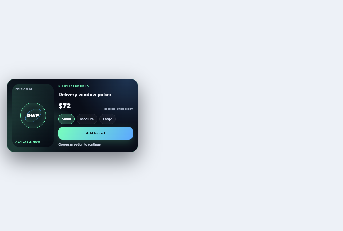
Delivery window picker
Selects a delivery day and time window with capacity and sustainability context.
Open component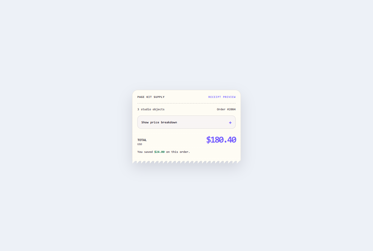
Receipt price breakdown
An expandable thermal-style checkout receipt that reconciles discounts, delivery, tax, and the final total.
Open component