
Accessible combobox patterns for search and autocomplete
Build autocomplete inputs with clear labels, fast filtering, active-option semantics, keyboard navigation, empty states, and selection recovery.
What you will build correctly
- Keep DOM focus in the input while one suggestion becomes programmatically active.
- Separate free-text search from required option selection.
- Support arrow navigation, Enter, Escape, typing, and clear recovery states.
Choose the correct autocomplete contract
Some search fields offer optional suggestions while accepting any query. Other controls require selection from a known list. Decide which model the product needs because validation, announcements, and what happens on blur differ substantially.
A select element is simpler when the list is short and users do not need filtering. A combobox earns its complexity when search materially improves a longer or remote dataset.
Connect the input, popup, and active option
Use role="combobox" on the input, expose expanded state, connect the popup with aria-controls, and reference the active option with aria-activedescendant while DOM focus remains in the text field. The listbox needs a stable id, and every option needs a stable id and selected state.
Visible focus and active-option styling should be distinct. Users can keep typing because focus remains in the input while arrow keys preview another result.
<input role="combobox" aria-autocomplete="list" aria-expanded="true" aria-controls="results" aria-activedescendant="result-2">
Implement a complete keyboard sequence
Down Arrow opens the list or moves to the next option, Up Arrow moves backward, Enter accepts the active option, and Escape closes without erasing the query. Home and End may move the text cursor when the list is closed, so do not steal them unconditionally.
Click and touch selection should run the same state transition as keyboard selection. After selection, place the readable value in the field and preserve an internal id when the application needs one.
- Typing always edits the query immediately.
- The active option scrolls into view.
- Escape closes once before clearing anything.
Handle async results and empty states calmly
Debounce remote requests, cancel stale queries, and ensure old responses cannot replace newer results. Show a compact loading status without announcing every network step, then report the result count or empty state politely.
An empty state should suggest a correction, free-text submission, or creation path based on the product. Preserve the query through errors and allow retry without forcing users to retype it.
Use the pattern
Study it in working components.
These internal examples connect the guide to standalone HTML, CSS, and JavaScript you can preview, customize, and download.
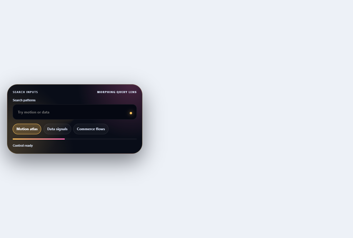
Morphing search combobox
Turns a compact search field into a filtered, keyboard-navigable suggestion lens.
Open component
Aurora search field
A luminous search control with a reactive aurora edge, live query hint, and real clear action.
Open component
Voice search control
Captures a simulated voice query through a pulsing orb, live transcript, and cancellable listening state.
Open component