
Frontend component testing: keyboard, responsive, and export checks
Test the real component package across keyboard paths, viewport sizes, themes, reduced motion, console errors, and standalone exports.
What you will build correctly
- Test the user contract and the exported files, not only the library preview.
- Cover keyboard, touch, responsive, theme, reduced-motion, and failure states.
- Keep automation focused on observable behavior and complement it with review.
Write the component contract before the test
List the semantics, input methods, states, responsive changes, public tokens, and files the component promises. A modal contract includes labelling, initial focus, Escape, focus containment, restoration, and mobile fit; a button contract is smaller but still includes label, focus, activation, pressed feedback, and disabled behavior.
Tests become more useful when each assertion protects a promised outcome instead of mirroring internal class names. Implementation can change while the user contract remains stable.
Exercise complete keyboard paths
Start from the browser chrome or a known preceding control and navigate using Tab, Shift+Tab, Enter, Space, arrows, Home, End, and Escape where the pattern expects them. Verify both the visible focus indicator and resulting state after each action.
For temporary UI, test focus when opening, interacting, cancelling, confirming, and closing after an error. A single successful click does not cover the recovery paths where accessibility defects usually appear.
- Focus order matches visual order.
- Every state is reachable without a pointer.
- Focus is restored after temporary UI closes.
Test content and layout at representative widths
Use narrow phone, tablet, small desktop, and wide desktop viewports, then add long labels and zoom. Check for horizontal overflow, clipped focus rings, hidden actions, unreadable previews, and components that become absurdly large because their layout assumes a full page.
Repeat in light and dark themes, reduced motion, and forced colors where relevant. Visual regression screenshots are useful for stable states, but interaction and accessibility assertions still need semantic checks.
Open the exact exported package
The library wrapper may provide fonts, resets, variables, or scripts that are absent from the download. Build the ZIP, inspect its manifest, open index.html directly, disconnect the network, and exercise the same keyboard and responsive contract.
Capture console errors and verify customized token values appear in the exported CSS. A component library has two products—the browsing tool and the files users take away—and both must pass independently.
                      await page.goto(`file://${exportPath}/index.html`);
await page.keyboard.press('Tab');
await expect(page.getByRole('button')).toBeFocused();
Use the pattern
Study it in working components.
These internal examples connect the guide to standalone HTML, CSS, and JavaScript you can preview, customize, and download.
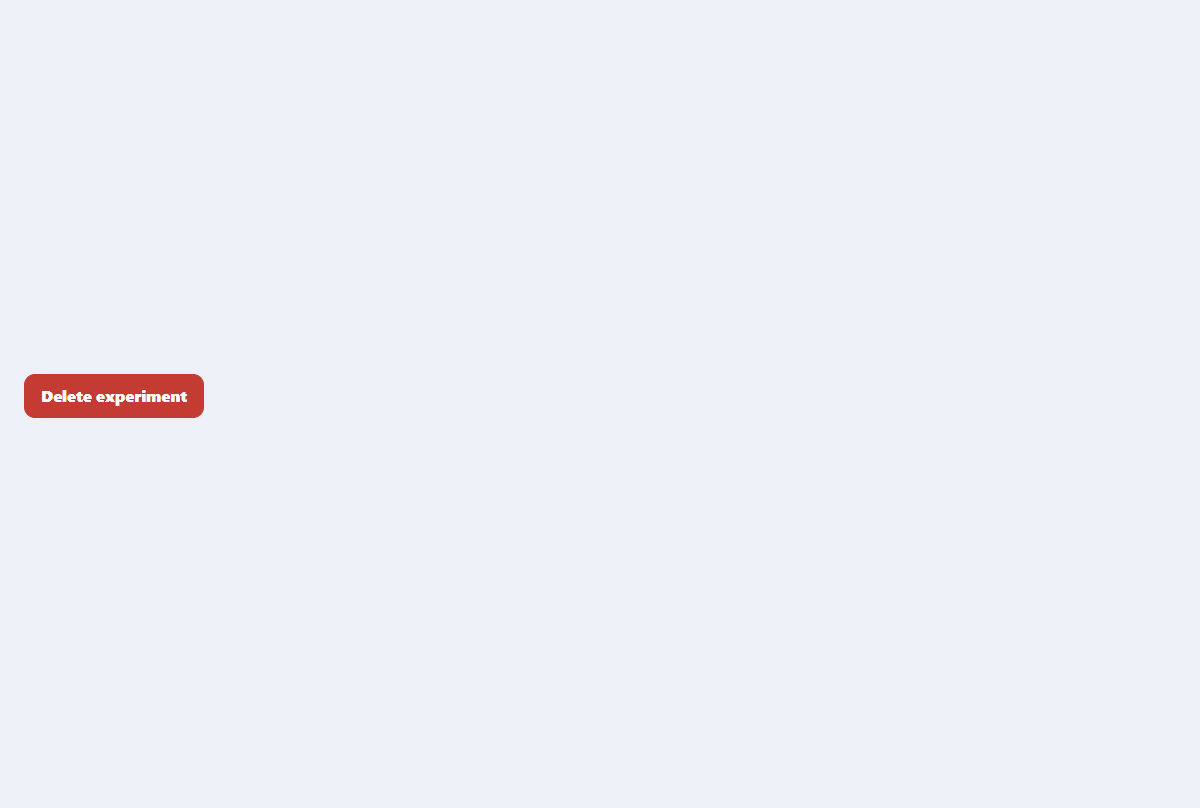
Accessible confirmation modal
A compact destructive-action dialog with focus trapping, restoration, and clear consequences.
Open component
Mobile navigation drawer
A full-height mobile menu with a dimmed backdrop, focus management, and grouped links.
Open component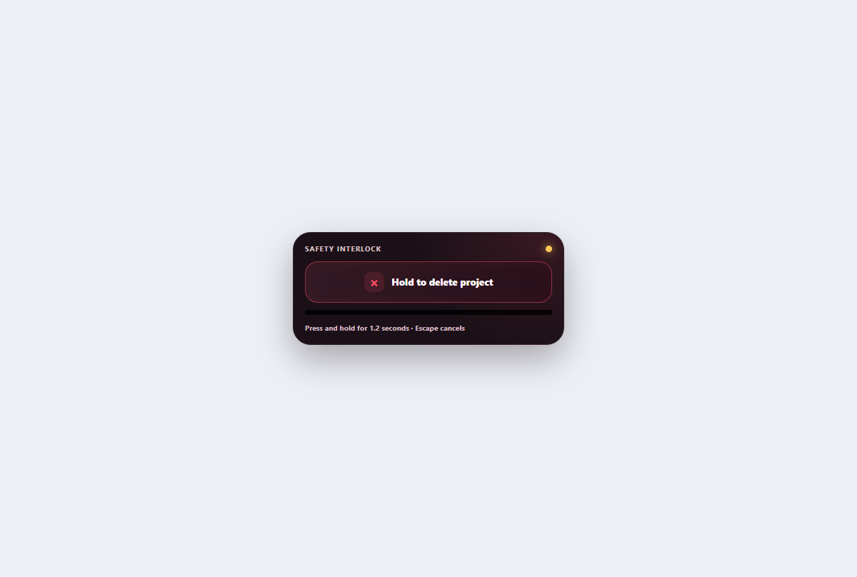
Hold-to-confirm button
A deliberate destructive control with pointer and keyboard holding, visible progress, cancellation, and confirmation.
Open component