
Every number needs context
Explainable data components
Charts become useful when people can understand the source, period, unit, uncertainty, comparison, and consequence. These components pair compact visuals with the text and controls required to make a responsible decision.
Why this set works
A stronger implementation baseline.
Units, periods, sources, and uncertainty stay attached to each value
Anomalies include a readable explanation and investigation path
Partial and stale data states remain visible before decisions are made
Working source
Preview, customize, and download.
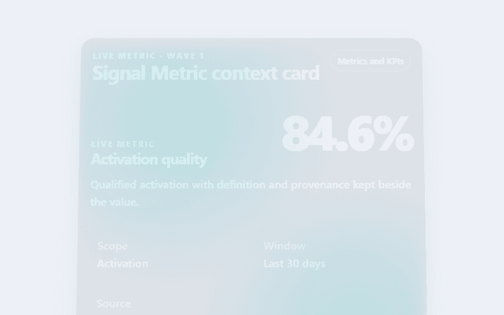
Signal Metric context card
Signal Metric context card is an accessible, animated metrics and kpis pattern with visible evidence and reversible actions.
Open component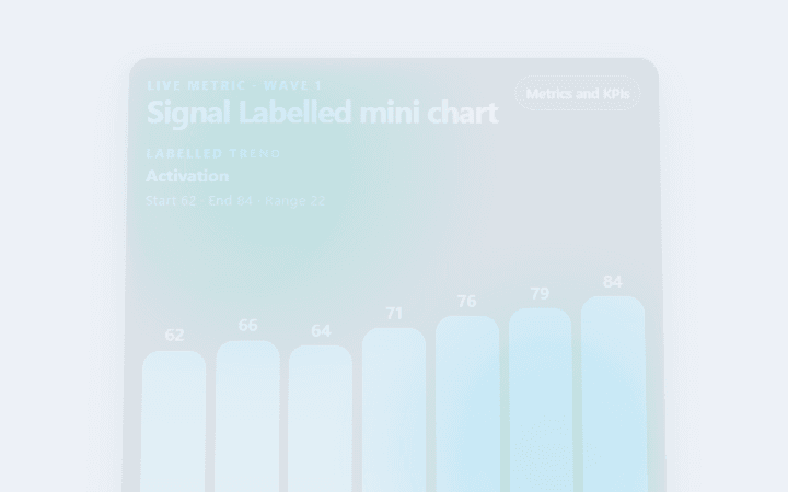
Signal Labelled mini chart
Signal Labelled mini chart is an accessible, animated metrics and kpis pattern with visible evidence and reversible actions.
Open component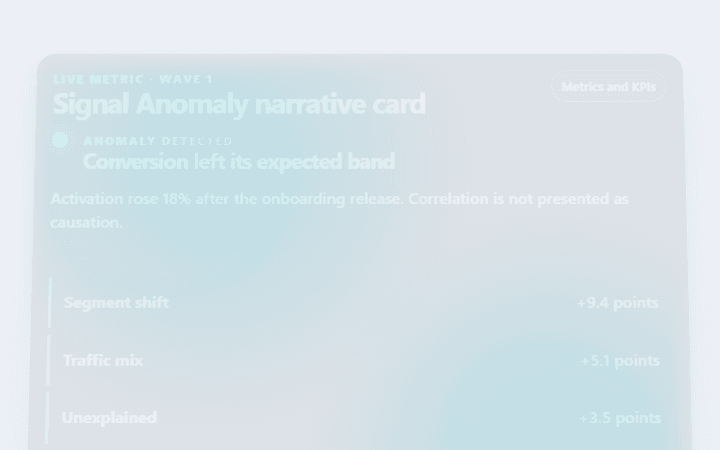
Signal Anomaly narrative card
Signal Anomaly narrative card is an accessible, animated metrics and kpis pattern with visible evidence and reversible actions.
Open component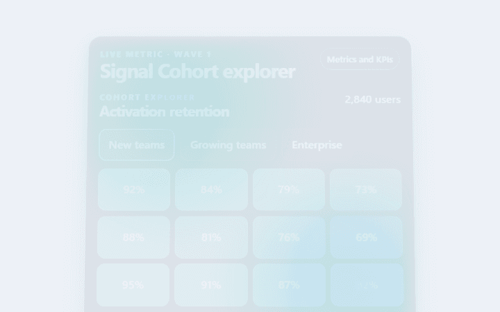
Signal Cohort explorer
Signal Cohort explorer is an accessible, animated metrics and kpis pattern with visible evidence and reversible actions.
Open component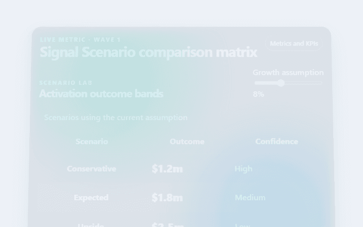
Signal Scenario comparison matrix
Signal Scenario comparison matrix is an accessible, animated metrics and kpis pattern with visible evidence and reversible actions.
Open component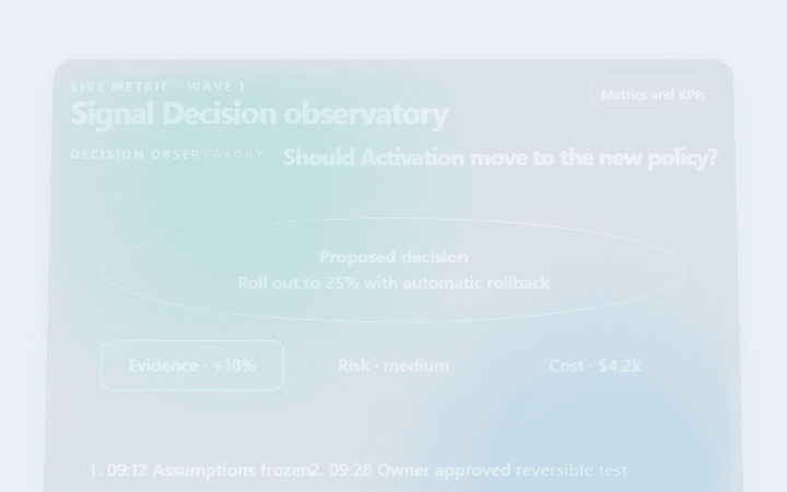
Signal Decision observatory
Signal Decision observatory is an accessible, animated metrics and kpis pattern with visible evidence and reversible actions.
Open componentBefore shipping
Implementation checklist.
Use these checks after adapting the components to your content and application state.
- 01
Name the source, unit, comparison period, and update time.
- 02
Explain confidence and missing data in language suited to the audience.
- 03
Provide a text or table equivalent for visual encodings.
- 04
Keep filtering controls from silently changing the meaning of a metric.
Implementation guidance