
Forms that help people recover
Accessible form components
This collection covers the moments where forms most often fail: labels lose context, errors arrive too late, custom controls hide their state, and keyboard users cannot complete the task. Each component keeps native semantics at the center and adds enhancement only where it improves the experience.
Why this set works
A stronger implementation baseline.
Visible labels and instructions that remain available after typing
Error messages connected to the field that needs attention
Keyboard and screen-reader behavior built into custom interactions
Working source
Preview, customize, and download.
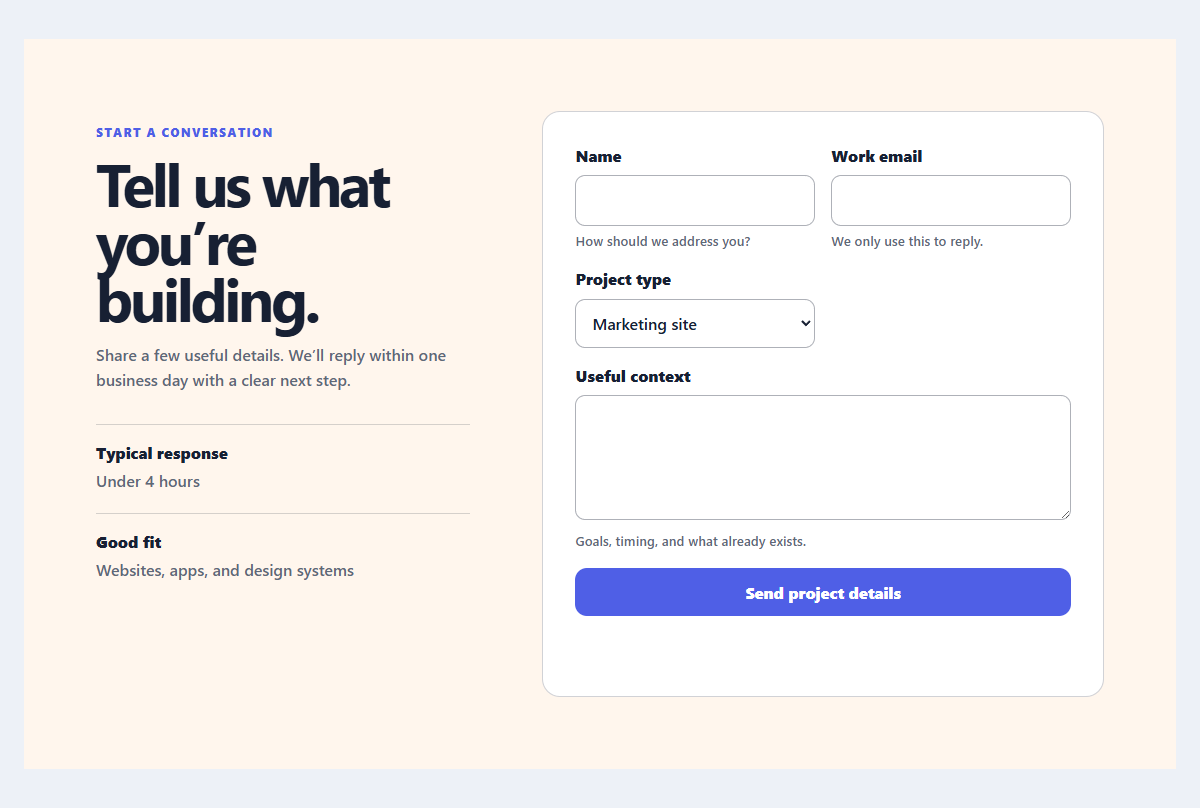
Accessible contact form
A practical contact form with explicit labels, helpful hints, and client-side validation feedback.
Open component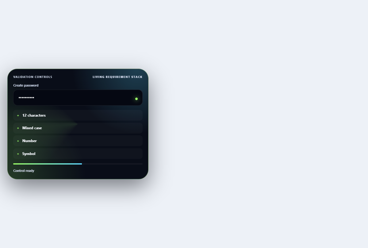
Inline validation stack
Turns password requirements into an ordered live checklist with strength and reveal controls.
Open component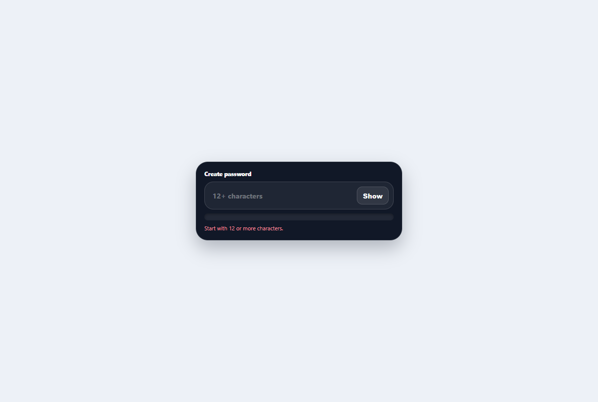
Liquid password field
A secure password control with reveal state, readable guidance, and a liquid strength reservoir.
Open component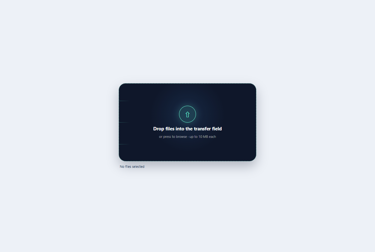
Kinetic file dropzone
A keyboard-ready file dropzone with animated transfer rails, drag state, and selected-file summary.
Open component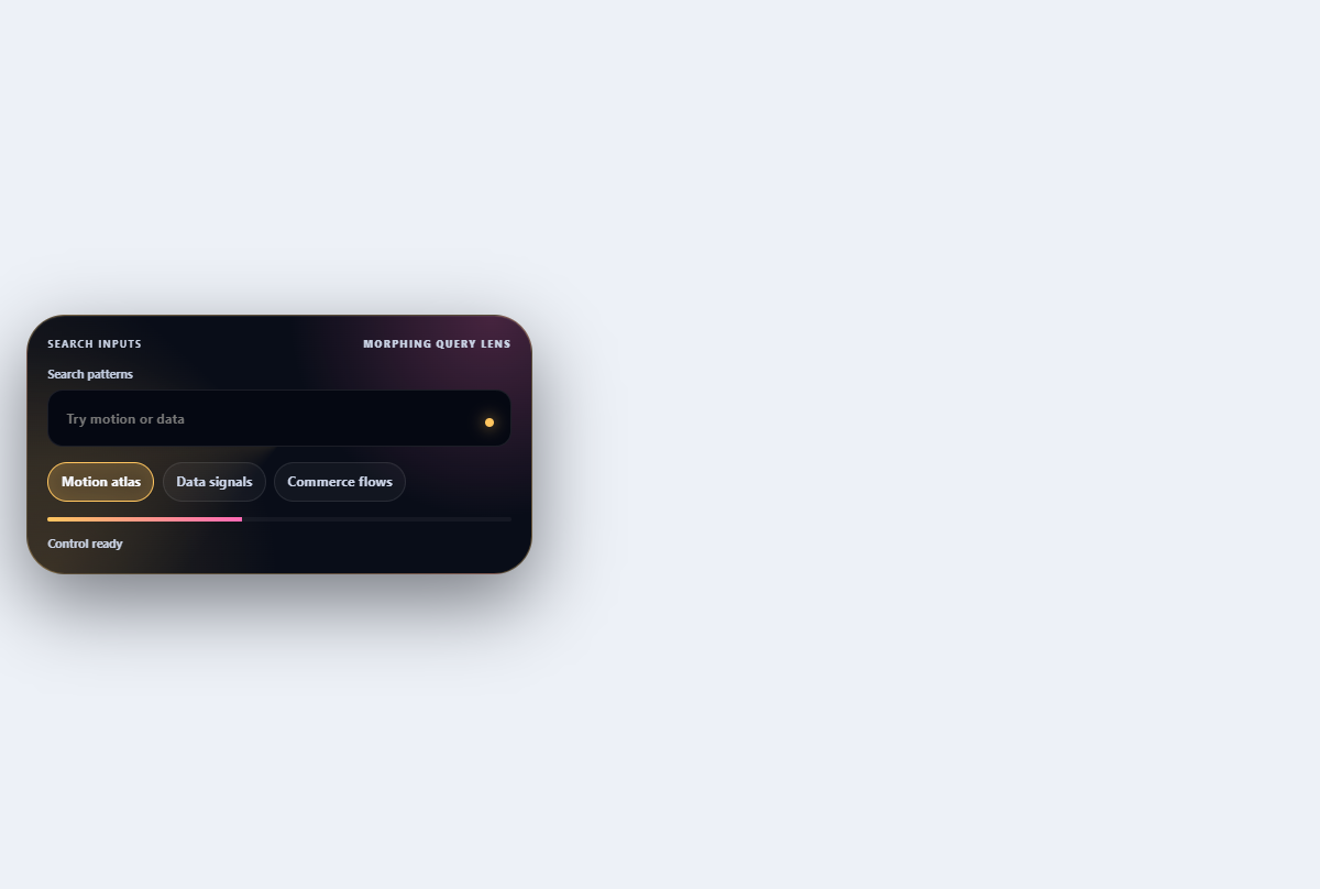
Morphing search combobox
Turns a compact search field into a filtered, keyboard-navigable suggestion lens.
Open component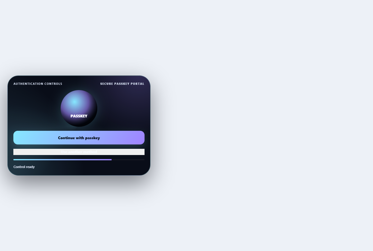
Passkey sign-in control
Explains and simulates a passkey sign-in ceremony with device and fallback choices.
Open componentBefore shipping
Implementation checklist.
Use these checks after adapting the components to your content and application state.
- 01
Keep native input semantics whenever the browser already solves the interaction.
- 02
Move focus only when it helps the user locate a blocking error or new interface state.
- 03
Test zoom, autofill, password managers, keyboard completion, and server-side errors.
- 04
Make success and failure understandable without relying on color alone.
Implementation guidance