
Build accessible SaaS mega menu navigation
Create a responsive SaaS mega menu with semantic destinations, keyboard-friendly disclosure controls, Escape behavior, and dependable mobile navigation.
What you will build correctly
- Use links for destinations and buttons only for opening or closing a grouped panel.
- Support Tab, Enter, Space, and Escape without recreating desktop-menu arrow-key conventions.
- Keep the mobile navigation structure equivalent to the desktop destination hierarchy.
Map destinations before designing the panel
A mega menu is useful when a product has several meaningful destination groups that cannot fit into a short top-level list. Start with product, solution, resource, and company information architecture, then remove repeated or low-value links. The panel should help a visitor choose a route, not reproduce every footer destination in a larger floating box.
Use a nav landmark with a useful label and normal anchors for every destination. A top-level item that only opens a panel should be a button with aria-expanded and aria-controls. If the same label also has an important landing page, provide that destination as a real link inside the panel instead of making one element behave as both link and disclosure.
- Keep destination names short and explain unfamiliar product terms with one sentence.
- Use headings and lists to expose the information hierarchy inside each panel.
- Avoid hover-only opening because touch and keyboard users need an explicit control.
- Leave account, login, and primary conversion actions outside a dense destination group.
Treat each top-level item as a disclosure
A practical website mega menu can follow the disclosure pattern instead of the application menubar pattern. Tab moves through buttons and links in normal order, Enter or Space toggles a panel, and Escape closes it. This behavior matches familiar web navigation and avoids the complex arrow-key model that users expect from desktop application menus.
Update aria-expanded at the same moment the panel visibility changes and allow only one product panel to remain open. When Escape closes the current panel, return focus to the button that opened it. Closing after a destination link is selected happens naturally through navigation, while clicking outside may be added as an enhancement if it does not interfere with pointer use inside the panel.
                      const triggers = [...nav.querySelectorAll('[data-menu-trigger]')];

function closeMenus() {
  triggers.forEach((trigger) => {
    trigger.setAttribute('aria-expanded', 'false');
    document.getElementById(trigger.getAttribute('aria-controls')).hidden = true;
  });
}

triggers.forEach((trigger) => {
  trigger.addEventListener('click', () => {
    const willOpen = trigger.getAttribute('aria-expanded') !== 'true';
    closeMenus();
    trigger.setAttribute('aria-expanded', String(willOpen));
    document.getElementById(trigger.getAttribute('aria-controls')).hidden = !willOpen;
  });
});
Adapt the hierarchy for narrow containers
On narrow layouts, expose a clearly labeled Menu button and keep the same destination groups inside the expanded region. Each group can remain a disclosure when that reduces scrolling, but do not hide every link behind multiple nested controls. People should be able to scan the available categories and understand their current location without memorizing the desktop presentation.
Use a container or viewport breakpoint based on when labels no longer fit, not a specific device name. Prevent the expanded navigation from covering focused items below the viewport, and allow page scrolling when its content is tall. Sticky mobile headers need careful focus testing because zoomed layouts can otherwise place the active link behind the fixed region.
Verify focus, touch, and route state
Navigate the complete header with Tab and Shift+Tab, activate every disclosure with Enter and Space, and close it with Escape from a link inside the panel. Test pointer movement without requiring a precise path between trigger and panel. At mobile zoom, confirm that the menu button, destinations, and primary action remain reachable without horizontal scrolling.
Mark the current route with aria-current on the destination link and keep that state independent from whichever panel is temporarily open. Test with JavaScript delayed so the basic destination links remain available or the menu button stays hidden until enhancement is ready. The related navigation components show product, documentation, and application variations of the same semantic foundation.
Use the pattern
Study it in working components.
These internal examples connect the guide to standalone HTML, CSS, and JavaScript you can preview, customize, and download.
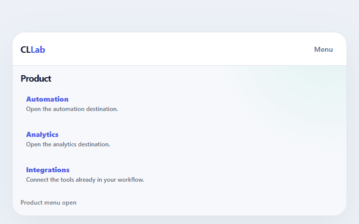
SaaS mega menu
Organizes product, solution, resource, and company destinations into a keyboard-friendly navigation map.
Open component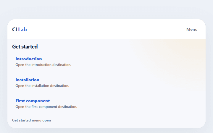
Docs sidebar navigation
Provides searchable, collapsible documentation navigation with a persistent current-page indicator.
Open component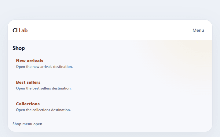
Commerce category nav
Makes product categories, featured collections, account, search, and cart understandable across widths.
Open component