
Compose a complete page from reusable UI components
Turn independent frontend components into a coherent page by planning hierarchy, shared tokens, content flow, and responsive transitions.
What you will build correctly
- Plan the page’s decision sequence before selecting visual components.
- Share a small token layer while preserving each component’s internal boundary.
- Test the transitions between sections as carefully as the individual sections.
Begin with the page decision sequence
A coherent page answers questions in an intentional order. A product page might establish the promise, show proof, explain outcomes, clarify price, and finally repeat the action. Select components for those jobs rather than choosing several visually impressive sections and searching for a narrative after they are assembled.
Write a one-line purpose for every section and remove any two sections that perform the same job. This prevents the page from becoming a catalog demo and gives each component realistic content constraints. The heading structure should reflect the same sequence so people navigating by headings receive the full argument.
- Name the user question answered by every section.
- Keep one page-level h1 and use h2 headings for major sections.
- Place proof near the claim it supports instead of collecting it at the bottom.
- Repeat a call to action only after the page has added new decision-making context.
Design the seams between components
The most visible composition problems occur between components: two dense sections touch, background changes create accidental bands, or adjacent calls to action compete. Review the page at normal reading speed and tune section spacing, alignment, and background transitions at the page layer rather than modifying each downloaded component.
Content length also changes the seams. A short testimonial beside a tall pricing group can leave an awkward empty region, while translated headings can wrap into the next visual block. Use grid and flow layouts that tolerate those differences and avoid negative margins that depend on one sample paragraph.
Validate the page as one responsive system
A component can pass its own responsive checks and still fail inside the complete page. Test it inside the actual content width, navigation shell, and page background. Pay particular attention to horizontal overflow, sticky elements, anchor targets, focus order, and the point where a multi-column section becomes a single reading flow.
Run the final page with slow network and CPU conditions so image loading, fonts, and client behavior reveal unstable space. Then navigate entirely by keyboard and zoom to two hundred percent. Composition is complete only when the order, spacing, and actions remain understandable across those conditions.
Use the pattern
Study it in working components.
These internal examples connect the guide to standalone HTML, CSS, and JavaScript you can preview, customize, and download.

Split launch hero
A product launch hero pairing concise positioning with a layered interface preview.
Open component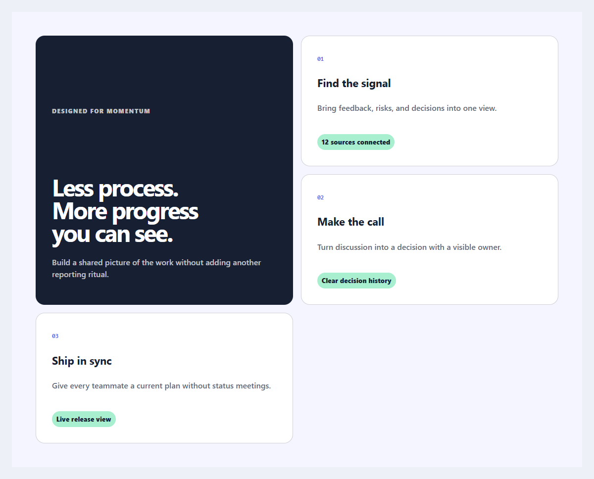
Outcome feature grid
An editorial feature section organized around user outcomes instead of product jargon.
Open component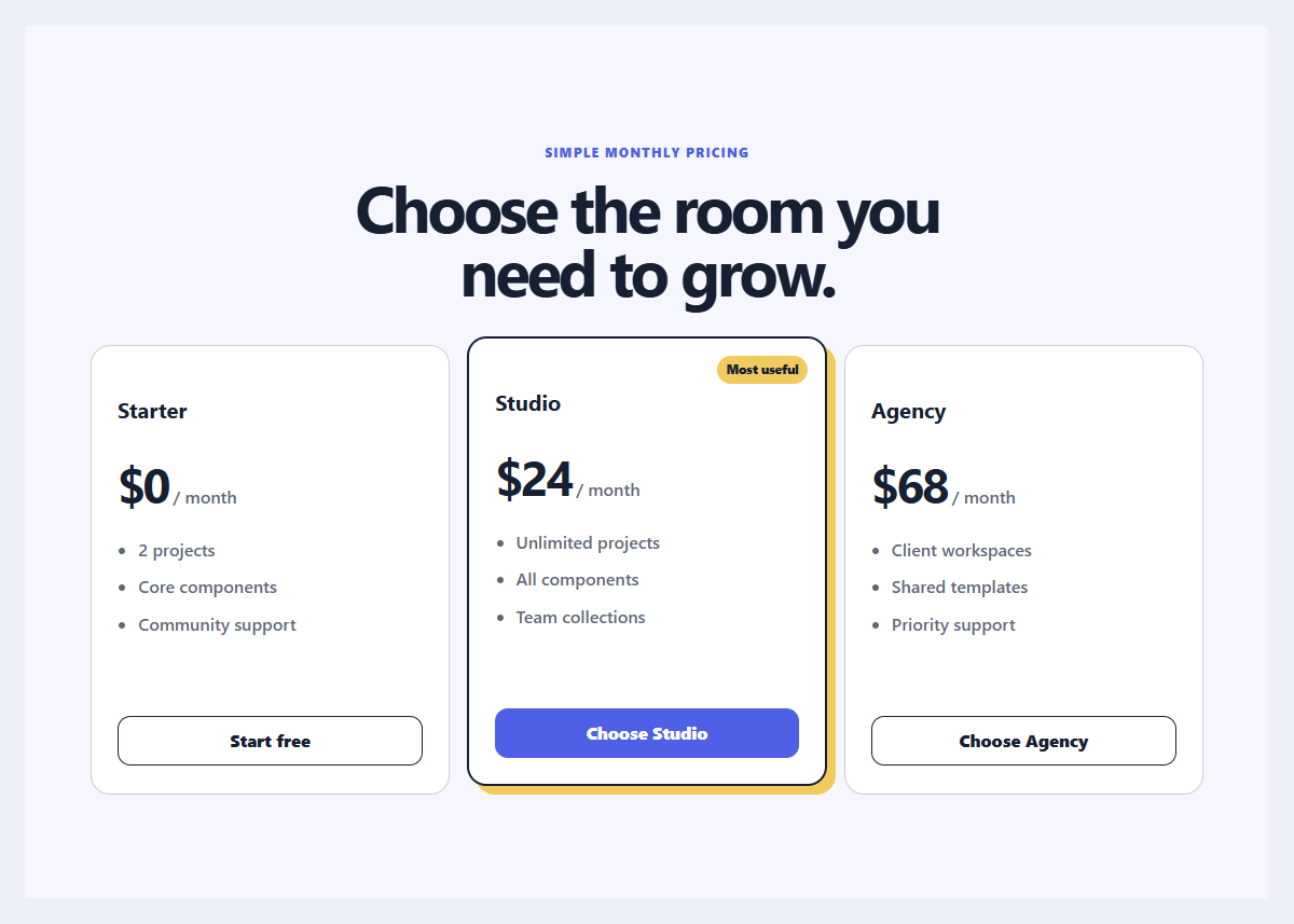
Focused pricing trio
Three pricing plans with restrained emphasis, comparable features, and clear billing language.
Open component