
Use downloadable HTML components in Astro pages
Integrate standalone component markup, scoped CSS, and small scripts into Astro while keeping pages fast, semantic, and easy to update.
What you will build correctly
- Start with an Astro component that renders semantic HTML without a client runtime.
- Use component-scoped styles or an intentional global stylesheet boundary.
- Add browser JavaScript only for behavior and make repeated initialization safe.
Make the static component the default
Astro can render the downloaded HTML as a normal .astro component without shipping a JavaScript framework to the browser. Move customizable copy and URLs into typed props, keep the semantic root element, and render repeated items from arrays only when the data genuinely varies. The result remains useful before any optional script runs.
Choose the component boundary around one coherent responsibility. A hero, pricing group, or navigation unit can be an Astro component, while a complete page should compose several components in a layout. Keeping those boundaries visible makes it easier to replace a section without entangling unrelated styles or content.
- Create a clear Props interface for text, links, and repeated data.
- Preserve native landmarks, heading order, labels, and button types.
- Use slots when callers need to provide meaningful structured content.
- Render a useful default state before adding client-side behavior.
Move markup into an Astro component
Place the prop definition and defaults in the frontmatter block, then paste the component markup below it. Astro expressions can replace sample copy without changing the surrounding structure. Attribute names remain close to HTML, which makes this translation smaller than a framework conversion and keeps the downloaded source recognizable.
For repeated lists, use stable data such as a feature identifier rather than the visible label as application state. Astro does not need a client key for static output, but clear data shapes help future maintainers understand which content belongs to the component and which content comes from the page that uses it.
                      ---
interface Props {
  title: string;
  description: string;
  actionHref: string;
}
const { title, description, actionHref } = Astro.props;
---

<section class="cmp-launch-hero" aria-labelledby="launch-title">
  <h1 id="launch-title">{title}</h1>
  <p>{description}</p>
  <a href={actionHref}>Explore the product</a>
</section>
Choose a predictable style boundary
The simplest approach is to place the downloaded CSS in the Astro component style block. Astro scopes those rules by default, while the existing unique root class keeps the source understandable if it is later exported again. Alternatively, import the stylesheet when several routes intentionally share the exact component implementation.
CSS custom properties remain the public customization API. Provide page or theme values above the component and use instance-level overrides sparingly. If an Astro scoped selector changes specificity, inspect the generated page before adding overrides; a cascade layer or a dedicated theme class is usually clearer than escalating with important declarations.
Add only the browser behavior the component needs
A plain script tag in an Astro component can initialize a small interaction without hydrating a framework island. Query beneath the unique root, guard missing elements, and use data attributes for state. When view transitions or repeated components are possible, make the initializer idempotent so it does not attach the same listener twice.
Verify both the generated HTML and the browser experience. Inspect the built route to confirm that primary text and links are server rendered, then test keyboard input, narrow viewports, reduced motion, and navigation between pages. The component should fail safely if its script is blocked or delayed.
Use the pattern
Study it in working components.
These internal examples connect the guide to standalone HTML, CSS, and JavaScript you can preview, customize, and download.
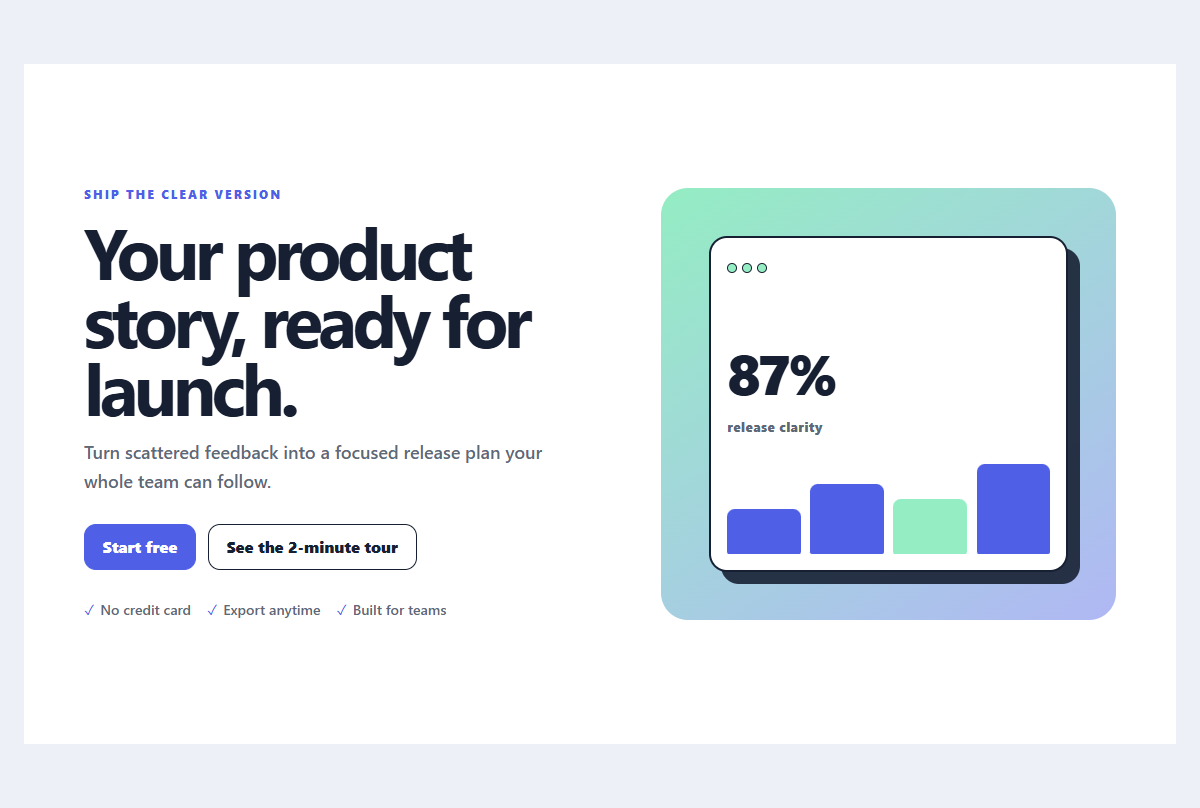
Split launch hero
A product launch hero pairing concise positioning with a layered interface preview.
Open component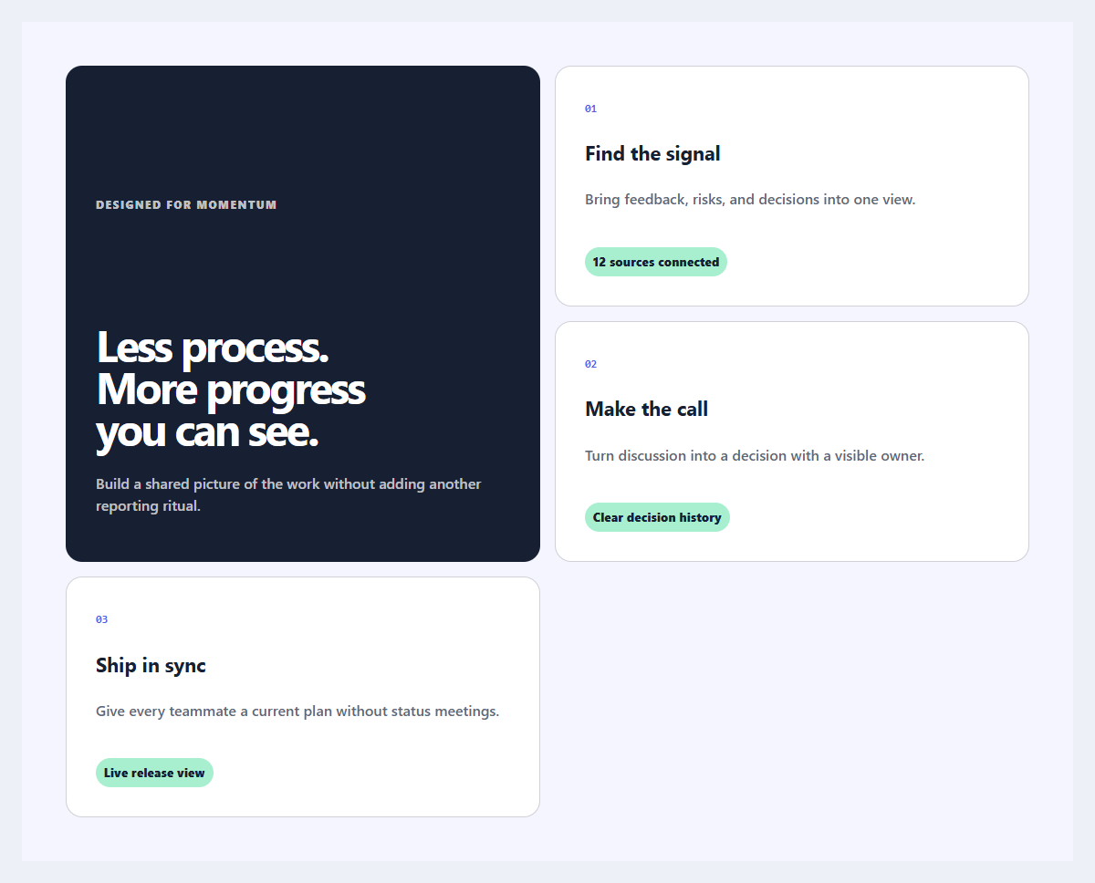
Outcome feature grid
An editorial feature section organized around user outcomes instead of product jargon.
Open component
Mobile navigation drawer
A full-height mobile menu with a dimmed backdrop, focus management, and grouped links.
Open component