
Use plain HTML and CSS components safely in React
Adapt standalone HTML, scoped CSS, and optional JavaScript into React without discarding semantics, duplicating state, or creating brittle effects.
What you will build correctly
- Translate HTML attributes carefully while preserving the component’s semantic structure.
- Let React own interactive state instead of running a second controller over the same elements.
- Keep component styles scoped and verify focus, cleanup, and repeated rendering behavior.
Decide which layer owns the interaction
A standalone component usually arrives as semantic HTML, scoped CSS, and a small script. React can render the first two directly, but the script needs a deliberate boundary. If React already controls the value, expanded state, or selected item, implement that behavior with props and state rather than starting the original controller beside it.
Keeping one owner prevents the visible interface and accessibility attributes from drifting apart. A button whose label comes from React but whose aria-expanded value comes from a separate event listener can easily report the wrong state after a rerender. List every stateful behavior before translating the markup and choose one owner for each one.
- Keep native links, buttons, labels, headings, and landmark elements intact.
- Move state-dependent classes and ARIA values into the same React render path.
- Use a ref only for imperative browser behavior that React does not model well.
- Avoid injecting the complete component through dangerouslySetInnerHTML.
Translate markup without flattening semantics
Most HTML moves into JSX with only small attribute changes: class becomes className, for becomes htmlFor, and inline style text becomes an object. Preserve the original element choices. Replacing a button with a clickable div creates keyboard, focus, and name problems that no visual conversion can repair automatically.
Break the component into React subcomponents only when the new boundary has a real purpose, such as repeated data or a separately testable interaction. Excessive fragmentation makes the downloaded example harder to compare with its React version and can hide the reading order that made the original markup understandable.
                      export function Disclosure({ title, children }) {
  const [open, setOpen] = useState(false);

  return (
    <section className="cmp-disclosure">
      <h2>
        <button
          type="button"
          aria-expanded={open}
          onClick={() => setOpen((value) => !value)}
        >
          {title}
        </button>
      </h2>
      <div hidden={!open}>{children}</div>
    </section>
  );
}
Bring scoped styles into the application deliberately
Import the component stylesheet once from the component or from an application style entrypoint. Because Coding Laboratory selectors begin beneath a unique component root, they can coexist with application styles without requiring a CSS-in-JS rewrite. Keep the root class and documented custom properties when changing the visual system.
Set design tokens at the nearest useful boundary. A page-level theme can provide shared defaults, while a component instance can override one or two values through a class or style prop. Do not copy internal declarations into a global utility file, because that removes the isolation that makes later component updates predictable.
Test rerenders, cleanup, and keyboard behavior
Render the component with its shortest and longest realistic content, toggle every state, and then unmount it. Any document-level listener, observer, or timer created inside an effect must be removed by the effect cleanup function. React development checks may mount effects more than once, so an unsafe controller often reveals itself as duplicate actions.
Finish with the interaction rather than a snapshot alone. Tab through the control, activate it with the expected keys, inspect focus after closing an overlay, and confirm that screen-reader state changes come from the same React state users can see. Repeat the checks after applying the application theme and at narrow container widths.
Use the pattern
Study it in working components.
These internal examples connect the guide to standalone HTML, CSS, and JavaScript you can preview, customize, and download.
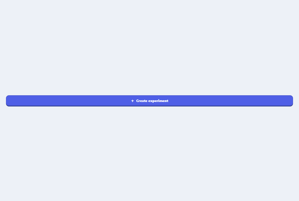
Primary action button
A focused primary button with an icon slot, compact sizing, and clear interaction states.
Open component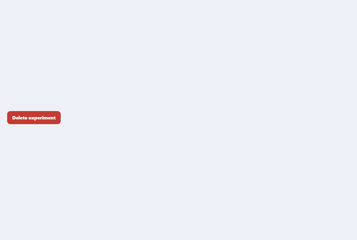
Accessible confirmation modal
A compact destructive-action dialog with focus trapping, restoration, and clear consequences.
Open component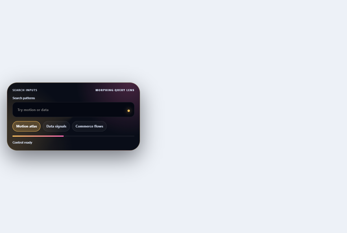
Morphing search combobox
Turns a compact search field into a filtered, keyboard-navigable suggestion lens.
Open component