
High-performance JavaScript dashboard layouts
Build fast JavaScript dashboard layouts with responsive HTML, CSS grid, lightweight charts, and clear patterns for KPI-heavy interfaces.
What you will build correctly
- Pair every value with its metric name, unit, comparison period, and a written change summary.
- Use intrinsic grid sizing so cards reflow according to container space instead of device names.
- Reserve stable geometry for loaded values and provide text alternatives for visual trends.
Define the decision behind every metric
A KPI card should identify the metric, current value, unit, comparison period, and direction of change. “148k” is not actionable without knowing whether it represents monthly recurring revenue, requests, or active users. Start from the operational question and remove values that do not influence a decision or provide necessary context for another signal.
Keep comparison language explicit, such as “up 8.4 percent versus the previous 30 days.” Color and arrows may reinforce the direction but cannot replace that text. When a target matters, state it beside the current value so a visitor does not need to remember an external threshold or infer performance from a gauge position.
- Use a definition list when several metric names and values share one summary region.
- Include the time range in the heading or control that governs the complete dashboard.
- Distinguish positive business impact from a numerically positive change such as higher churn.
- Link a summary card to the records that explain it when investigation is possible.
Build a high-performance layout around available space
CSS Grid with repeat, auto-fit, and a sensible minmax value lets KPI cards wrap when their container becomes narrow. This matters in application shells where a sidebar can change available width without a viewport breakpoint. A minimum around sixteen rem often leaves space for a label, value, and comparison without forcing awkward single-word wrapping.
Keep the DOM reading order aligned with visual priority so reflow does not create a different sequence for keyboard or screen-reader users. Avoid dense masonry layouts where a tall card changes the scan path. Larger chart or table regions can span columns at wide sizes and return to a single track through a small container query. Render labels and layout in HTML and use JavaScript only to update the values or chart data that actually change.
                      .dashboard-summary {
  container-type: inline-size;
}

.kpi-grid {
  display: grid;
  grid-template-columns: repeat(auto-fit, minmax(min(16rem, 100%), 1fr));
  gap: 1rem;
}

@container (min-width: 52rem) {
  .trend-panel { grid-column: span 2; }
}
Explain charts and reserve loaded dimensions
A small chart needs an accessible name and a text summary of the important trend. If exact values matter, provide a table or linked detail view rather than attempting to encode every point in a long alternative description. Decorative bars can be hidden from assistive technology when the adjacent text already communicates the same conclusion.
Reserve height for charts and a reasonable inline width for asynchronous values so data arrival does not shift surrounding controls. Skeletons should match the final geometry and disappear without collapsing space. Server-render stable metric labels and period context even when numbers require a client request, allowing the page structure to remain useful during slow or failed responses. Load chart code after the initial dashboard structure, share one data request where possible, and avoid hydrating static metric cards.
Test real states inside the application shell
Test short and long values, negative changes, missing data, zero states, loading, errors, and unusually long localized labels. Resize the dashboard container with the sidebar open and closed, then repeat at browser zoom. Confirm that period controls update every card consistently and that focused elements remain visible beneath sticky headers.
Measure layout shift and largest content rendering on the complete route because fonts, authentication, and shell navigation affect the result. Use automated checks for metric formatting and visual regression, followed by keyboard and screen-reader testing. The related revenue, customer health, and incident dashboards show how the same layout system can serve different operational decisions.
Use the pattern
Study it in working components.
These internal examples connect the guide to standalone HTML, CSS, and JavaScript you can preview, customize, and download.
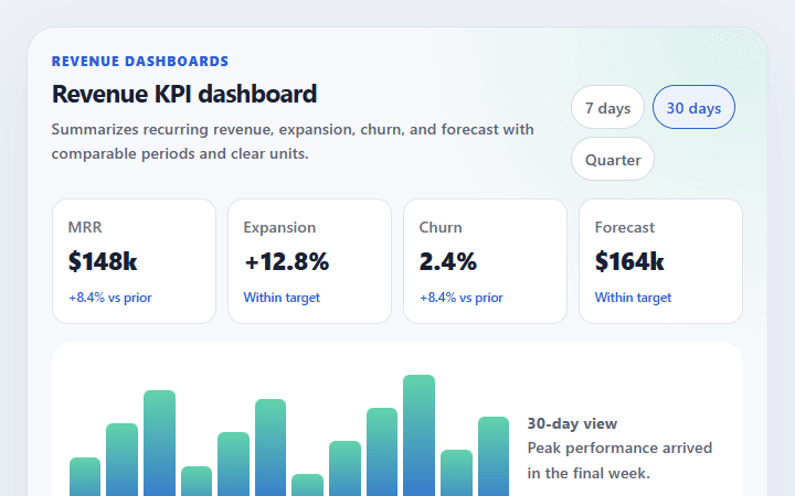
Revenue KPI dashboard
Summarizes recurring revenue, expansion, churn, and forecast with comparable periods and clear units.
Open component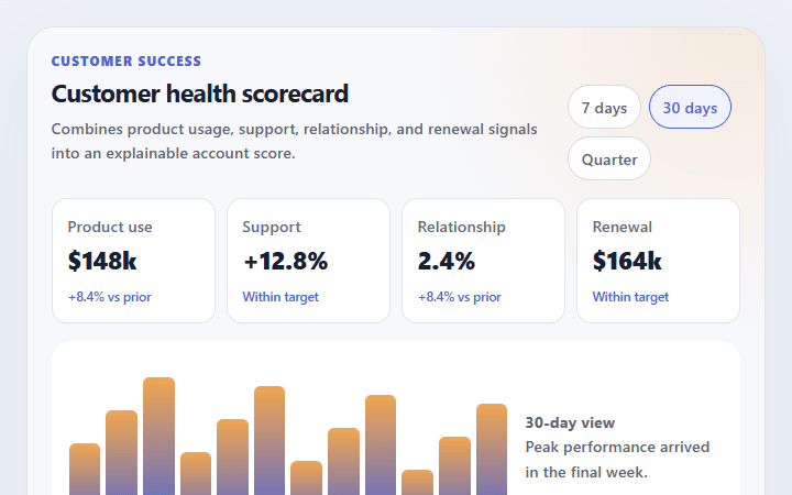
Customer health scorecard
Combines product usage, support, relationship, and renewal signals into an explainable account score.
Open component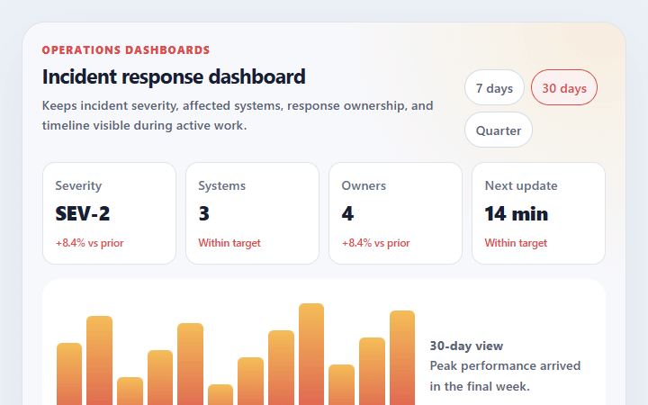
Incident response dashboard
Keeps incident severity, affected systems, response ownership, and timeline visible during active work.
Open component