
Build a responsive pricing comparison table with HTML and CSS
Create an accessible plan comparison that stays readable on mobile, makes feature differences clear, and supports confident pricing decisions.
What you will build correctly
- Use real table semantics when users must compare the same features across several plans.
- Keep plan names and feature labels visible while narrow screens scroll the comparison region.
- Pair the comparison with a concise pricing summary instead of repeating every sales claim.
Choose comparison semantics before styling the plans
A pricing comparison is tabular when each row describes one feature and each column represents one plan. In that case, a real table gives every value useful row and column context. Cards may look simpler, but they force visitors to remember which features appeared in earlier plans and make a complete comparison harder for screen-reader users.
Start with the decision buyers need to make. Put meaningful differences near the top, group secondary limits below them, and remove rows where every plan is identical. The comparison should reduce uncertainty rather than display the maximum possible number of checkmarks. A short note can explain shared features without turning them into repetitive table rows.
- Write plan names as column headers and feature names as row headers.
- Use text such as Included or Not included when an icon alone could be ambiguous.
- Keep price, billing period, and primary action outside dense feature rows.
- Order differences by decision value instead of internal product architecture.
Build a table that exposes its relationships
Use thead for plan headings and tbody for the feature list. Add scope to header cells so assistive technology can announce the correct relationship as people move through the comparison. A caption can summarize the purpose without repeating the page heading, while visually hidden context can clarify symbols that are intentionally compact.
Do not make the entire table a collection of buttons or links. Keep actions in a predictable final row or in a plan summary immediately above the table. This separation lets people review information without encountering the same call to action after every feature, and it gives keyboard users a shorter, more useful focus order.
                      <div class="pricing-table-scroll" tabindex="0" aria-label="Compare pricing plans">
  <table class="pricing-table">
    <caption>Features included in each monthly plan</caption>
    <thead>
      <tr><th scope="col">Feature</th><th scope="col">Starter</th><th scope="col">Team</th></tr>
    </thead>
    <tbody>
      <tr><th scope="row">Projects</th><td>3</td><td>Unlimited</td></tr>
      <tr><th scope="row">Priority support</th><td>Not included</td><td>Included</td></tr>
    </tbody>
  </table>
</div>
Preserve context on narrow screens
Allow the comparison region to scroll horizontally instead of shrinking text until it becomes unreadable. Give the wrapper a visible focus style because keyboard users need to discover that the region is scrollable. A subtle edge fade may suggest more content, but it must not cover values or become the only indication that additional columns exist.
Keep the feature column sticky when the table contains many rows. Plan headings can also remain visible within the scroll container, provided their stacking order and background prevent overlapping text. Test zoom and long localized labels because a layout that works with short English feature names may fail when content expands or browser text size increases.
Connect the comparison to a complete pricing flow
A table answers which plan includes a feature, but it does not need to answer every pricing question. Place a billing-period control before the plan summaries, show the effective recurring price beside each plan, and reserve the detailed table for visitors who want evidence. Enterprise buyers should receive a clear path to discuss volume, security, or procurement requirements.
Verify the full flow at 375, 768, 1024, and 1440 pixels. Navigate every action with a keyboard, inspect header announcements with a screen reader, and confirm that selected billing periods update all visible prices consistently. The downloadable examples below separate these responsibilities so you can compose them without creating one fragile mega-component.
Use the pattern
Study it in working components.
These internal examples connect the guide to standalone HTML, CSS, and JavaScript you can preview, customize, and download.
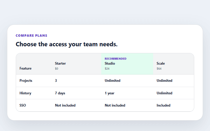
Pricing feature comparison
A responsive plan comparison table with explicit availability labels and a clear recommended tier.
Open component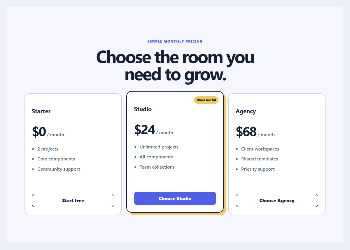
Focused pricing trio
Three pricing plans with restrained emphasis, comparable features, and clear billing language.
Open component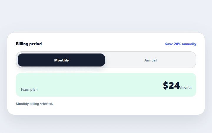
Billing period toggle
A two-option billing control that updates visible prices and announces the selected period.
Open component