
Wrap a standalone HTML component as a custom element
Turn reusable HTML, scoped CSS, and defensive behavior into a custom element with a clear API, lifecycle cleanup, and accessible output.
What you will build correctly
- Use a custom element to define lifecycle and configuration, not to replace useful native semantics.
- Choose light DOM or shadow DOM based on styling and content requirements rather than novelty.
- Reconnect safely, clean up external work, and reflect only meaningful public state.
Confirm that a custom element solves a real boundary
A custom element is useful when the same behavior must initialize consistently across different application stacks or when an explicit lifecycle improves integration. It is not necessary for every static card or section. Keep native controls inside the element so browsers and assistive technology still understand the interaction without learning a replacement vocabulary.
Define the public contract before writing the class: which attributes configure the component, which properties expose richer values, and which events report user actions. A small contract is easier to maintain across React, Astro, a CMS, or a plain document than a collection of undocumented internal selectors.
- Use a hyphenated element name that describes the component role.
- Keep links, buttons, labels, inputs, and headings native inside the boundary.
- Document attributes, properties, events, slots, and default content.
- Avoid turning visual design tokens into a large JavaScript property surface.
Build a repeat-safe lifecycle
The connectedCallback can run more than once if the element moves within the document. Guard internal setup so reconnecting does not duplicate controls or listeners. Store bound handlers on the instance when they must later be removed, and keep queries beneath the element rather than searching the complete document.
Use disconnectedCallback for observers, timers, subscriptions, or listeners attached outside the element. Listeners attached to descendants disappear with those nodes, but work attached to window or document survives unless it is explicitly removed. Treat cleanup as part of the component API, not optional optimization.
                      class LabDisclosure extends HTMLElement {
  connectedCallback() {
    if (this.dataset.ready === 'true') return;
    const button = this.querySelector('button');
    const panel = this.querySelector('[data-panel]');
    if (!button || !panel) return;
    this.dataset.ready = 'true';
    button.addEventListener('click', () => {
      const open = button.getAttribute('aria-expanded') !== 'true';
      button.setAttribute('aria-expanded', String(open));
      panel.toggleAttribute('hidden', !open);
    });
  }
}

customElements.define('lab-disclosure', LabDisclosure);
Choose light DOM or shadow DOM deliberately
Light DOM preserves the page’s content relationships and allows existing scoped CSS to work with minimal changes. It is often the better fit for headings, forms, navigation, and content supplied by a CMS. The unique component root still provides a practical style boundary without hiding the content from page-level selectors.
Shadow DOM offers stronger style encapsulation but introduces a new theming and content-distribution contract. If you use it, expose a small set of CSS custom properties and parts, verify accessible-name relationships, and test form participation. Do not adopt shadow DOM only to avoid fixing unscoped selectors.
Test the element in more than one host environment
Place multiple instances in a plain HTML page, then use the element inside the framework or CMS that will host it. Change attributes before and after connection, move an instance within the document, and remove it while an interaction is active. These cases reveal lifecycle assumptions that a single static demo will not expose.
Finish with the same user-facing checks as any component: keyboard operation, focus visibility, zoom, reduced motion, high-contrast settings, and narrow containers. The custom-element wrapper is successful only when it makes integration more predictable without weakening the accessible HTML inside it.
Use the pattern
Study it in working components.
These internal examples connect the guide to standalone HTML, CSS, and JavaScript you can preview, customize, and download.
Accessible confirmation modal
A compact destructive-action dialog with focus trapping, restoration, and clear consequences.
Open component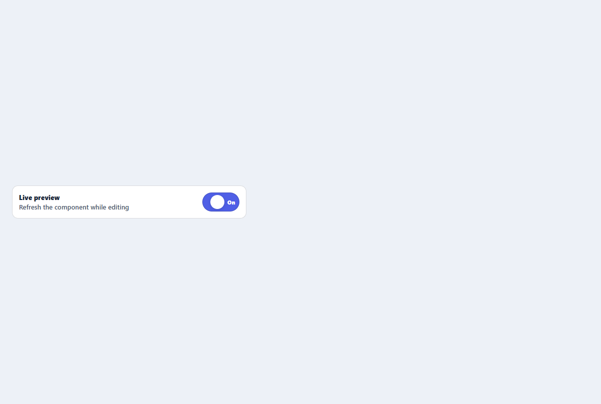
Labeled toggle switch
A compact settings switch with visible labels and announced on or off state.
Open component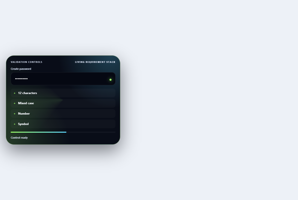
Inline validation stack
Turns password requirements into an ordered live checklist with strength and reveal controls.
Open component